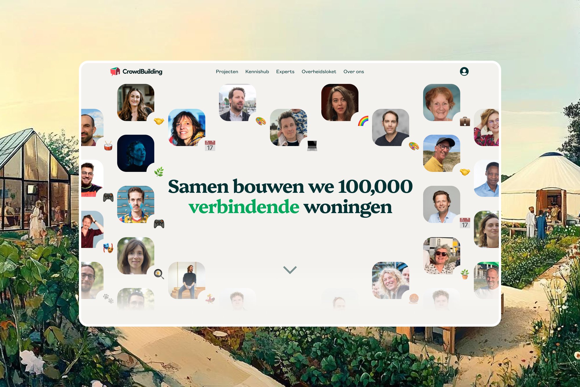
Bijzonder
Identity, website and product design
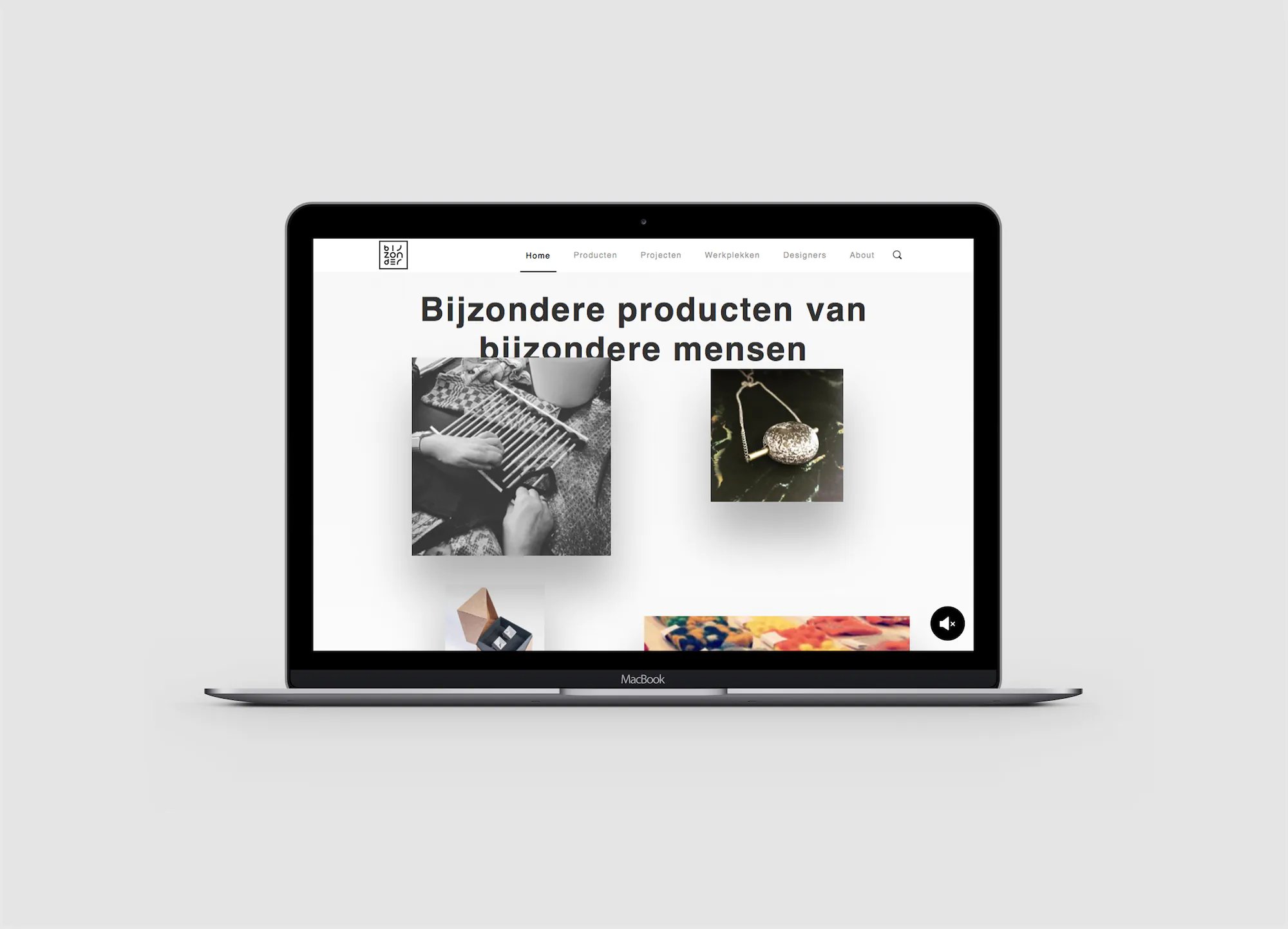
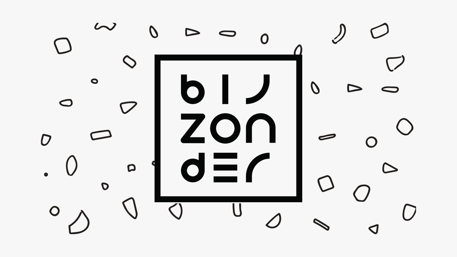
I created the identity, website and packaging for Bijzonder — a social organisation that partners with care institutes like Bartiméus and Leger des Heils to design beautiful products with disabled patients and shift how their work is perceived.
Collaboration
- The Salvation Army
Identity, website and packaging created for a social organisation, tailored for clarity and impact.
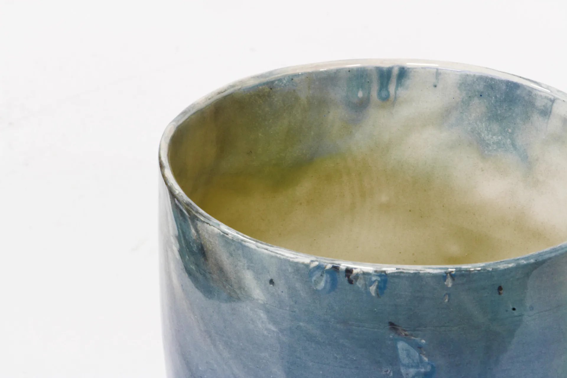
Bijzonder is a social organisation which partners with care institutes such as Bartiméus and Leger des Heils to create beautiful products and change perceptions of disabled patients. These institutes previously made items like candles and soaps, but their unappealing designs and poor marketing led to slow sales and negative perceptions of the makers.
Design System
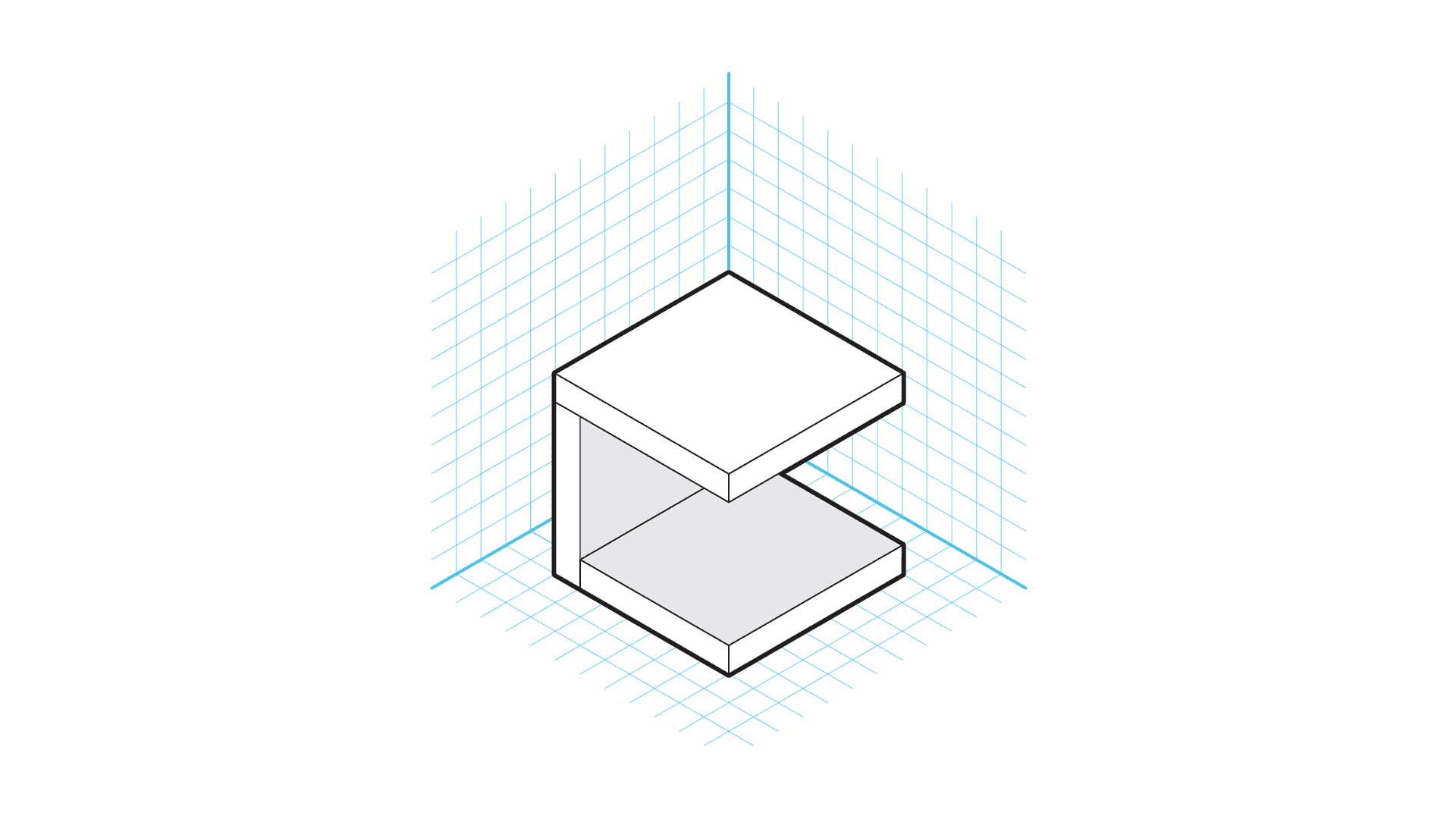
By creating a simple modular block design system, we could easily experiment and create new designs quickly and efficiently. My team and I decided to divide the project into two main tasks; the first focusing on creating a foundational brand identity and the second focusing on improving the existing products and creating new designs. The core value of the brand is the people behind the products. We, therefore, worked with the care institutes to find the heart of what Bijzonder is.
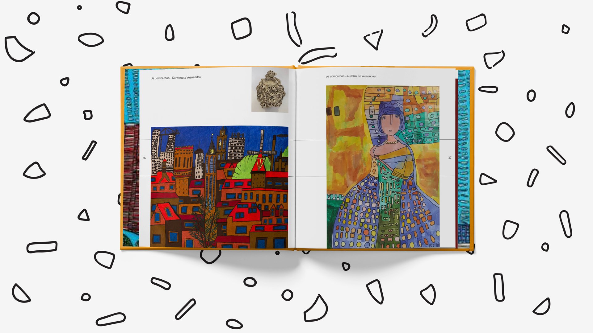
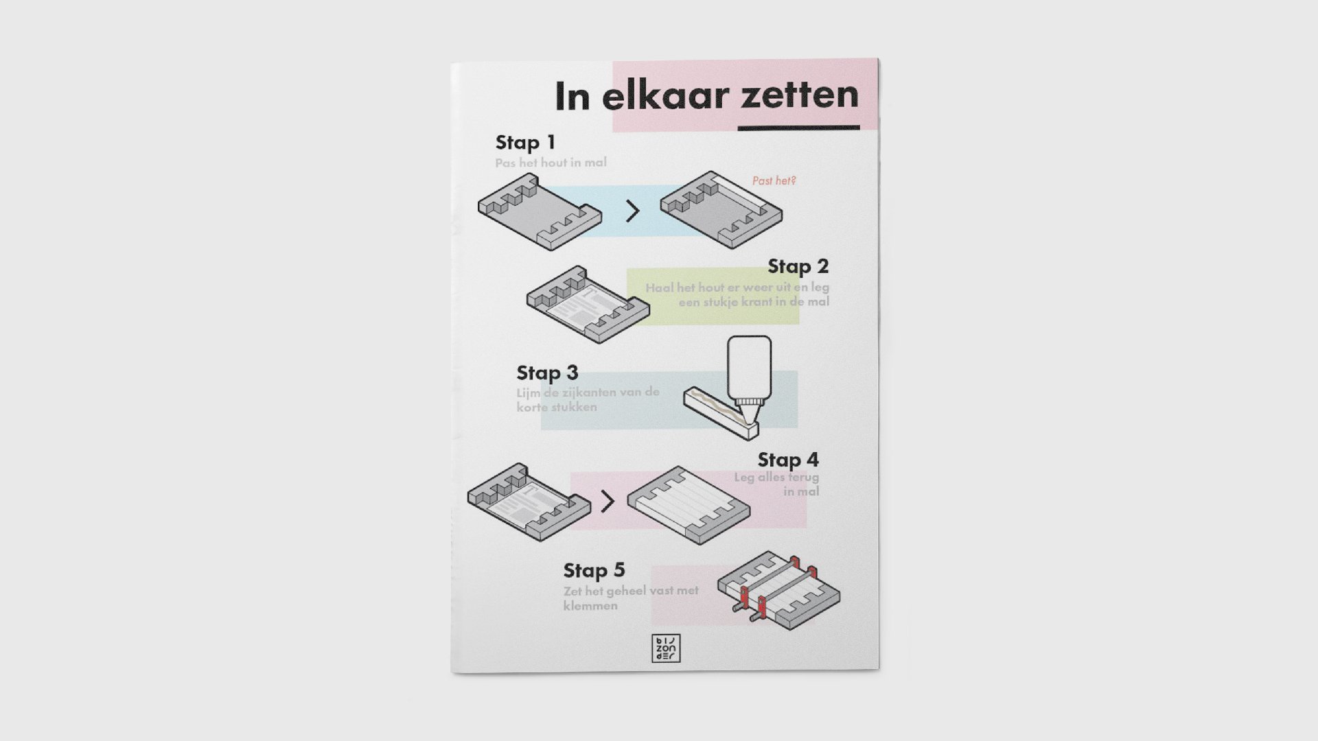
By creating assets such as packaging, tools and guides with a strong branding, we enabled the makers to tell a story through products people want to have. Tracing over art pieces that various patients made at “De Wijde Doelen”, I created patterns that were modern, aesthetically pleasing and based upon their work. The identity needed to be flexible for new designers to work with while remaining recognizable. I was inspired by the Hillary Clinton campaign logo in how it constantly changes based on the context. We then designed a website that was easily updatable for Bijzonder while focusing on the stories behind each product and its maker. Each product has a unique QR Code which links to a certain page on the website telling the story of the person who made it, creating a more personal, human experience while reducing print costs. Together, we created products that were simple and easy to build and designed worksheets and templates to help them if they ever became lost or confused.
The majority of the work was based on making molds, tools, and worksheets for the institutes to follow that were tailored to each institute’s difficulties as well as creating a foundation and guidelines for the next wave of designers to take over and work upon.