
Sail
A collaborative canvas for communicating, exploring and sharing the web.
As principal designer at Sail, I led end-to-end design over two years for a San Francisco startup building a collaborative canvas for the web. I worked closely with the founders on strategy, product, brand and motion — work that helped Sail successfully raise over six million dollars.
Collaboration
- Ron Bhattacharyay
- Jimmy Liu
- Kent de Bruin
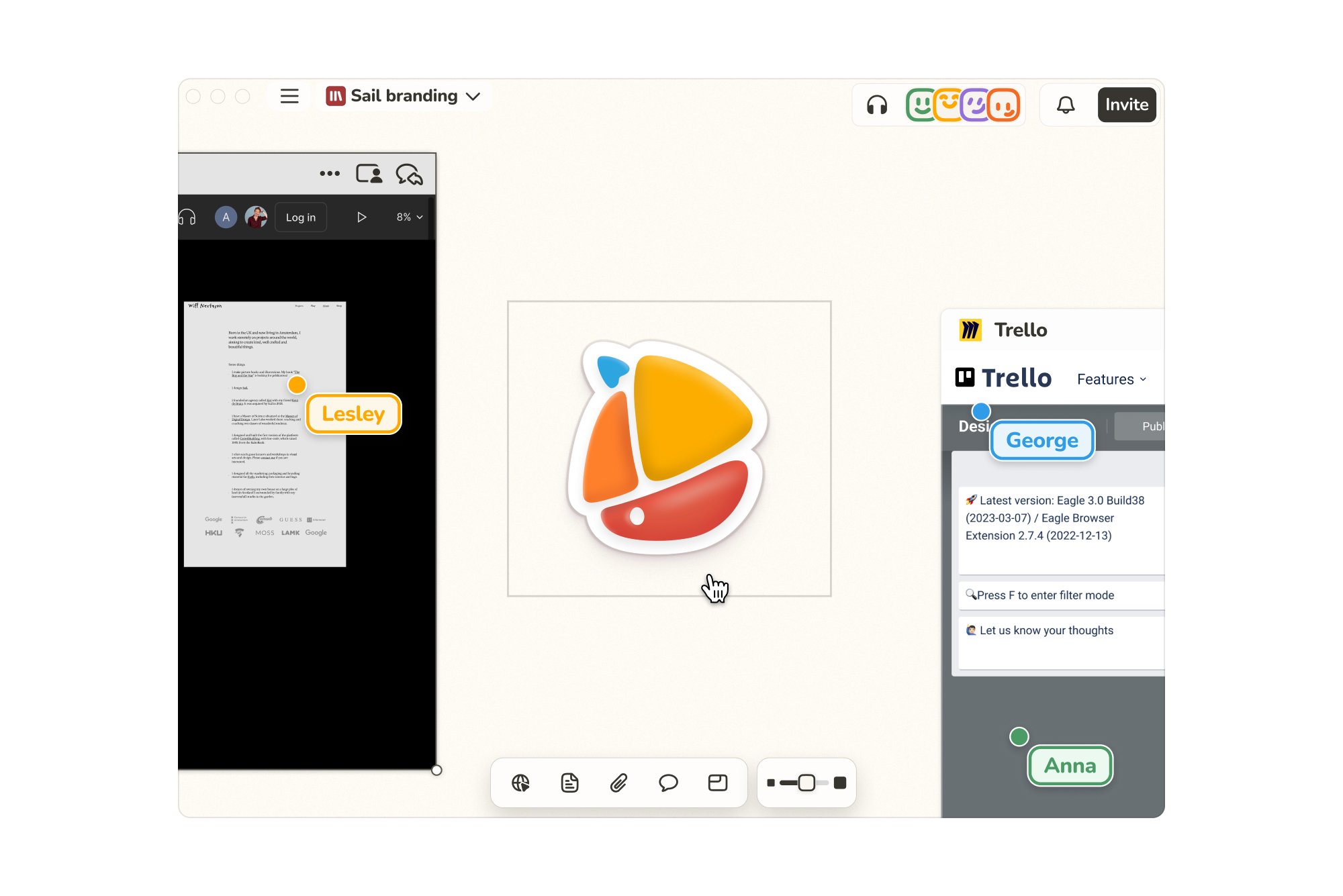
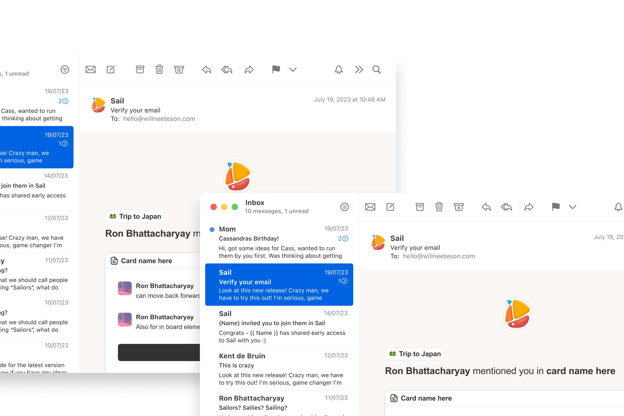
We chose Chromium to bring full browser capabilities to Sail, a significant undertaking. This decision allowed us to fully leverage web technologies.
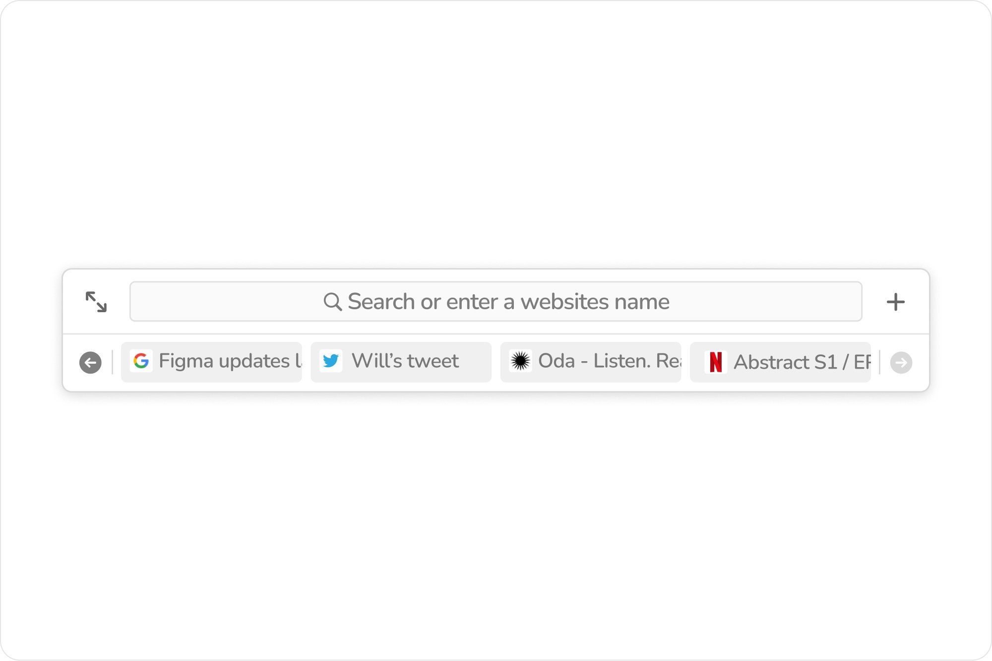
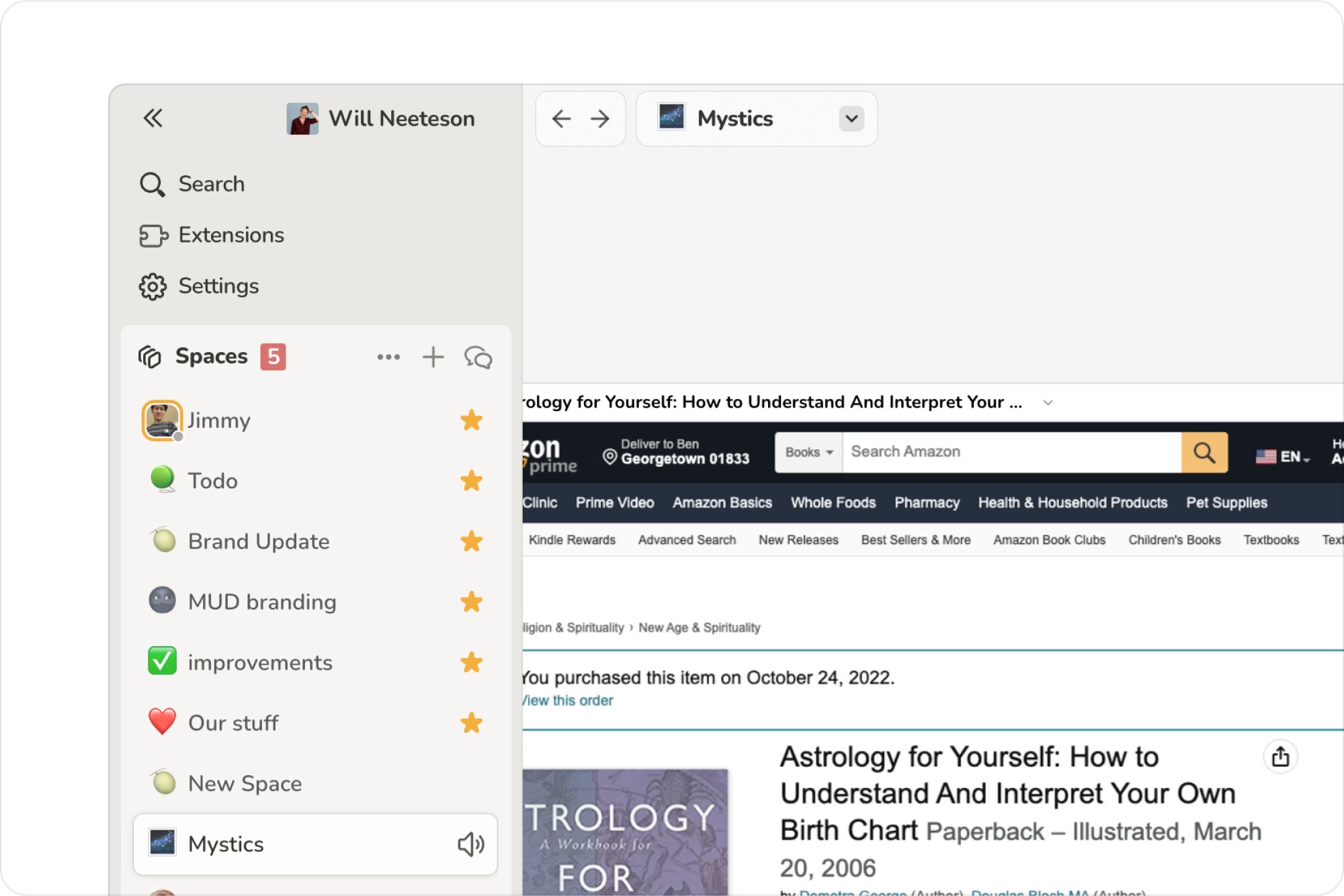
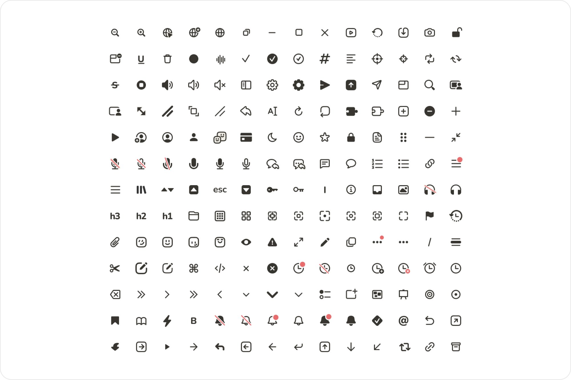
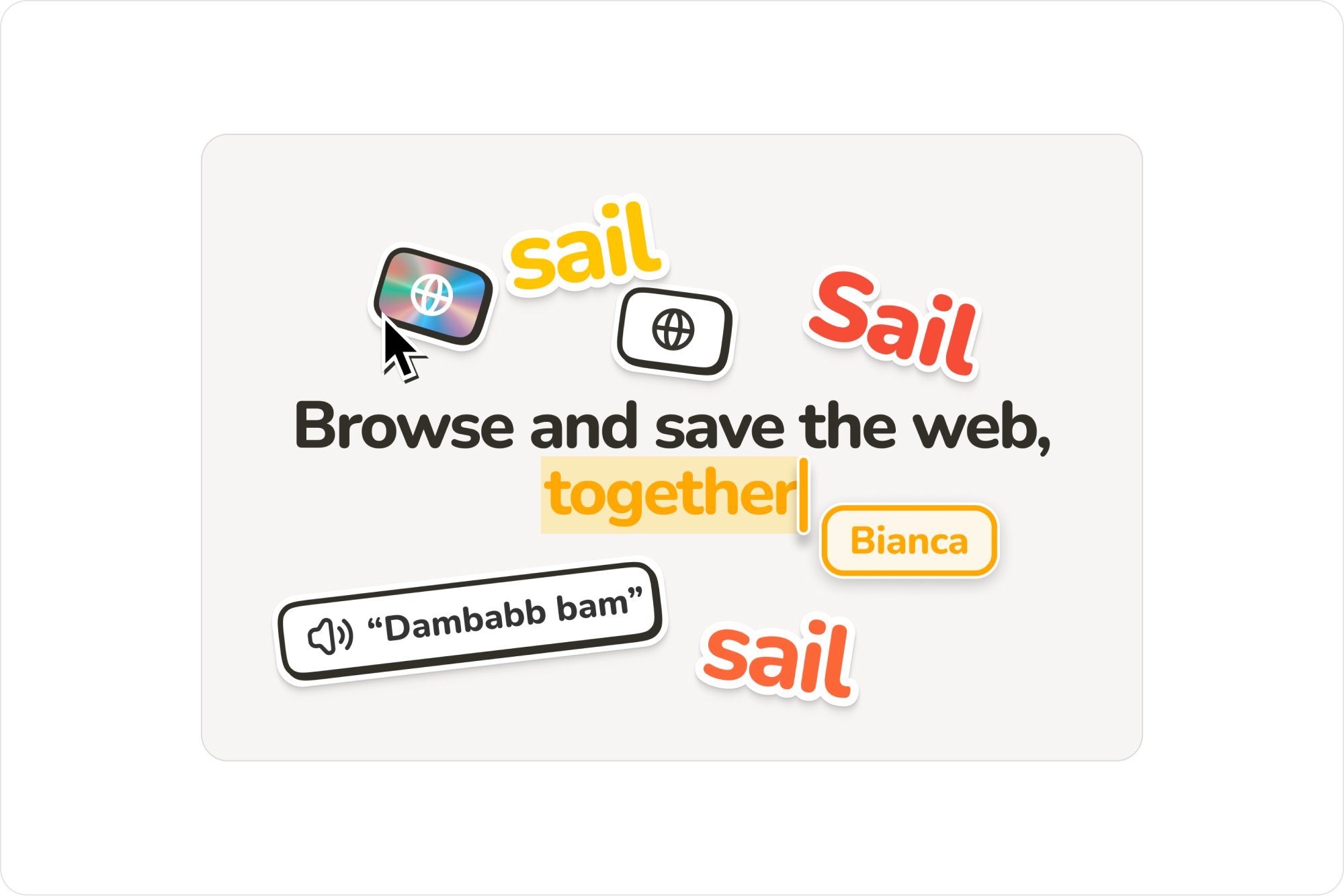
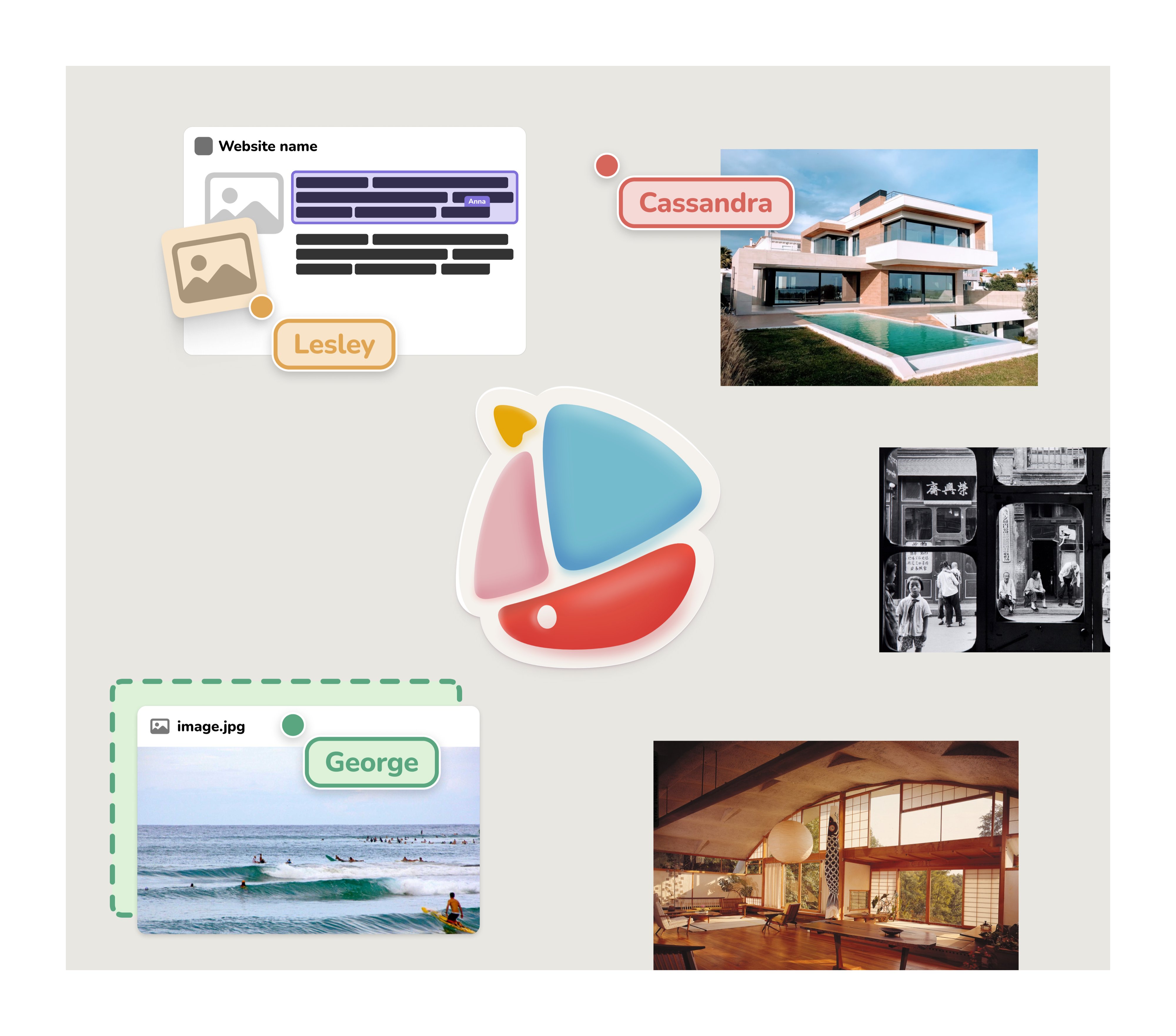
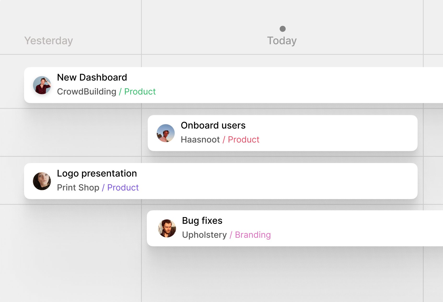
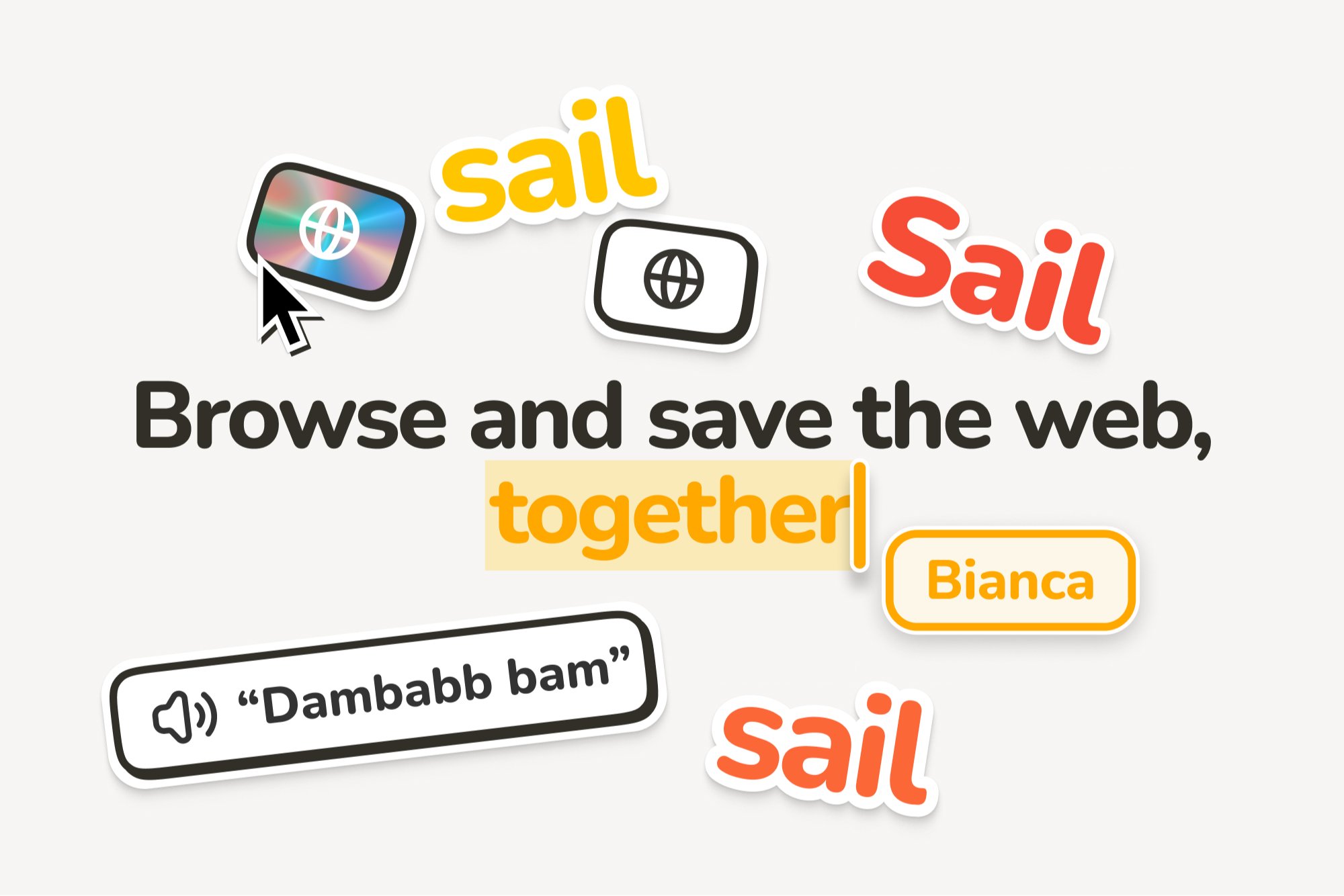
I created a minimal, content-focused design, experimenting with colour schemes, shadows, and gradients to balance playfulness with professionalism. The result was a tactile, user-friendly interface that differentiated Sail from its competitors. I also designed a custom icon set, featuring hundreds of playful yet clear icons, to align with the brand’s visual identity.
I worked closely with the founders at every stage, leading the prototyping of new features, refining the user experience, and ensuring design consistency across the entire product. My contributions were instrumental in shaping the product’s vision and directly impacted Sail’s successful raise of over six million dollars.
Finding the metaphor
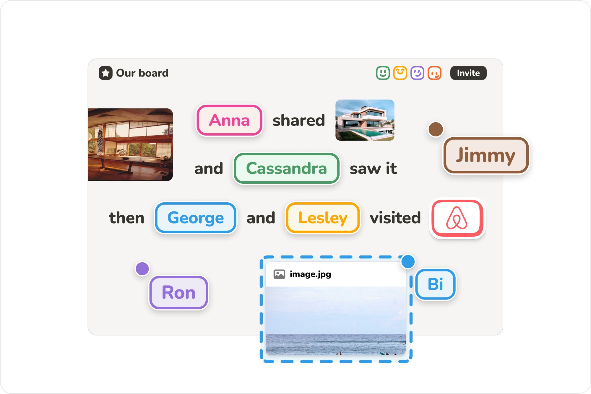
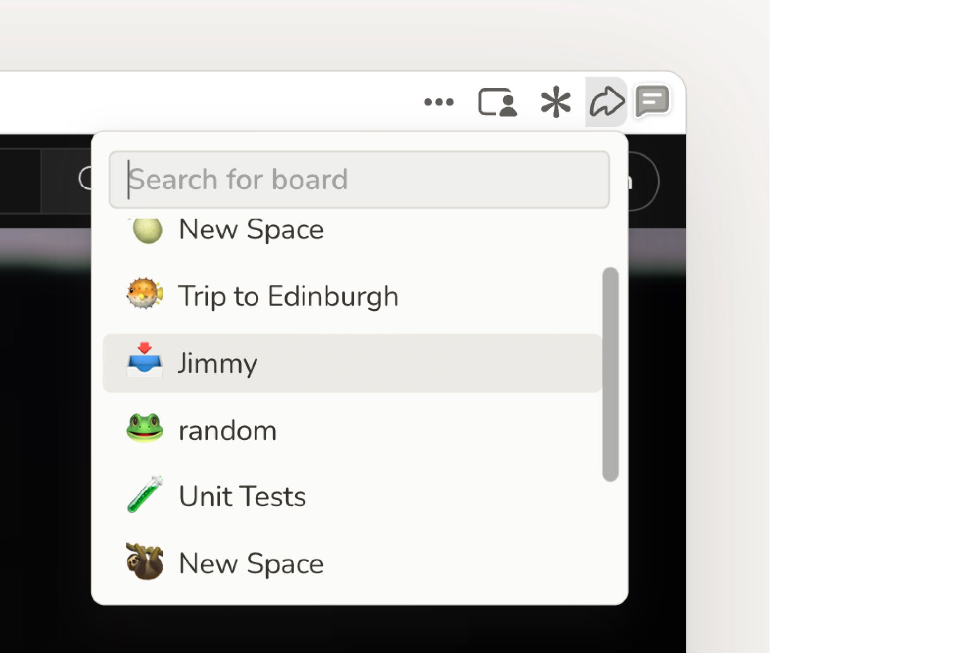
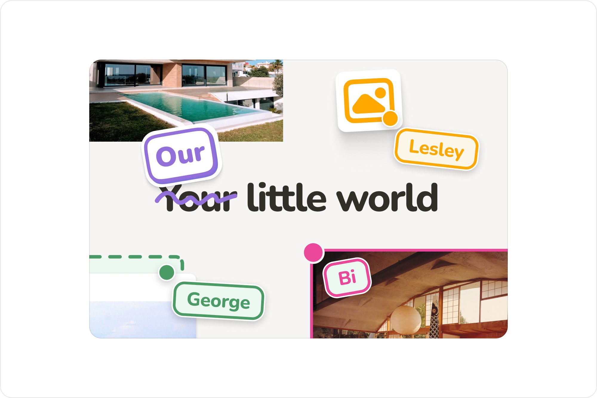
We explored various concepts, such as a collaborative browser, before settling on the “shared table” as the central metaphor for the platform. This approach allowed users to visually collect and collaborate on websites within a shared space at the same time.
The interface was designed entirely around this concept to enhance the collaborative experience, creating a tactile, user-friendly interface that differentiated Sail from its competitors.
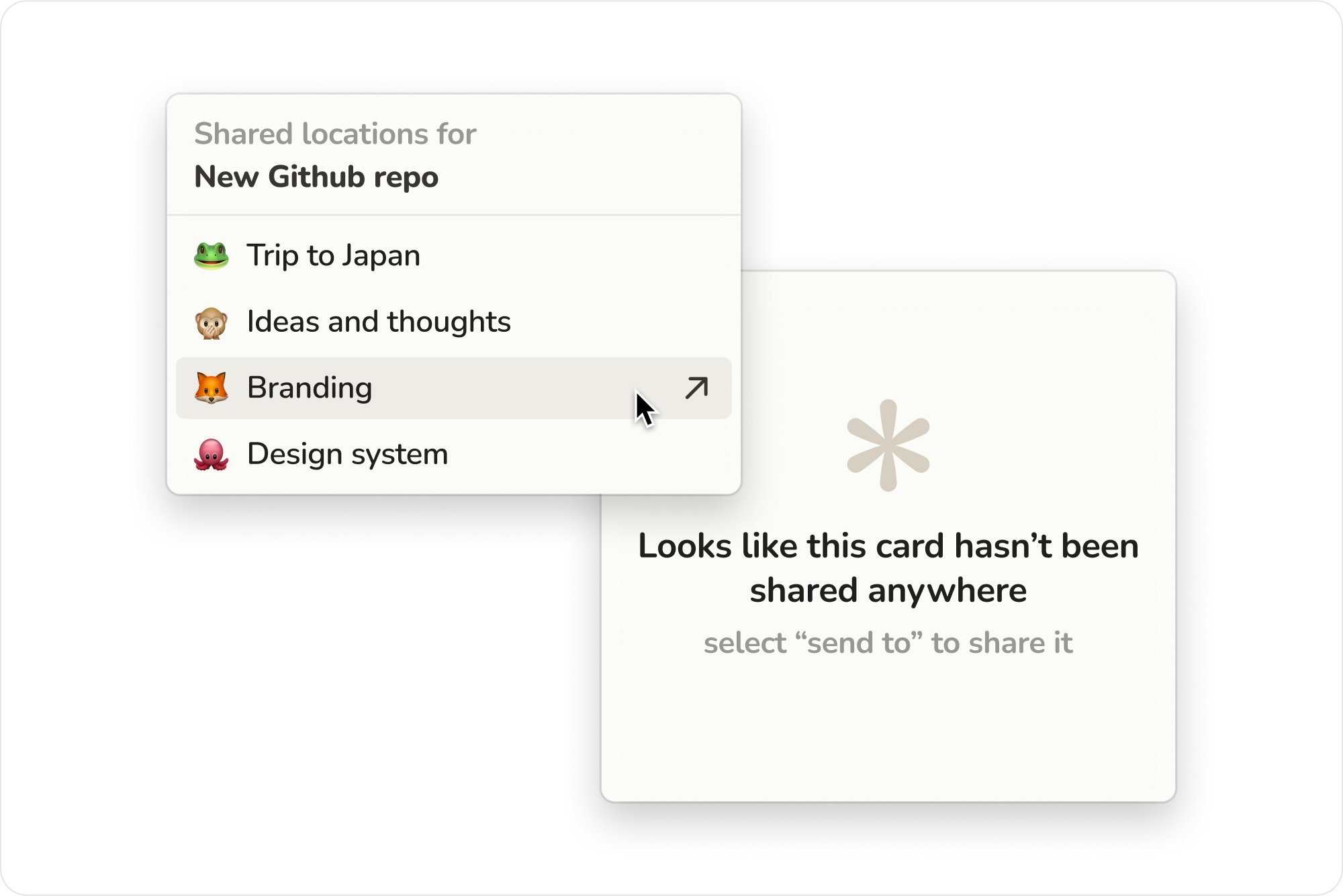
Sail’s core idea was deceptively simple: a shared space for users to collaborate on online resources. However, standing out in a crowded market posed a challenge.