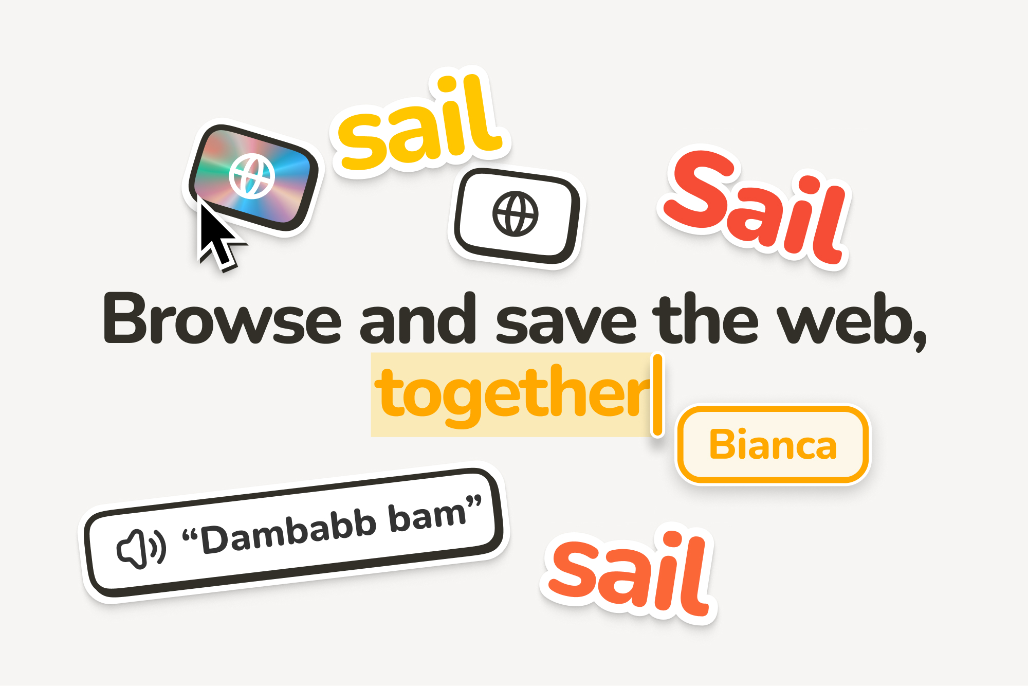
“Sail, don’t surf”, a riff on the original 'surf the web' phrase, encapsulated many of our aesthetic principles.
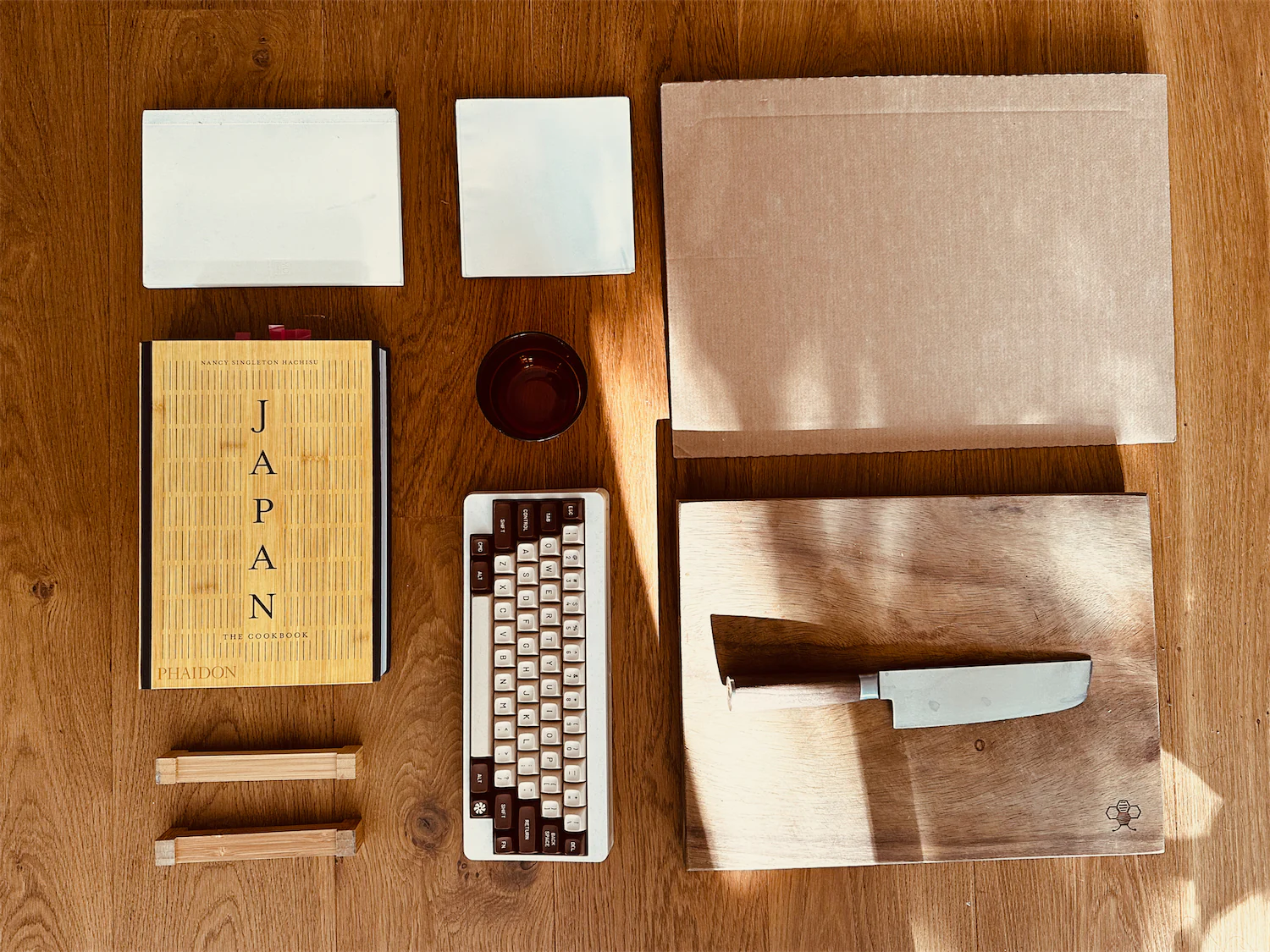
The team and I were cautious about aligning too closely with the notion of a work tool, aiming instead to capture the whimsy and wonder often found on the internet. Yet, Sail was designed for productivity, so steering too far from this focus would counter its intended purpose. Stationery, which beautifully melds playfulness with work, served as a source of inspiration. I was particularly influenced by products like Moleskine and the digital offerings from Andy Works.
The logo continued this theme of playful work. I imagined it as a sticker-like design you might find on a notebook, slightly skeuomorphic, and with a strong, distinctive shape.
I figured out the base shape fairly quickly, with the most nit-picking being on the roundness of the base. The shading, however, took the most time. I tried hundreds of variations, exploring different materials and techniques.
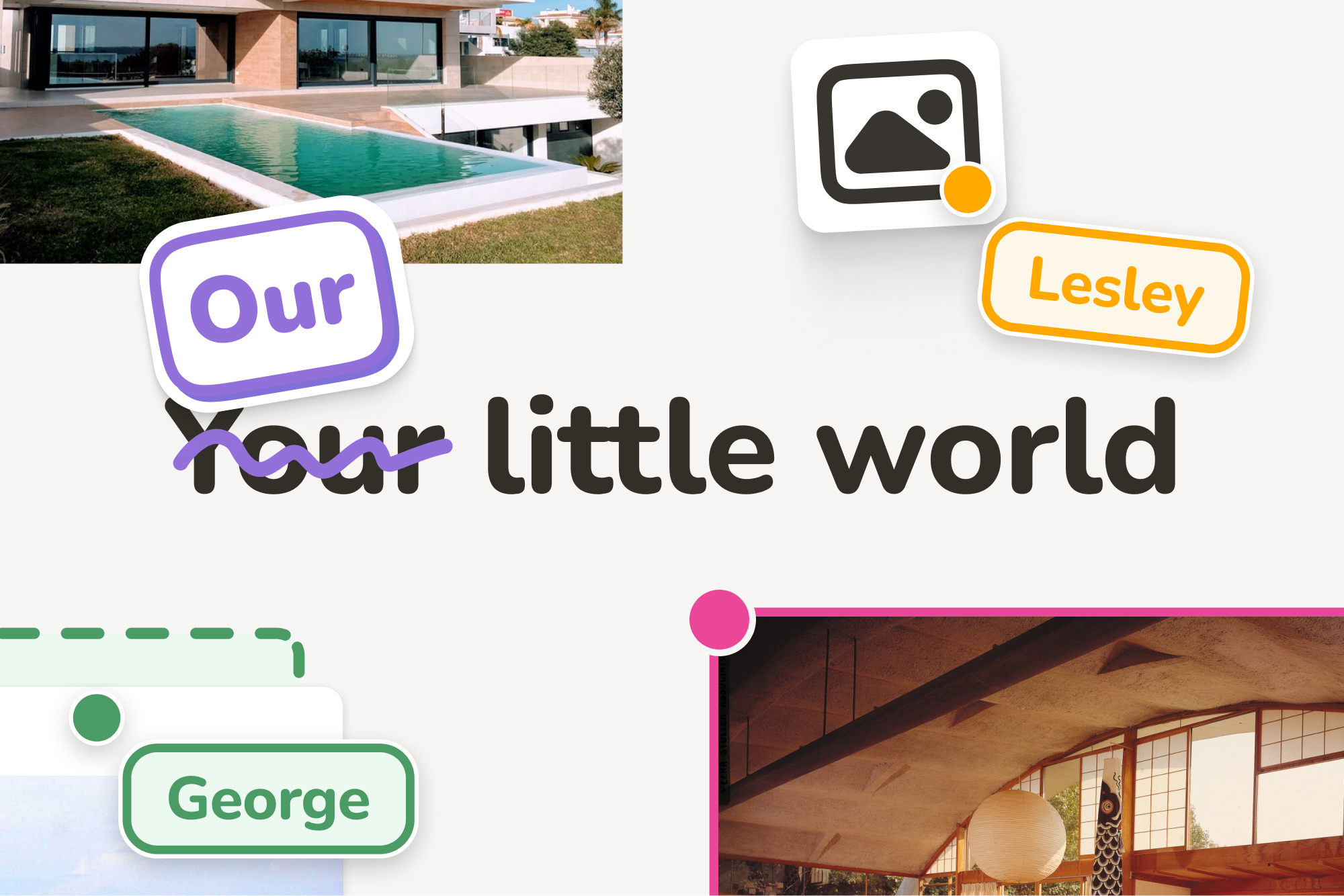
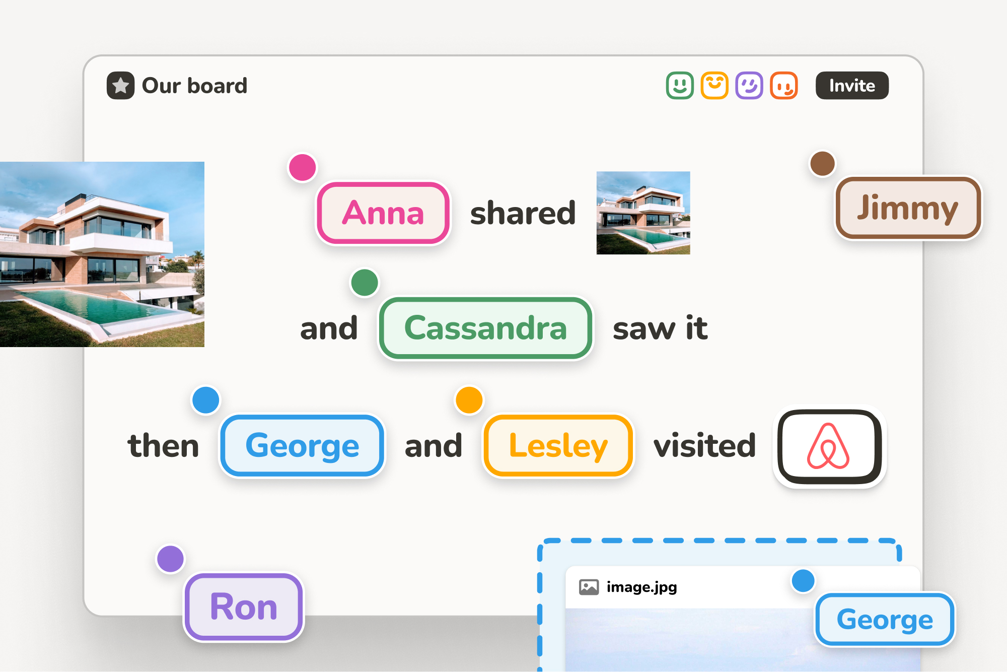
As we were crafting the product, I was continuously trying to understand the people who would be using it. There was a certain beauty in the process of being and working together. Eager to capture these nuances, I wanted to illustrate these little stories. I believed that they could serve a dual purpose: not only as effective marketing material but also as a tool in shaping the features of the product itself. This approach aimed to create a product that truly resonated with its users, not just in function but in spirit.
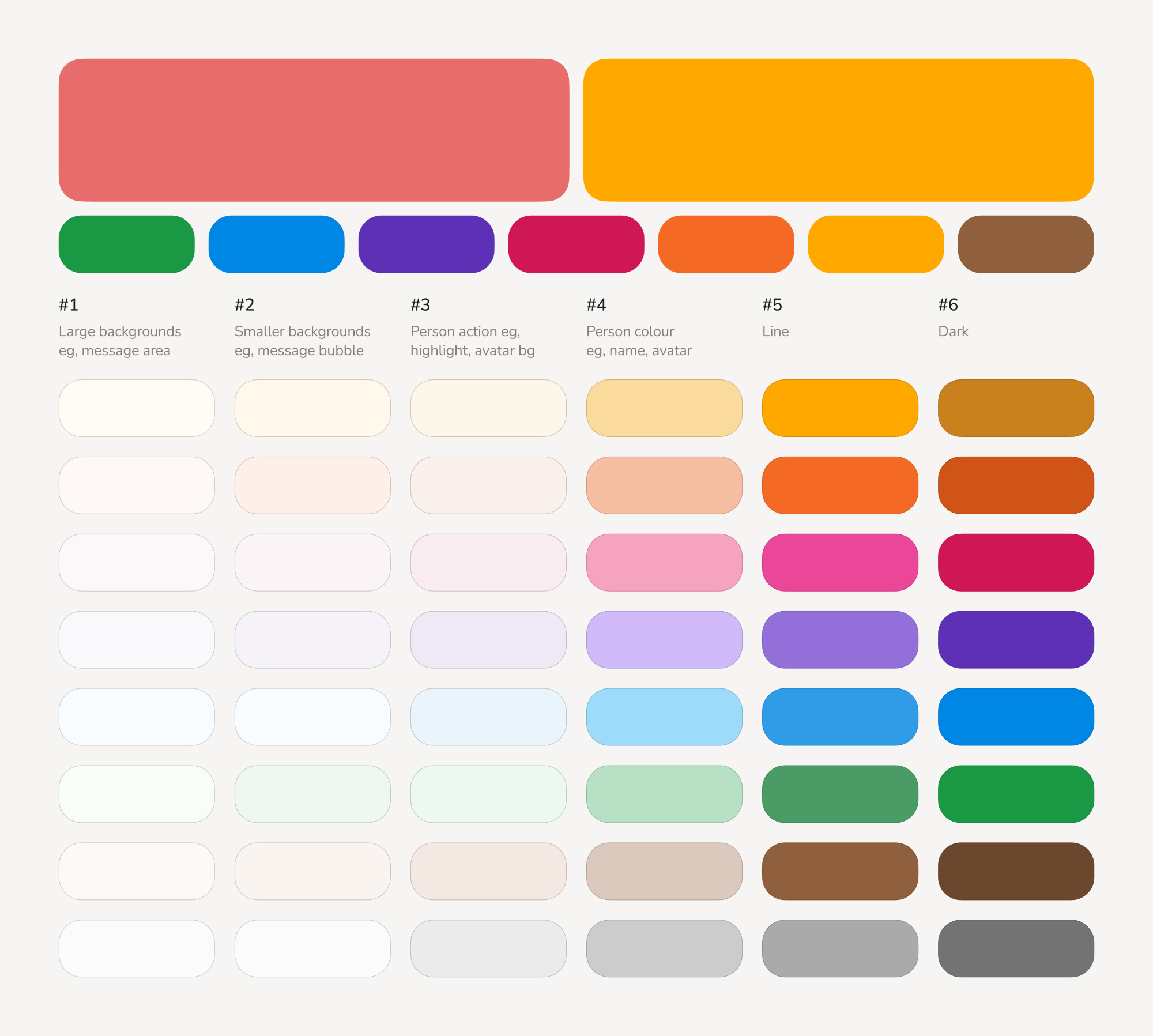
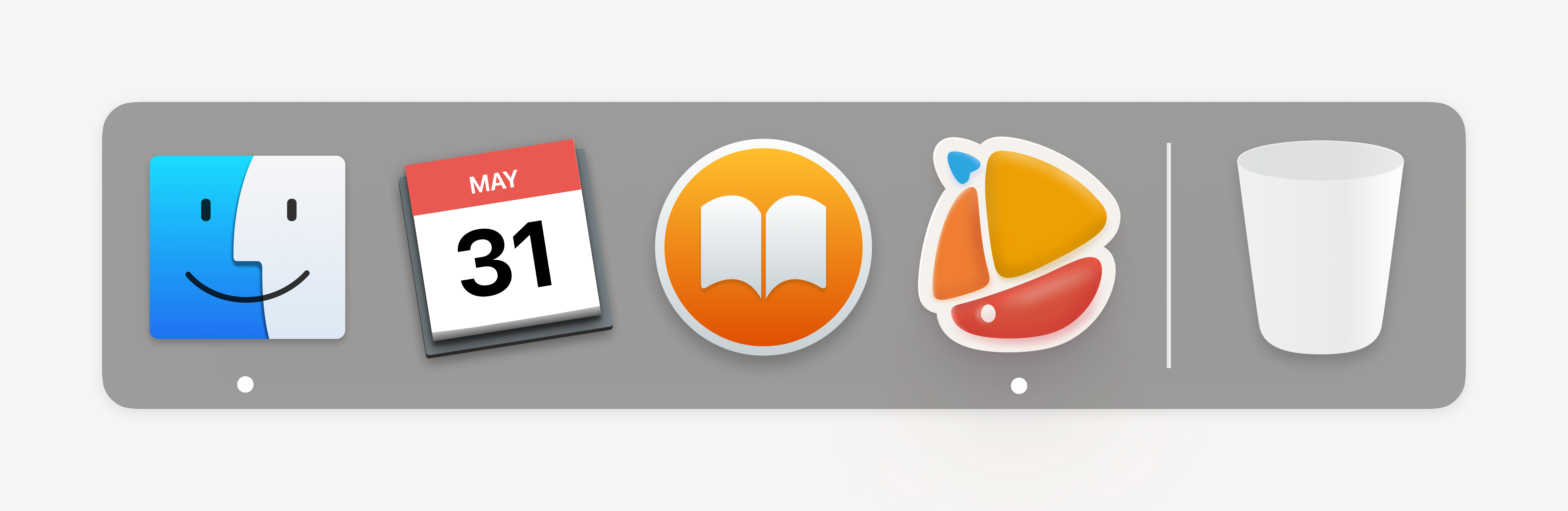
From the outset, knowing we would target multiple operating systems, it was clear that using Apple Symbols was not an option. My exploration of open-source icon libraries didn’t yield satisfactory results, especially since many of our features required custom icons. I decided to create our own icon library. Of course, I underestimated the number needed; by the project's end, I had drawn almost 200 icons.
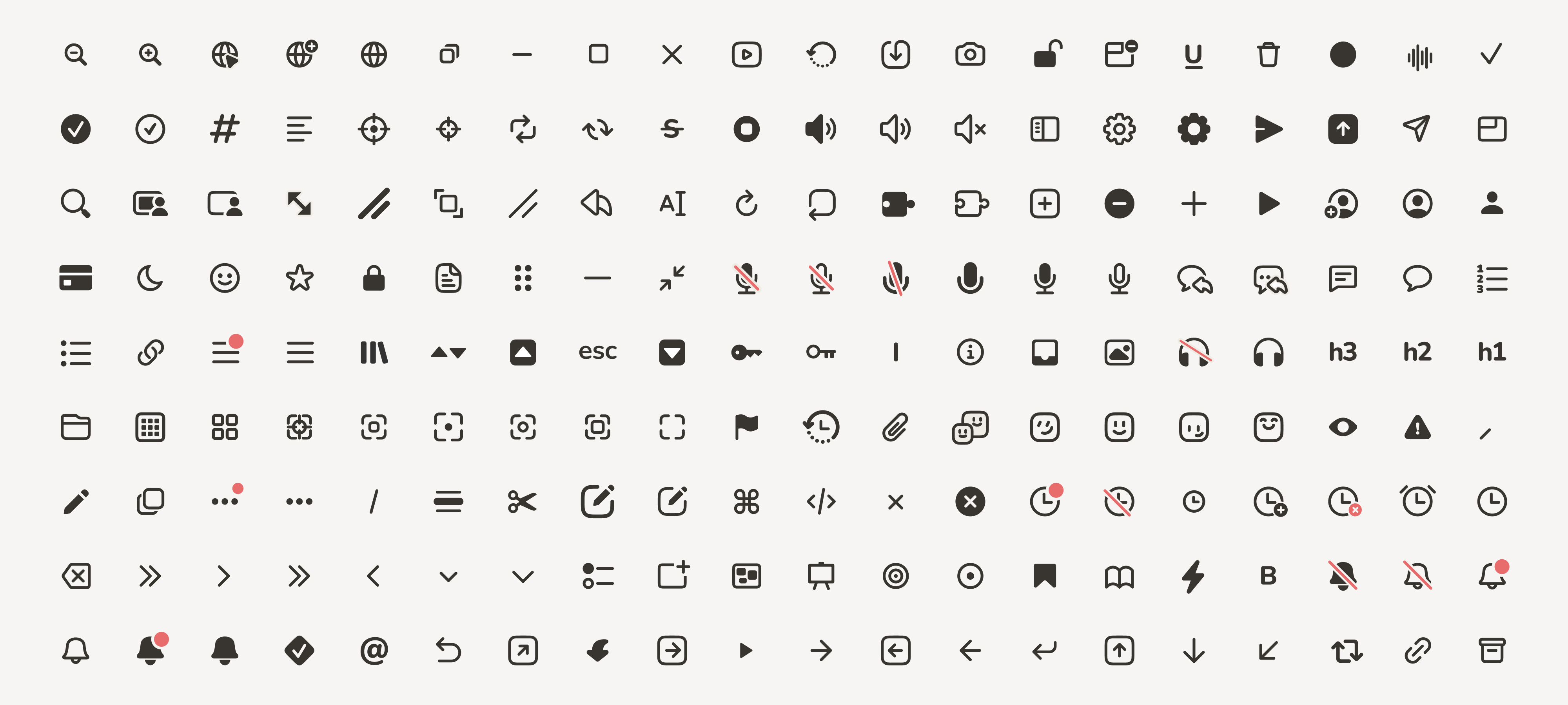
These icons were designed to mirror the playful yet simple aesthetic of Sail. I opted for a style that was mostly line-based, somewhat chunky, and quite rounded, to keep in line with the overall look and feel we were striving for.