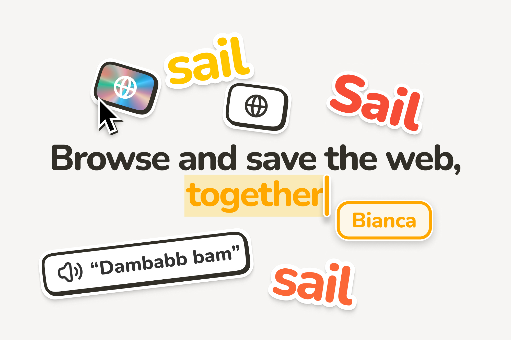
“Sail, don’t surf”, a riff on the original 'surf the web' phrase, encapsulated many of our aesthetic principles.
The team and I were cautious about aligning too closely with the notion of a work tool, aiming instead to capture the whimsy and wonder often found on the internet. Yet, Sail was designed for productivity, so steering too far from this focus would counter its intended purpose. Stationery, which beautifully melds playfulness with work, served as a source of inspiration. I was particularly influenced by products like Moleskine and the digital offerings from Andy Works.
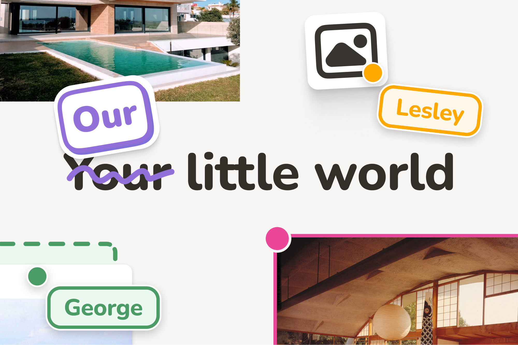
The logo continued this theme of playful work. I imagined it as a sticker-like design you might find on a notebook, slightly skeuomorphic, and with a strong, distinctive shape.
I figured out the base shape fairly quickly, with the most nit-picking being on the roundness of the base. The shading, however, took the most time. I tried hundreds of variations, exploring different materials and techniques.
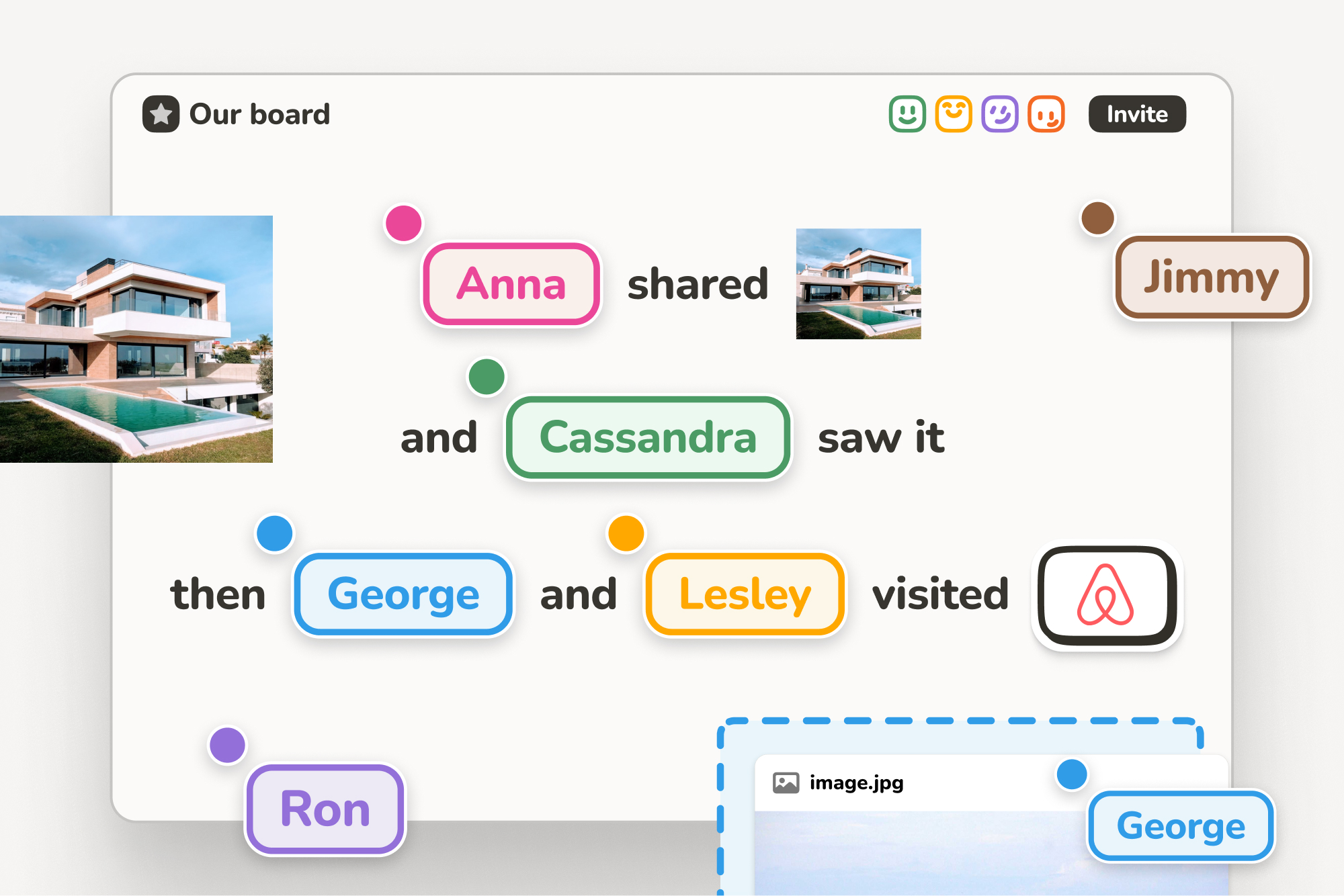
As we were crafting the product, I was continuously trying to understand the people who would be using it. There was a certain beauty in the process of being and working together. Eager to capture these nuances, I wanted to illustrate these little stories. I believed that they could serve a dual purpose: not only as effective marketing material but also as a tool in shaping the features of the product itself. This approach aimed to create a product that truly resonated with its users, not just in function but in spirit.
From the outset, knowing we would target multiple operating systems, it was clear that using Apple Symbols was not an option. My exploration of open-source icon libraries didn’t yield satisfactory results, especially since many of our features required custom icons. I decided to create our own icon library. Of course, I underestimated the number needed; by the project's end, I had drawn almost 200 icons.
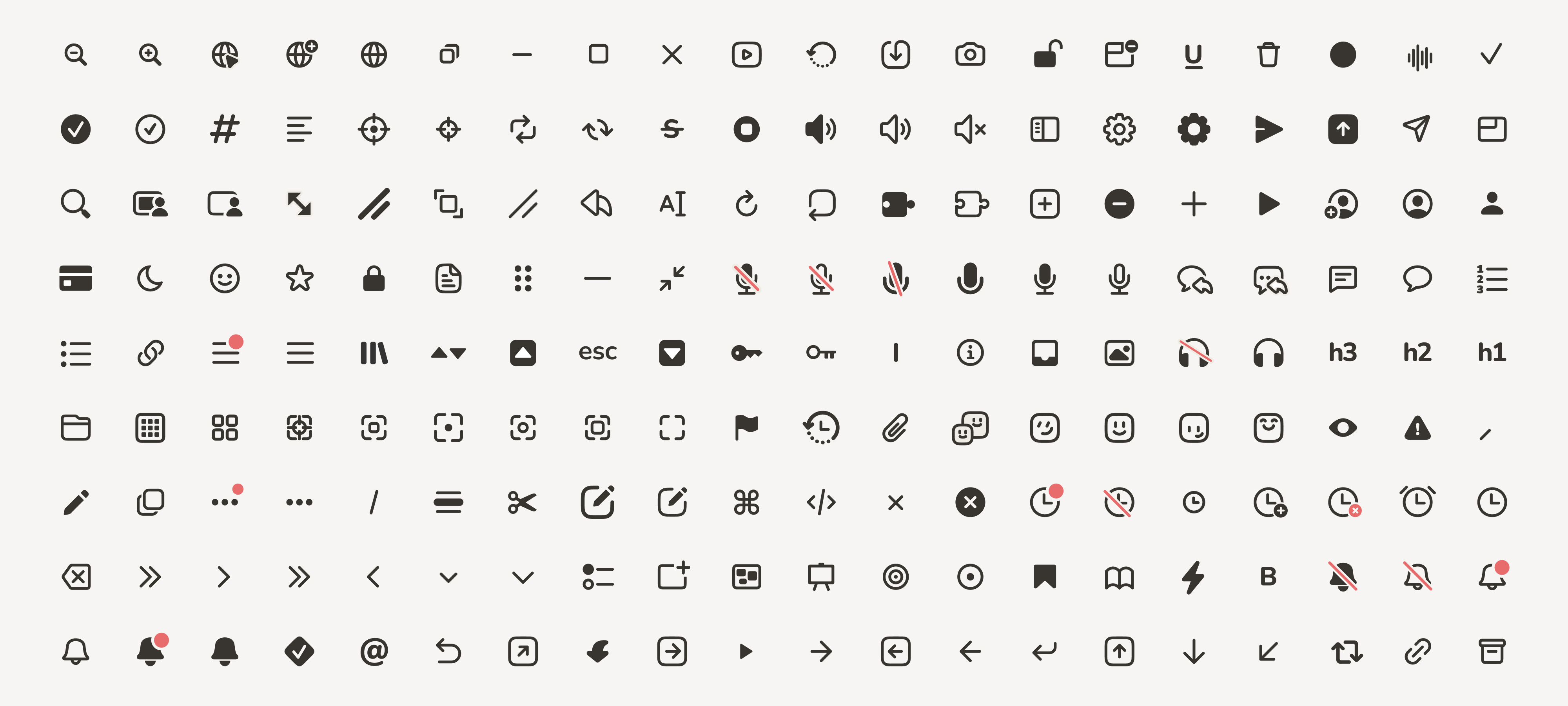
These icons were designed to mirror the playful yet simple aesthetic of Sail. I opted for a style that was mostly line-based, somewhat chunky, and quite rounded, to keep in line with the overall look and feel we were striving for.


I know that I have less to live than I have lived.
I feel like a child who was given a box of chocolates. He enjoys eating it, and when he sees that there is not much left, he starts to eat them with a special taste.


There's something quite special about traveling at night by train. The world is darker, quieter. Things are being tided up and put away. There is a calmness to it all.
I enter the train and flip out the little laptop tray, hoping that this one doesn't have food or old gum attached. The carriage is empty and the light flickers gently. This feeling of going from one place to another reminds me of a lecture I had a few years ago on liminal space.
"To be on the threshold of something new, but not quite there yet. The physical space between one destination and the next".
A sense of nostalgia floods the train.
I think of my family, of my place in the world, of where I am and where I'll be. I feel bittersweet and yearn for the past. It's comforting, this space. Watching houses rush past me, the lights representing the stories of those that live there. Briefly my notifications matter less. I can barely make out a flock of birds in the night sky. I pass rivers and trees. I go through tunnels and past stations. My chair rocks gently back and forth with the tracks.
All at once a voice crackles from a nearby speaker tells me where I am, from a face I'll never see. The train screeches to a halt and the doors open. The place from where I was is now where I was going to, and my time in my liminal space ends.

Waking up never used to be this difficult. I had to drag myself out of bed today, Sleep Cycle telling me I had a solid 6 hours of blissful sleep (minus the apparent sleep talking and outside storm). The last couple of days has been a complete contrast from the perfect weather we had a few weeks ago. Never-ending wind, gales and rain. Perfect weather for huddling (retreating?) inside and focusing on the work.
Boil water. Clean pot. Crush beans. Make coffee. Drink.
Today is a polishing day. Lots of small or half finished tasks that have been on my to-do list for a while. Also have to find some time to do my taxes. Taxes, wonderful, wonderful taxes.
Connected some new form fields from the MOSS booking form to Airtable using Integrately. I tried switching to Make (previously Integromat) after their huge (entirely underwhelming) rebranding but was left with more questions than answers and a wasted weekend. I even sat down with a developer friend to go through it. No idea. Integrately, while terribly designed, is a surprisingly fantastic Zapier alternative; at only a fraction of the cost. Took a string of ID’s and was able to easily map it to Airtable’s reference fields.
I have been using Figma to lay out both Stories in Between and The Littlest Things, which has been insanely helpful. Being able to view the content at a meta level, and zoom in on the finer details, helps me understand the flow of the story. I only wish that there was better integration with Lightroom CC and Photoshop, my current workflow of taking screenshots, copying them and pasting them into Figma makes me feel uncomfortable, dirty even. Perhaps a plugin one day?
Will.

For the last 10 years I have been freelancing in practically every discipline of design. Starting in my late teens I would take any work I could find, scrounging for cash and hungry for experience. If the current project was terrible there was always the next one. And the next. While many of these endeavours never really went anywhere, I was building my skillset, intuition and craft. It is only in the last 2/3 years where the projects have started getting bigger that I can reflect on this journey.
For the past year I have been at Sail, working as a product designer on the future of the internet. I started as a contractor, juggling other projects at the side. As my work at Sail progressed I found that my current client projects were slowly and neatly wrapping themselves up. For the first time in my life I was saying no to incoming requests. Opportunities that I would have previously killed for were now trickling in through previous contacts or my online presence (as minimal as it is) and I was DECLINING them. I was spread too thin and didn't have enough time, energy or headspace to do them all.
Then one day I started working full-time at Sail.
As the product and team mature, I find myself reflecting upon my own growth and continued shortcomings. My biggest lesson has been that of focus, or my previous lack of it. It is something I often heard from others, and acknowledged myself, however shrugged off; believing that the energy that I had was best put into as many areas as possible. Much like riding a bike, understanding these principles takes time, a lot of effort and many bumps and bruises. I have found that many learning points of my life have been filled with such moments, where everything suddenly clicks into place as though the secrets of the universe have been unlocked. From learning to read as a child to understanding design principles, there is a sudden "aha" moment where the complexity of the subject fades away and the brain cannot go back to where it was before.
What I have read of focus seems very much aimed at the art of saying no. While this is incredibly valuable, I find it to be only partially true. Committing to the thing you are saying yes too, intensity and wholeheartedly, is equally important, yet just as difficult as saying no. It requires taking the same energy that would have been scattered, and aligning it consciously and precisely. Less fun, less diverse, yet more rewarding. As a project progresses, "no" becomes arguably easier to say. The design language clarifies, code is written, users join, and foundations becomes more secure.
In the future I hope to stay true to this course; to take on a select, curated amount of projects and devote myself to their completion in the highest level of craft, kindness and thoughtfulness that I can.
I reached the end of my notebook today. It is leather-bound with replaceable paper. Since a year ago or so I used only moleskins (or a cheaper variant), and have quite a collection of them sitting on my shelf, holding weird thoughts, ideas and past versions of myself. They date all the way back to my first day of art school where my handwriting was smaller and lines thinner. I found, however, the cover either too hard or too soft and wished for something which I trusted and depended upon, but that could be refilled once full. The creative process is a fragile one. Ideas are delicate and ethereal things, birthed in thought and often too abstract for the spoken word.
I empty and replace the paper. I choose for the dotted kind, hoping for it to give me some kind of guidance, yet refrains from steering me. This moment holds excitement; such promise of what you might create and what could break the newness of the page. Who will I be when these pages are full, and what will have filled them up?

It was a hot night. The type of heat which seeped under your skin and boiled from within. The air hung thick and heavy as rain poured down and smouldered against the thick, metal roof. While the wail of the night siren had been called a couple of hours ago, small blinking dots could be seen scattered around the airport.
Joel lay on his mattress blanketed by a thin sheet and listened to the tapping of the rain. The heat made the wound on his arm ache. It was too dark to see anything, but as he ran his fingers over it he felt a scab forming, tightening the skin around it.
He must have made a sound louder than he intended for a whisper followed, as if in waiting. "Joel, are you awake?". The walls were thin and the voice was soft yet clear. His mouth was dry as he took a breath. "Yeah" he whispered back. "Can't sleep?" "No" the voice replied. Her tone held a hint of worry. Seconds passed and they both lay in silence.
"We shouldn't be here" she finally muttered, breaking the silence. Her words were flat and heavy. He wondered what he could say, but finally concluded that he lacked the words and instead leant closer to the wall.
Due to bureaucracy they now lived in close proximity to the Found, groups of homelessness which now worked on the wall, and awaited further information. The woman behind the counter had apologised profusely, and promised revalidation as soon as possible, but could simply not speed or change the process. He had made sure that they stayed together, even if it meant changing to a worse district. Luckily they were assigned two empty spaces next to each other in the airport area and they had moved both mattresses to be on either side of the wall.
She started coughing.
Life after school had seemed so promising. Emily had been almost immediately recruited to the DAM project and Joel soon applied afterwards. She was one of many spending her days reading through data and creating stress tests for potential breaches, trying to determine where the floods were most likely to occur. Joel took more of an architectural role, making sure that the design for the dam was not only functional but aesthetically pleasing. The days were long, but he enjoyed his work. He was happy then.
And then came Dark Friday. A sudden surge of panic that had been unknowingly brewing for some time erupted. Like a domino effect, situation after situation occurred. Companies went bankrupt, factories shut down, the weather became ever more unpredictable, and the rain burnt.
The coughing worsened.
"Hey, hey, hey, listen to me Emily" he whispered calmly and pushed his head even closer to the wall. "Come on, brea..".
"My inhaler" she wheezed in between coughs. "It's empty".The moment those words left her mouth he darted off his mattress and frantically started searching in the dark. His heartbeat increased. The room was small, barely larger than the bed, and he quickly found what he was looking for, a worn canvas bag which housed a small vile of corse, white powder.
Joel crept up to the door, and leant up closely to the handle.Like many others in the facility he had altered the mechanism so that it wouldn't lock from the inside after dark. With a careful downward motion the door opened. He left through the opening, each step holding a calculated haste. Only the sound of leaking metal and a fit of muffled coughing could be heard.
Emily's door was directly next to his and he pushed softly against it, half hoping she had left it open for him. She hadn't.
"Open up" he hissed.The medicine had started to wear off and the itch had transformed into a burning sensation. He winced, gazed upward and grimaced at one of the many eroded hole in the metal roofing. Rain. It dripped, fell and sizzled as it hit the ground. Outside of his room was lighter, and he could just make out the wound on his arm. Angry, red, raw. He heard movement on the other side.
"Em!" He growled impatiently. There was a small gap under the door, though just too small for the vile.
The handle rotated and the door clicked.
After glancing behind him, Joel slithered inside, taking great care in leaving the door slightly open.
Do not wake the others. The rules were clear.
Once inside he adjusted his tone accordingly. It was getting worse. She was now using twice the powder compared to a year ago. He had always known Emily to have trouble breathing and had never seen her without the inhaler she carried; a small, L-shaped tube that had been battered, scratched and worn. He had offered many times to buy her a new one, even gifting a cleanly designed, handmade model one year, but she had simply smiled and politely declined. This inhaler had kept her alive. This inhaler was hers.
As soon as they were revalidated they would leave the city, there was nothing for them here anymore.

We are getting older and living longer. However an aging population brings a set of perils, regardless of the financial implications and economic impacts. Professors at the Free University Amsterdam (VU) noticed that while we’re getting older, we are also becoming increasingly lonelier. We are so intrinsically connected to technology in our lives, why not use it to our social, human advantage?
Enter Alice, a social robot developed to aid the elderly in their daily routine and achieve a better quality of life. VU professors Johan Horan and Ellie Konijn did the initial ‘in-vitro’ of Alice. Then, Deloitte came on board to take it further. I was able to talk to Franklin Heijnen about working on the project.
Great project, but there are ethical implications with this robot...
Well, that’s why we defined some design criteria. One of which is that it should not eliminate or take anything away from human to human interaction. In fact, it should augment it and make sure that you get more connections, more people-to-people interactions, and that communication between friends and family is stimulated by what Alice does, by connecting to someone close to you who you can connect to.
How far do you think we are at a technological standpoint to Alice, or the next variation of her, actually feeling something or being aware of her existence?
I don’t know if this will happen. There are philosophers who say that consciousness might be part of a robot in the future, but at the moment we are really taking the first steps into having meaningful interactions. To be honest, we are just taking the first steps in her surviving for a couple of hours. Some people say it can be done, that you can feel a connection. For example, I recently got the Google Home and noticed that it sometimes almost feels like talking to someone. “Tell me the news”, “play me this song”. It's amazing how easily you feel connected when you’re talking, which is a different interaction to typing or reading from the screen.
I think other ways of interaction, such as creating eye contact, even if it is animated, also adds to the feeling of a meaningful interaction

So, it’s not so much about imitating, but about projecting a feeling rather than actually doing it?
Yes, although we are actually in the phase of seeing what works. We are taking these baby steps and they are crucial in learning and seeing what is working and what's not working; what is uncanny or what is complex when you interact with this audience.
So far it seems like the participants have been very happy to live with such a robot.
[Laughs] Well, at the moment it's really been just a few hours. The participants might interact with Alice for a day or so, but there's also a lot of frustration, especially when she doesn't understand. There's a documentary of an early version of Alice on Brandpunt, a Dutch news programme. There you see a lot of frustration when she doesn't understand you well or repeats your feedback. Saying that, we have also noticed that the participants are very forgiving.
So, is it more about creating an experience that doesn't break after a while?
Yeah, so that the experience doesn't break and keeps you stimulated. Also, when does she start talking? You don't want her to be chatty all day as that might become boring. Even when you’re having an interesting conversation with a friend you don't talk the entire day. When does she come alive or when does she start a conversation, and on what basis does she do that? Those are questions to be answered.
I think the interesting design principle is to design for positivity, in which you really use designs to improve the lives of your users.

How do you feel about the future of this AI in designing for a better future?
In general, AI interaction, such as talking to your car and to your appliances, will be more dominant than screens. I think that design could and should play a role in making people’s lives better. For example, designers are now using e-commerce to sell more and to make interactions easier and to facilitate interaction. But I think the interesting design principle is to design for positivity, in which you really use designs to improve the lives of your users, to create more meaningful interactions, to learn things, to have better health. I think this is where design can play a part.
Even commercial organisations are looking at these principles. For example, not only how can I sell more insurance packages but how can I make my clients healthier, or how can I help them eat better. More and more of these questions will be part of the process when creating tools, apps, designs, chats, etc. Brands are looking at how they can play a role in society and improve people's lives while being a brand that is sustainable.
It sounds like this future technology is definitely making the future of technology more humane.
Absolutely, I think this is making technology more humane. One of the biggest challenges is not only making sure that people become empathetic to the robot, but, perhaps more importantly, making sure that the robot is empathetic towards them. So that it reacts to the tone of your voice, sees when you're sad, knows when you need to go outside to meet your neighbour. The technology should work like a platform, so that it knows that two doors away from you there is someone who is also lonely. This might be a robot, a voice interaction, so that Google Home knows and just tells you to go outside.
Design for positivity is definitely something that is part of making technology useful but also using technology to create a better world.

Her is 2013 film directed by Spike Jonze staring Joaquin Phoenix as Theodore, a man tasked with writing meaningful and emotion letters to other people. The story is a moving tale of a Theodore’s evolving relationship with an ever growing artificial intelligence. Throughout the film there is strong references towards the Singularity theory.
However, I would like to focus upon the films aesthetics and world and how it can inspire designers.
I was personally very moved by this film when I first saw it.
Her was one of the first Sci-fi films which depicted a future I could imagine myself living in. Its world felt approachable, humane and gentle with the furniture taking almost 60’s feel, very different from the harsh and cold bleakness of Minority Reports or Blade Runner. In Her’s world, technology melts and morphs into the everyday life rather than standing out. Screens are fairly absent and everything works in the background, quiet, capable and low key. Devices are smart yet ambient and unobtrusive.
“There are a number of films that cover that very well so we didn’t need to go there. This is a pleasant, soft future where everything is designed to everybody’s personal taste.” – Barrett on the films world
Design and technology often flow at the footsteps of science fiction. I believe that by sending this film back to 1994, designers and engineers alike can be inspired by another type of future design, calm design. The future doesn’t have to consist entirely of green UI’s, flashing lights and deadly robots.
Lesson one. Good design is as little as possible.
The nineties are iconic for bright colours, bold typography and funky product design. Design follows trends, technology and a natural progression of inspiration and culture. In the 1980’s, Dieter Rams created a list 10 of principles he believed formed good design. The tenth principle, good design is as little as possible, could question and counter some of the more questionable design decisions, such as trolls or the old MacBooks, that could have benefited from use, or at least inspiration, of these principles.
Lesson two. Design for wellbeing.
In 1994 mobile phones were chunky, bulky and, in general, ugly. The progression to the modern day smart phones seems almost inevitable, but as the novelty and newness of the smartphone wears off, the screen is slowly fading away. People are become more and more aware of their own digital wellbeing and how the modern day smart phone, while incredibly powerful and useful, is perhaps not best for human beings.
Ambient information and design is becoming more popular and more accessible. Phone companies are even including wellbeing apps and system integrations for their devices, such as iOS’ “Screen time” and Androids Pie “Digital Wellbeing”, limiting, tracking and helping users find balance between their own screen time while informing them of their own habits.
https://gizmodo.com/an-interview-with-geoff-mcfetridge-on-the-interfaces-fr-1526237090
https://mashable.com/2014/01/15/her-singularity/?europe=true#6LQhlrmQ7ZqM

How many smart devices have you interacted with today? Whether you woke up to your smartphones alarm, checked into the train using the digital gates or visited your daily websites chances are you used a digital device. These devices have become so intertwined and ingrained within our culture and society that we do not question their place, yet only a fraction of our society knows how their invisible, code-based language works.
I myself am not a coder. Before I starting at my Masters, I had dipped my toes in the various languages, but they scared and confused me so I never fully immersed myself. However after various workshops, experiments and teaching, I could see a certain logic which transcended the screen and formed the framework holding together the fabrics of the digital world. While I will never posses the mind of a developer, I believe that it is vital for a designer to at least understand the work involved in writing code and what is possible, instead of simply passing a finished design and expecting to see it built. An architect must have some comprehension of structural intensity and material knowledge in order to design good, solid buildings that not only are aesthetically pleasing but also push the boundaries of what is possible.
We live in a digital world, surrounded by technology and devices. How can we design for a world we do not comprehend or understand?
The last couple of years has seen a drive behind making coding more accessible to the average person by making it fun, interesting and approachable.
In the UK, for example, the BBC has been involved in the Microbit Project which involves teaching code to children using simple draggable blocks. Apples iPad has an app called “Playground” which consists of various lessons teaching the Swift language in small interactive puzzles.
“Computational thinking teaches you how to tackle large problems by breaking them down into a sequence of smaller, more manageable problems.” – Dan Crow, CTO of SongKick
Lesson 1 - Design code for people, code for designers.
Even in the current form of coding, there is much to be desired.
The spoken language is elastic and dynamic, meanings can interpreted and words can be played, formed and morphed. As a novice, code lacks this fluidity and forgiving nature. Syntax errors are a frequent teeth gritting result of my experimentation and learnings.
To bridge the gap between the world of coding and that of traditional design, I would like to inspire designers and developers of 1994 to play, learn and build new tools together that intuitively empower non-coders.
Lesson 2 - Pixels are dead, code as a tool.
We are nearing the beginning of the end of screen first based design. Technology has advanced to the point of not always needing a screen. The gleaming canvas of pixels, sleek visual interfaces and prodding fingers is now not the only thing that needs a designers attention. Haptics feedback, voice control, ambient technology and more are no longer second class citizens to a designer.
I would like to teach the 1994 designer to not always design for the screen and to do so designers need to create prototypes unlike the classic web or app based brethren. How would a 1994 digital designer start designing the latest version of Apples HomePod or Googles Home device?
https://www.coderevkids.com/why.php
https://envato.com/blog/teaching-kids-code-important/
https://www.idtech.com/blog/5-reasons-your-child-should-learn-to-code
https://skillcrush.com/2017/01/30/learn-to-code-benefits/
https://inkbotdesign.com/zero-ui/

*With this artefact I am cheating slightly as the artefact itself will not be launched until 2020. However, due to my own fascination of the subject, I think it is worth the risk.*
Cancer Breakthroughs 2020 (previously known as the Moonshot Project) aims to help cure the collective group of cancer by improving the sharing of information between various hospitals, research centres, biotech companies and conducting several clinical trials in the field of immunotherapy, with as many as 20,000 patients. These trials are intended to later be followed by larger trials.
The project was first mentioned in January 2015 during a speech which Vice President Biden made in the Rose Garden, triggered by the death of Bidens’ son to cancer. On January 12, 2016 during his State of the Union Address, President Obama officially announced the goal stating “Let’s make America the country that cures cancer once and for all”.
“Significant breakthroughs in molecular science, supercomputing technology, and a willingness across the entire healthcare continuum to change the paradigm for cancer care.”
The goal of the Cancer Breakthroughs 2020 project - Facebook page
The word cancer does not refer to only one disease but a collection of more than a hundred different diseases, each with their own wide-ranging characteristics, risk factors, causes and treatments. What works on one patient does not necessary work on another. Every sixth death in the world is due to some form of cancer, making it the second leading cause of death.
**Lesson 1 - Follow the money, stay sceptical.
**It is easy to overlook any negative associations with such a noble and just cause, but with over a billion dollars going towards this project, from both private and public funding, one must ask what are the implications of this funding? Where does the private money come from and for what reason?
It is unfortunate that one must take such a sceptical view upon such project whose goal is focused upon good, but bad actors appear in the best of places, and it would be naive to assume that there would not be people hoping to benefit from such a scheme.
**Lesson 2 - Fight the disease. Together.
**Even before Nixons “war on cancer” cancer has been, rightfully, viewed as a threat to humankind. However, the data and information that individual hospitals and research clinics have gathered has in the past been notoriously difficult to assess and share. If this wealth of information could have been assessable earlier, further breakthroughs and advancements could have been made. Every life saved is one less broken family.

In 2000 George W. Bush ran against then vice-president Al Gore in the closest presidential elections since 1876. After an incredibly competitive period, the eventual outcome rested upon the state of Florida who’s votes were deemed “too close to call”. Bush led the election-night vote count in Florida by 1,784 votes and became the 43rd President of the United States.
Although the President of the United States doesn’t have almighty power, they are still a massive global influence and arguably, holds one of the most powerful positions in the world. By tracing the most significant events to its smallest denominator, a single piece of paper became the catalyst of a domino effect of decisions.
This piece of paper was the Florida Palm Beach Country ballot sheet designed by Theresa LePore. The ballot, named the butterfly ballot, has a somewhat confusing design and odd alignment of the various items. The punch holes run down the centre of the page with arrows connecting the candidate's name to that of the corresponding punch hole on both sides. This design lead around 4000 people mistakenly punching the second hole believing that they had chosen the second candidate and more than 19,000 people accidentally punching more than one hole.

"...most confusion probably resulted from a misalignment of the row and punch-hole lines. This conclusion is supported by the improbable number of votes for Patrick Buchanan...as well as the number of double votes that occurred for candidates that were adjacent on the ballot." – Universal Principles of Design.
I do not believe that this was a calculated move on the designers' behalf and is an unexpected case of bad, untested design. From what I have found on Theresa LePore her reasoning for the design were entirely just. To improve visibility she increased the letter size causing the information to need two pages.
“Palm Beach County has a lot of elderly voters. I was trying to make the ballot so that it would be easier for the voters to read, which is why we went to the two-page, now known as the butterfly ballot.” – 2007 Theresa LePore.
Design can be a powerful tool for communication and understanding. Theresa LePore failed to communicate how to use her design which led to thousands of spoilt votes. Voting is one of the most powerful forms of freedom of speech, if the method voting becomes too confusing, that freedom no longer exists.
The user of the butterfly ballot had a very different need and view than that of the designer. The designer was interested in each of the ten candidates and how they could be divided in the most logical and clearest way while confronted by the limitations of the method and machines that would punch holes in the paper. The voter was interested in casting their vote for one candidate and didn’t care for the others. They would scan the paper, find the name of their chosen candidate and punch the hole. This problem could have been avoided by simple user testing.

Those following the adventures of the Useless Machine project will know of our quest against utilitarianism: design often takes a formulated approach and steps away from its artistic roots. We decided to form a small rebellion against the powers at be, yet, after writing our last post the three of us suddenly felt very lost.
There were so many directions to explore and pools of information to dive into, we needed to understand the essence of what we were doing. So, we took a step back to view our thoughts at a distance and remember why we started this project in the first place. We regrouped in the meeting room and mapped the bits of data from within our brain on to the large whiteboards.
Us three stooges have been driven by the idea of the value of instilling life into an artefact, and are fascinated by our species’ ability to form emotional bonds with emotionless objects. What urges us to connect to our surroundings so much - even when it’s about lifeless things? We wondered if, by replicating this attachment within objects that we created, it would result in a form of value for the user.
You do not simply throw your grandparent away for being less physically functional as they previously were.
Mission: Activate Emotional Controls
Take, for example, your smart device: on good days, it simply works. The majority of us do not know how, nor does it concern us. It works in the background as we go about our day-to-day lives, quietly working its magic. That is, up until something unexpected happens and the device fails, resulting in a frustrated and annoyed user. Despite our strong bond, we discard of our dear objects with a disturbing ease once they stop serving us. You do not simply throw your grandparent away for being less physically functional as they previously were (or at least we hope you don’t…). You love them despite their flaws. Yet, with our objects, we lose a sense of understanding and, in the process, empathy.

Now imagine if instead of making you a nice warm cup of coffee, your barista machine would spit, drizzle and spurt the brown, caffeine based liquid everywhere but in your cup. Stressful, right? But what if it apologizes sincerely afterwards? How would you feel and how would your relationship with that object change? Here lies the essence of our quest, the search to find emotional worth in objects and devices that have no perceived functionality.
We realised that an artefact that fails to complete its task is deemed worthless. However, when said artefact struggles and its trying nature becomes visible, we feel a sense of empathy. With the result being very much the same, we instil value within the struggle and therefore a sense of worth.
Operation: User Recce
To gain further insights into our questions and queries, we dived into the world of user research. We first created a series of cards, depicting different machines and robots, ranging from abstract metal boxes to almost human-like androids. We also collected several short clips depicting interactions between humans and machines. We showed these to the participants and asked them a range of questions, trying to gauge their opinion on which type of machines and robots were the most pleasing, or least disconcerting, to the participant - in other words, to which equipment they connected the most.

The data pointed to the participants not forming an empathetic connection with a machine that was too robotic whilst feeling a sense of discomfort with anything too human-like. The sweet spot is an object showing human-like behaviour, exaggerating upon our movements and expressions, while looking noticeably different from us.
People are not perfect, therefore neither should our machines be.
Take for example Wall-E - the main character in Pixar’s animation film by the same name. Even though his (and notice that we assign this robot a gender) appearance is very different than that of ours, his actions, movements, and expressions are all exaggerated variations of human behaviour, almost childlike. We trust and like Wall-E and want him to succeed. His defects are charming and add life and character to the machine. People are not perfect, therefore neither should our machines be.
And just like that we leave you with a cliffhanger. We’re equipped and armed now. The rebellion is near.


A two part series documenting the process of designers Jolijn Friederichs, Rowan Verbraak and Will Neeteson.
In contrast to the corporate and serious projects that fill our day-to-day life, we needed a project that was more playful and open. Something that tickles our sense of humour and fills us with joy. Our inner rebel wanted to design against the status quo. That idea quickly turned into a stance against solutionism or, in other words, designing for uselessness.
The more we encounter this status quo the more rebellious we become. To us, irony is a strong medium to challenge beliefs and crack their foundation. Humour and surprise tend to make an audience more accepting of other perspectives and create a more critical attitude. A Useless Machine is an object that is designed to be fun, critical and, obviously, ironic.
Our heads were full of ideas and directions, so we decided to put all of these on a whiteboard and see where this could take us. Interestingly enough, our writings and scribbles caught people’s attention and they provided us with more inspiration and got the useless discourse going.
One of the directions that stood out was that of disobedience, i.e., in the context of everyday functional products behaving in completely unexpected ways and how that could embody in a personality. For example, the chair that flees when you approach it, or the laddering Alexa that keeps on asking why, why, why, why...

In order not to dwell in this phase, we decided to go and buy different pre-existing products so we could hack them, and play with their functions. We wanted to start experimenting with the idea of bringing an object to life and what kind of personality it could get. It turns out, that this process is very fluid and things fell into place very easily.
The abundance of materials available allowed us to play around and get our creative juices flowing until we ended up with Expedition Kill All Planets (EKAP): a collection of objects that unexpectedly collaborate in destroying the environment, with a specific aesthetic in mind. You thought your documentation was unique? Well we made a stop motion video of EKAP and we had the most fun.
We argue that a designer should occasionally rebel, be weird, have fun, and play. Already back in 1938, Johan Huizinga described us as ‘the Homo Ludens’: we as human beings intrinsically need playfulness. According to him, this is a crucial element to the forming and development of culture..
In our solutionist society, play is sometimes undervalued and often frowned upon. Everything tends to exist in order to aid the achievement of a goal and reach its perfect state. We call forth the Useless Machine to ‘destroy’ this society and fight against this status quo! By using the elements of surprise and humour, we can inspire others to pursue their own rebellion. And if people don’t get it, or don’t laugh, then at least we had fun designing and creating - and that is worth something, right?
The door was heavy as it creaked opened, revealing two figures.
One lead. He carried a wave of boldness. The other followed, her eyes focused upon the ground.
Strength contrasted fragility. Frustration contrasted fear.
He eyed the ageing menu hanging behind the counter while she looked around.
A flickering sign hung from the ceiling, displaying the meal of the day and various other greasy foods. Hamburgers, Beef-burgers, fish burgers, the list continued.
His eyes were locked upon the menu. She visited the bathroom and, once the door had shut, glanced at the mirror.
The reflection symbolised far more than a recent bruise, it symbolised the mistake she had made. It symbolised the wrong words at the wrong time. It symbolised one mans dissatisfaction with the world and his frustration escaping, again and again. Each time harder, each time more prominent. She run her thin fingers over her face and let the soreness rush over her. The world stood still as she stared at the violet trophy she had spent so much time trying to conceal. There was no reason to leave.
The bathroom was a forgettable, dimly lit, space. Nothing about it, except perhaps its own forgettability, was memorable. A small, foggy window was the only other exit to the outside reality.
She could feel his small, sharp eyes watching her as she reappeared, the bathroom door closing timidly behind her.
He was a heavy man with a receding hairline and lined face.
The waiter asked what they wanted.
He replied by raising his hand and pointing at one of the many options.
He sat down. She followed.

Subscribe to receive a monthly email containing latest projects, experiment's, images and more.