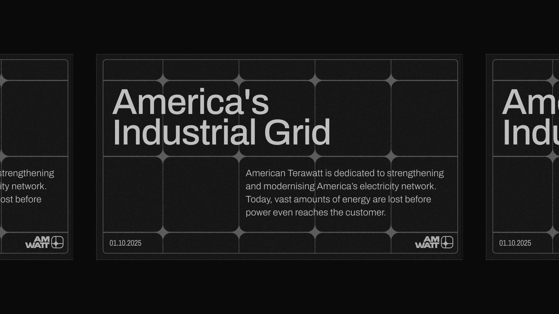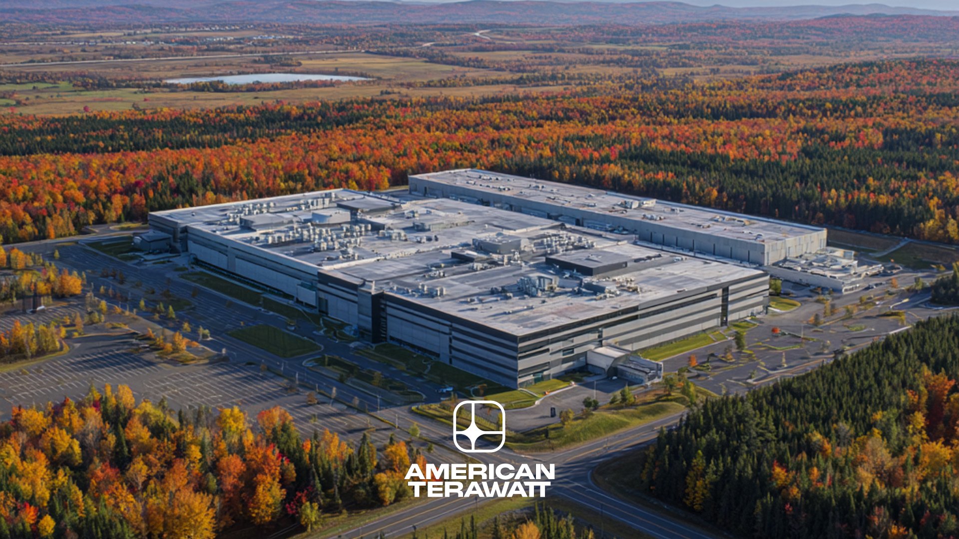
American Terawatt
American Terawatt is dedicated to strengthening and modernising America’s electricity network.
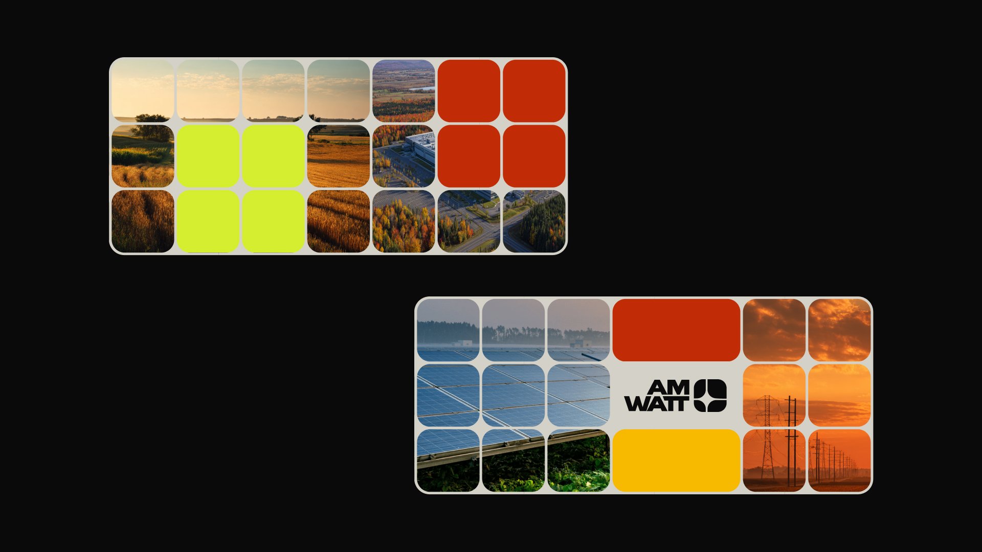
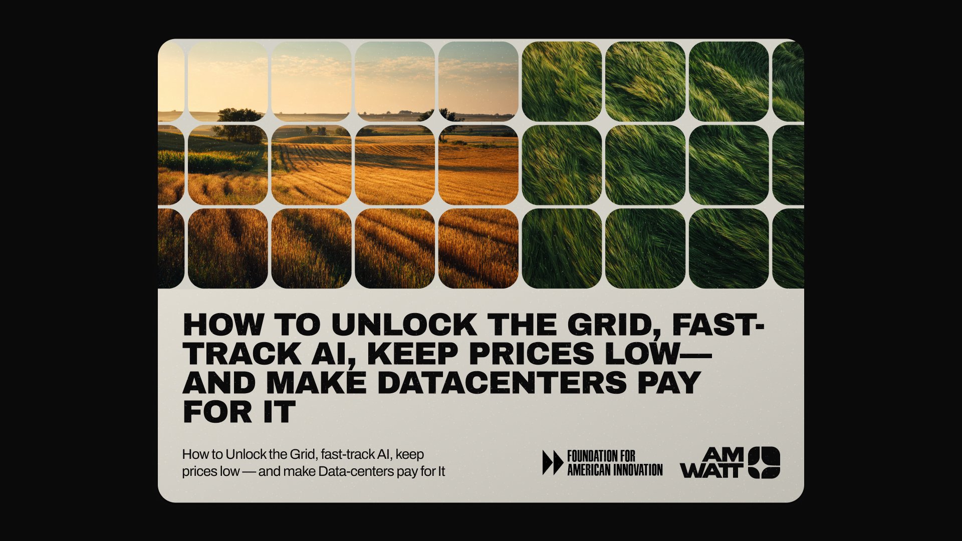
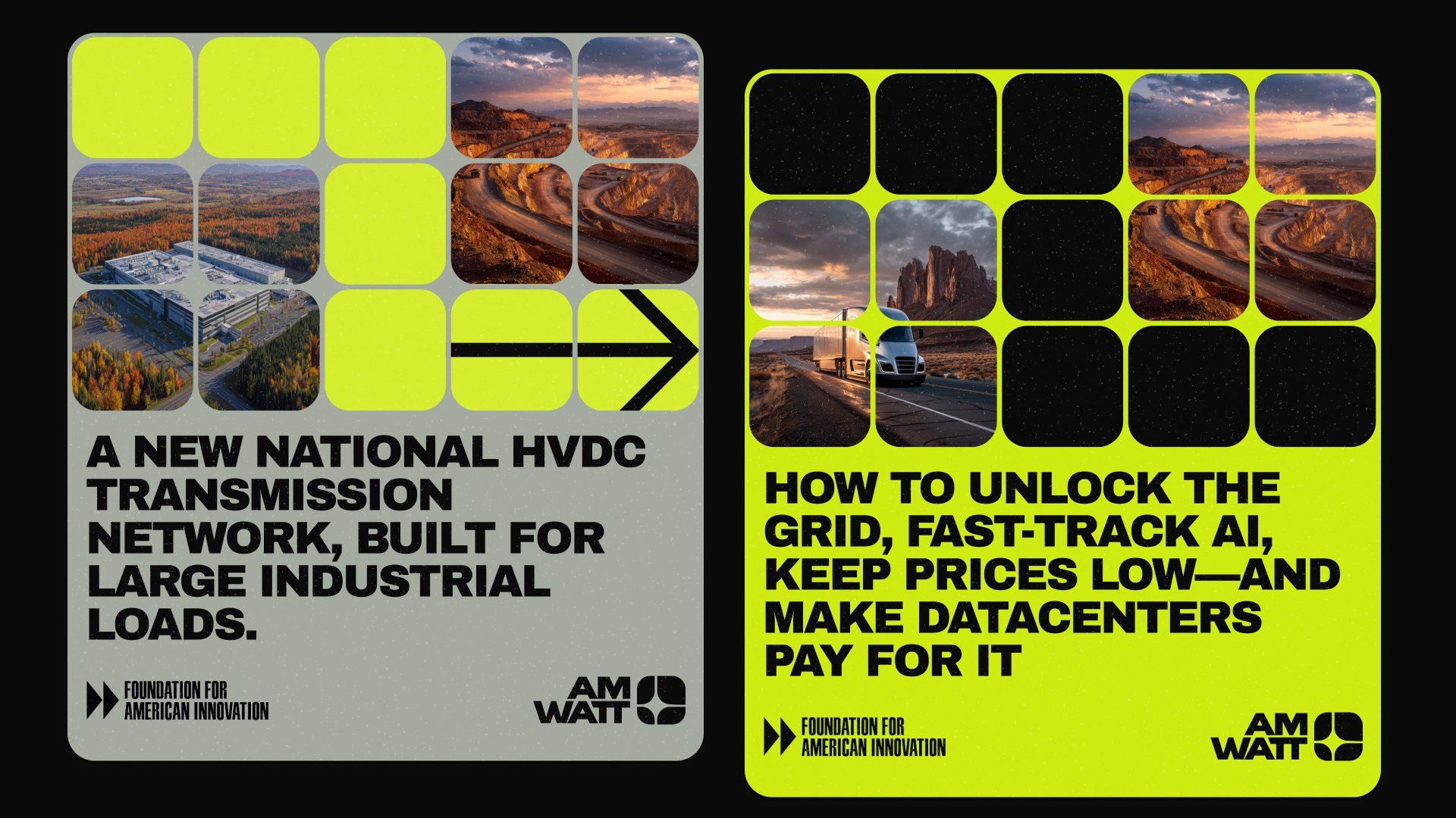
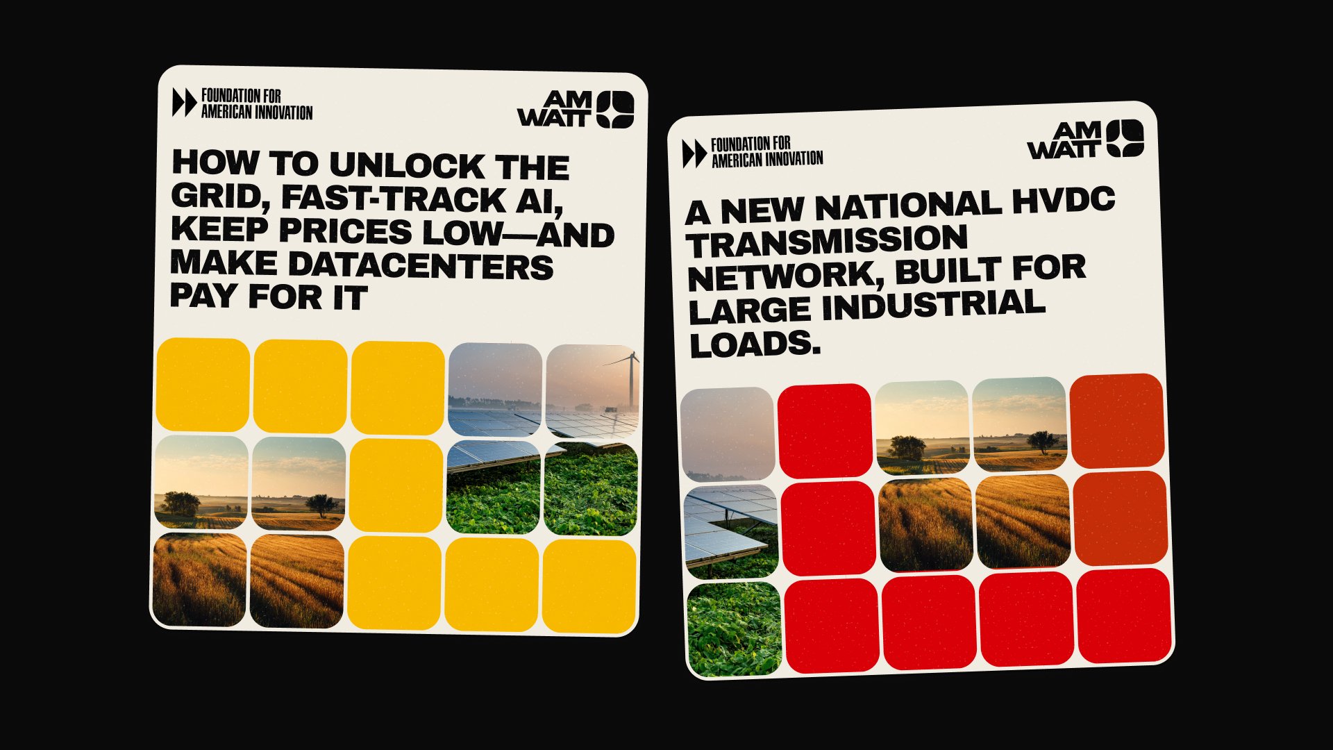
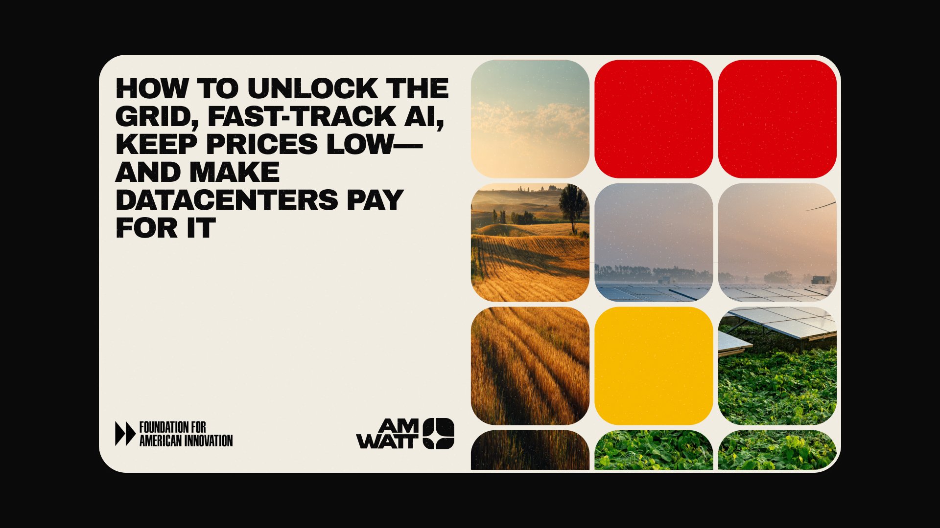
Brand identity and splash site for American Terawatt, a company modernising America's electricity grid. Built for trust, longevity, and quiet authority.
Collaboration
- Ron Bhattacharyay
- Anton Troynikov
It’s not every day someone asks you to help rebrand a piece of the American electrical grid. When the email from Ron — founder of American Terawatt — first hit my inbox, my first thought was, “Wait. The grid? The actual grid? The thing my toaster runs on?”.
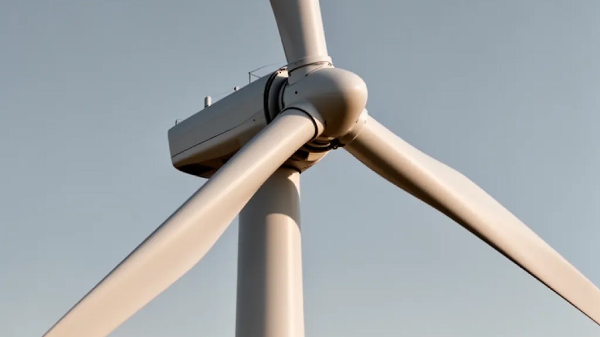
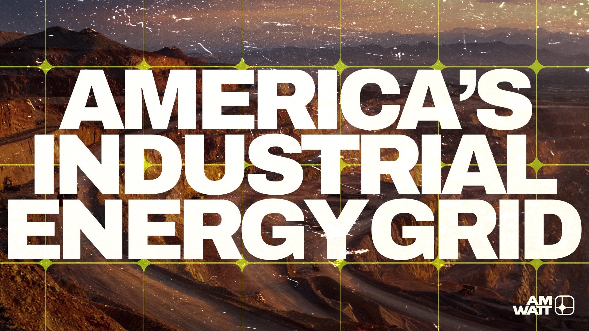
Here’s a fun fact most people don’t know: somewhere between 5% and 8% of the electricity that leaves a power plant in the United States never actually reaches the customer. It just… disappears. Bled out through resistance, heat, and transformers older than your grandparents. We’re talking about a country-sized leak. Trillions of watts, gone.
American Terawatt is dedicated to plugging that leak. Modernising the connections. Reducing the waste. Making sure that when the lights are supposed to be on, the lights are on. Not the sexiest pitch in the world maybe, but absolutely one of the most important. You can’t have AI, EVs, or honestly anything else without electrons showing up where they’re supposed to.
Strategy: A brand for grown-ups.
Before any pixel got pushed around, Ron and I spent a lot of time just talking. About the customer. About the industry. About what energy and infrastructure people actually respond to — and what they roll their eyes at.
The audience here isn’t a 24-year-old VC scrolling Twitter. It’s a 55-year-old utility executive who’s been keeping the lights on for three decades. Someone who’s seen a hundred Silicon Valley startups roll into town promising to “disrupt” their world, and watched ninety-eight of them roll right back out again. This person doesn’t want a swoopy gradient logo. They want to know you’re serious. They want to know you’ll still be here in twenty years. They want trust, and trust isn’t earned by looking like every other startup with a pastel deck and a one-syllable name.
So we set the rules early:
- Trust over hype.
- Clarity over flash.
- Substance over trend.
- American, not Californian.
That last one is important. There’s a kind of branding aesthetic — you know the one — that’s become the visual lingua franca of every Silicon Valley company since about 2018. Inter Tight. A gradient. A lowercase wordmark with the tracking opened up. The vibe is somewhere between “we’re a coffee shop” and “we’re a series B fintech.” It’s fine. It’s also exhausted. And it’s the exact wrong language for a company that wants to be taken seriously by people who turn wrenches and run transmission lines.
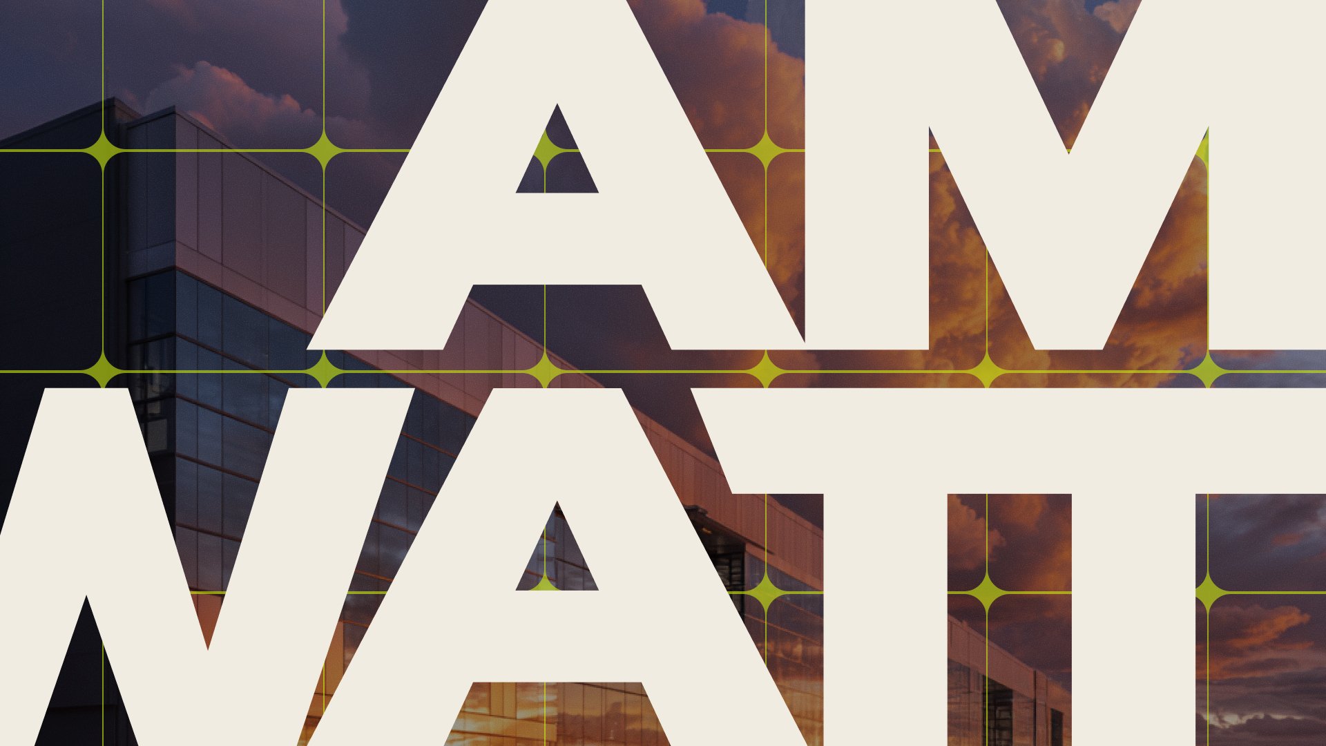
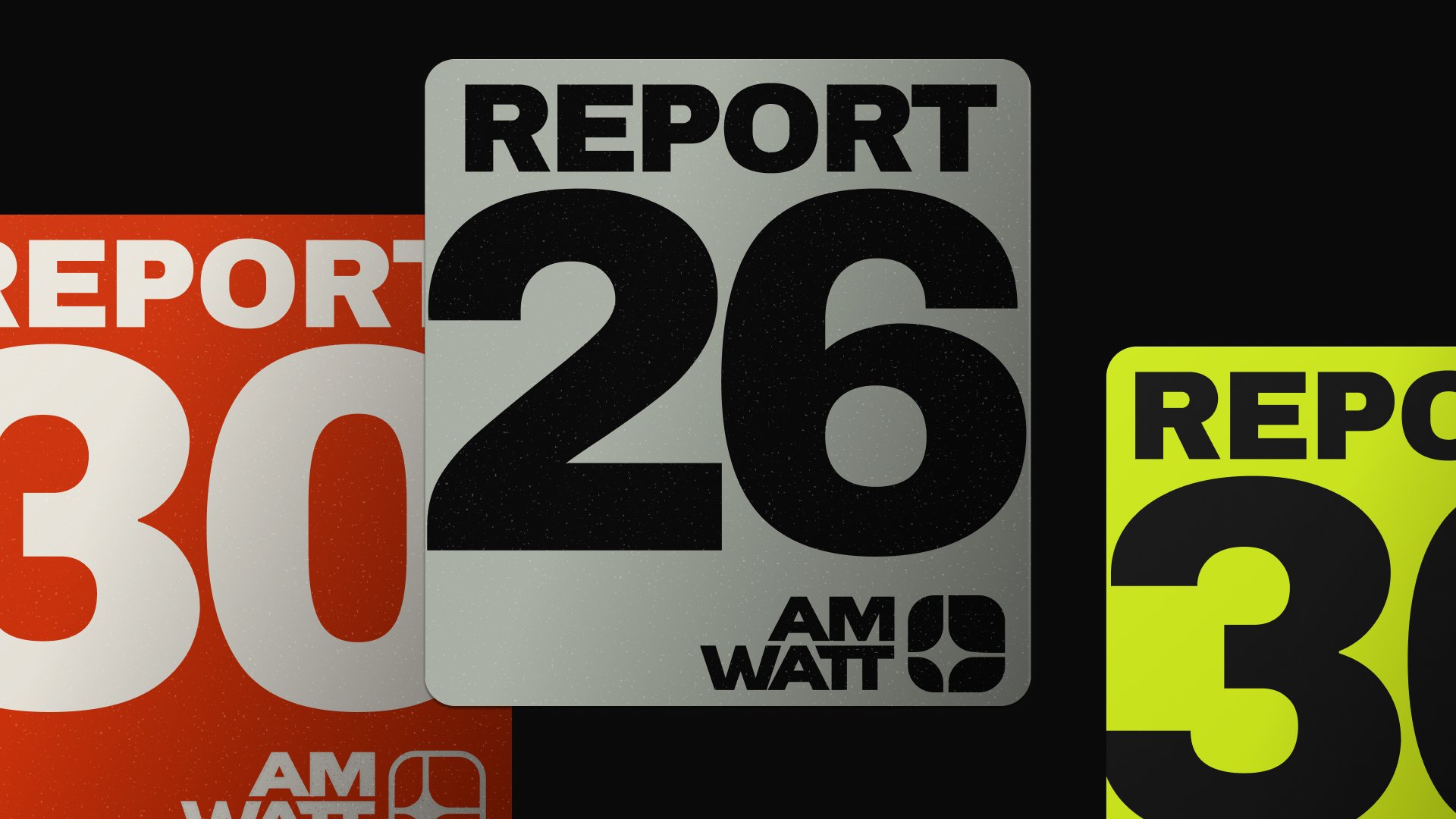
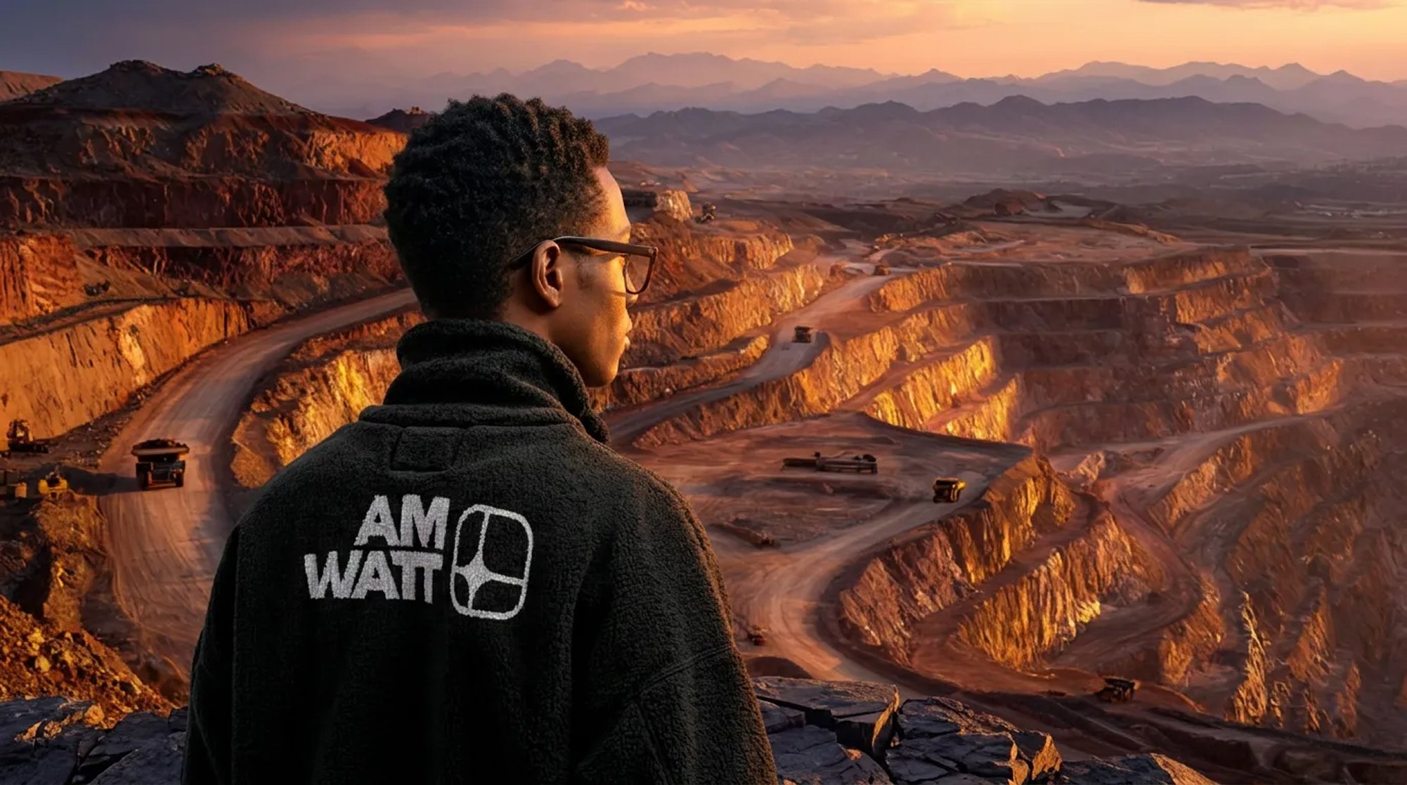
We wanted American Terawatt to look like it could’ve existed in 1958. And also in 2058. Calm. Confident. A little bit boring in the best possible way. The kind of mark you’d see stamped on a substation door and not question for a second.
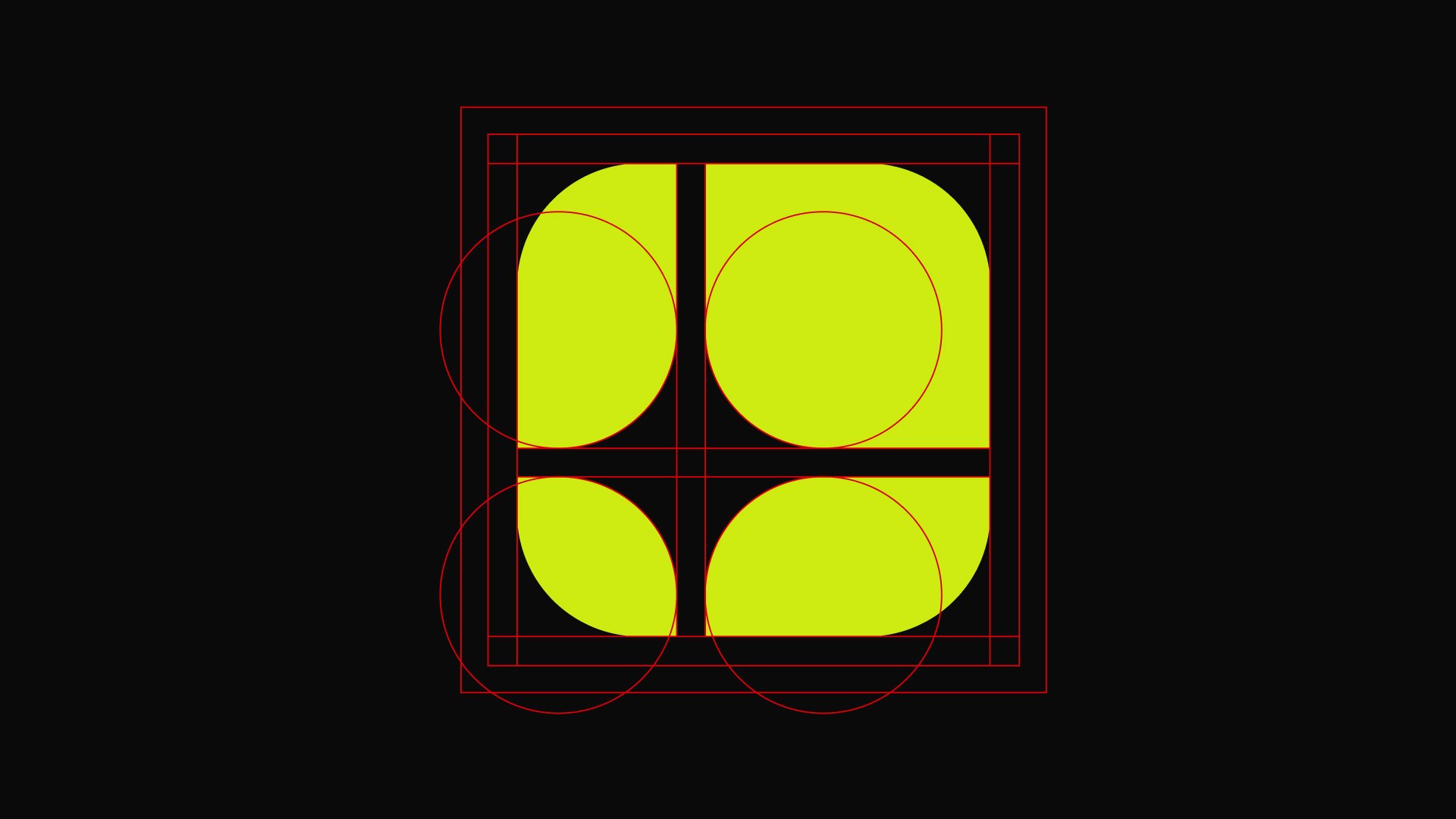
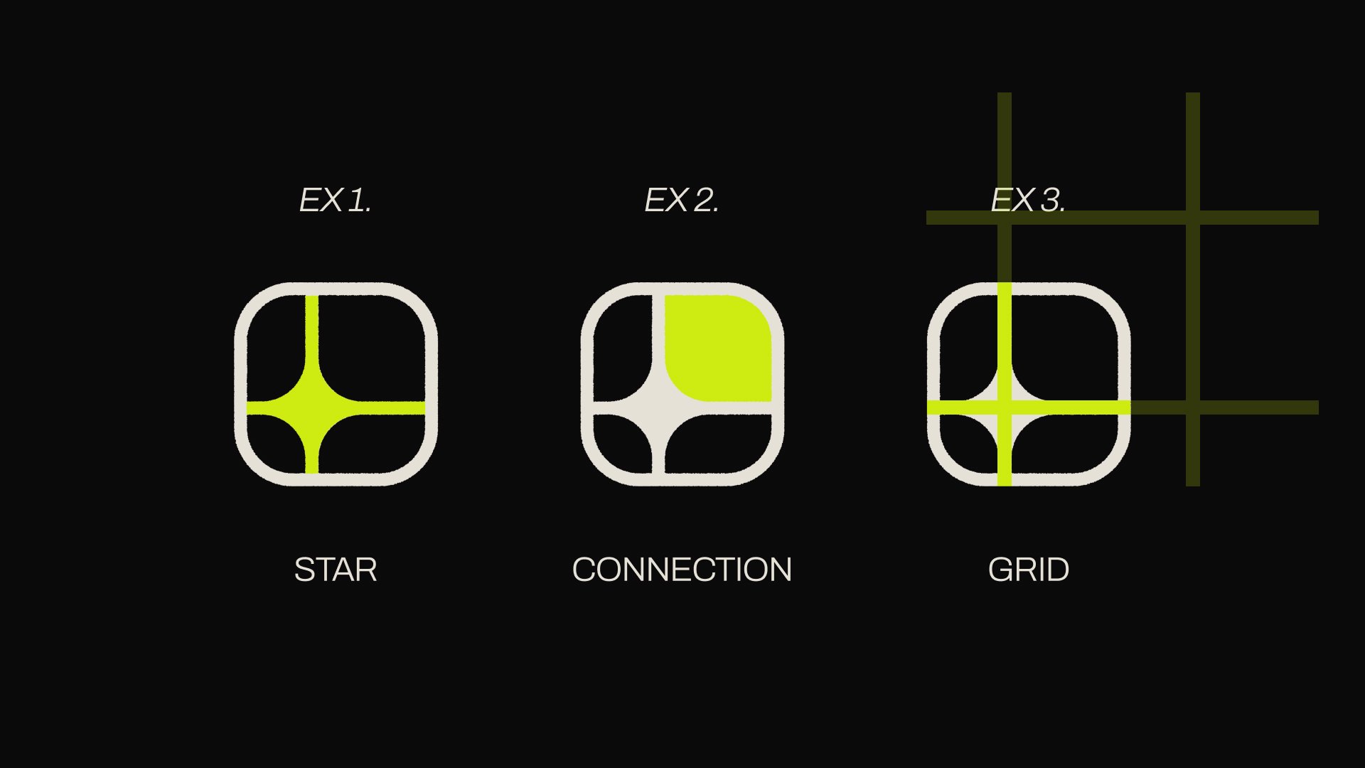
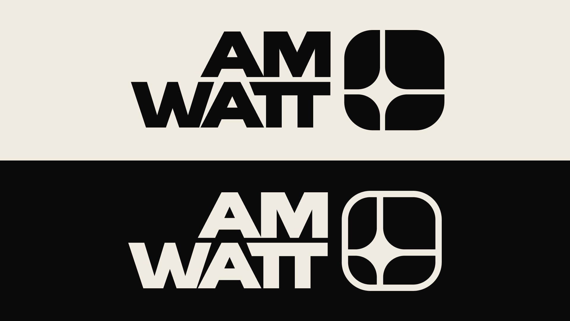
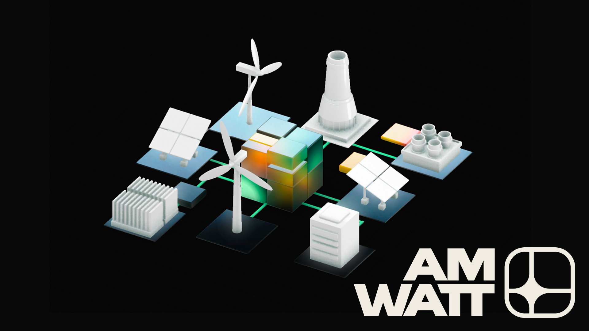
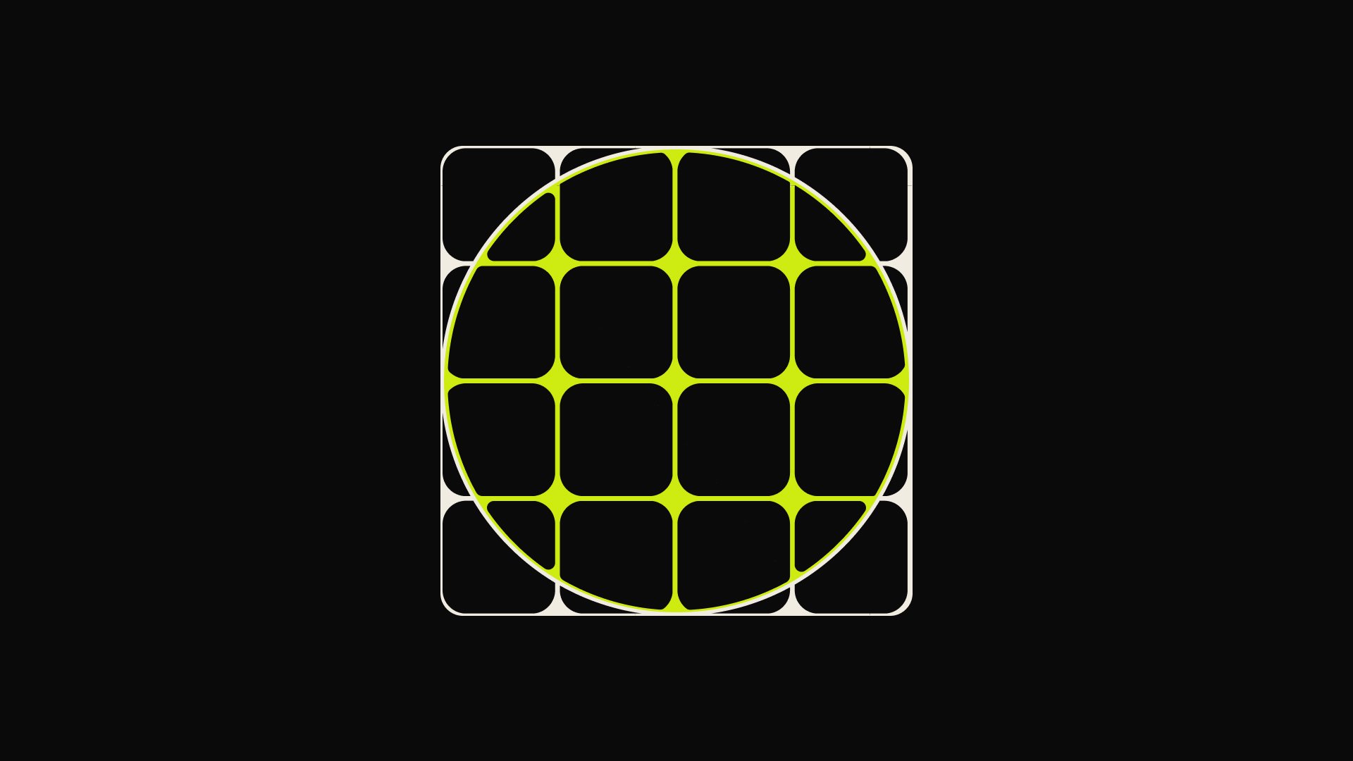
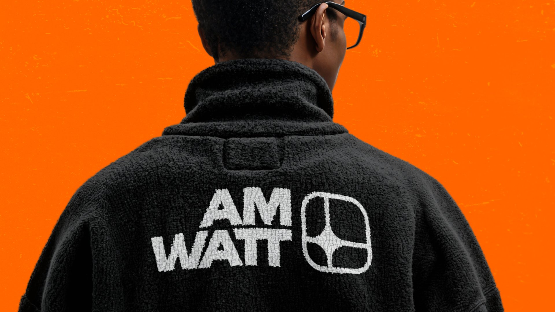
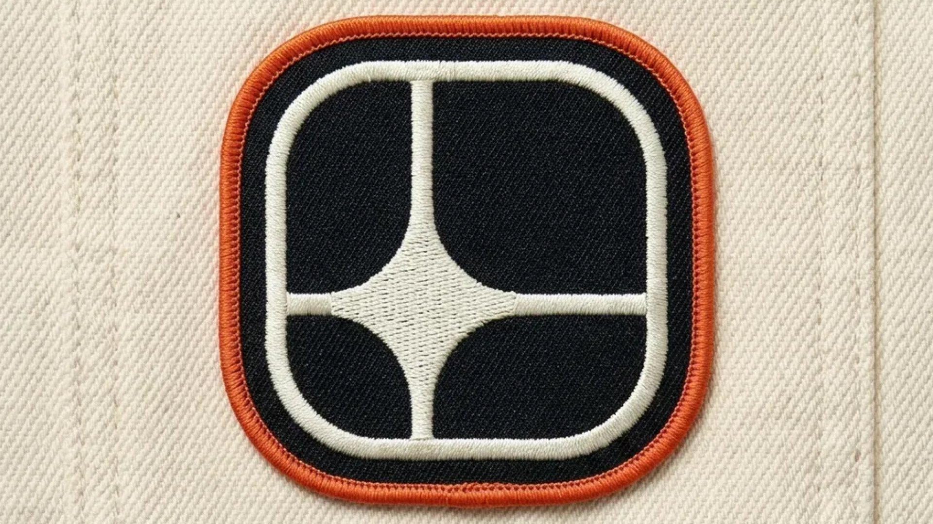
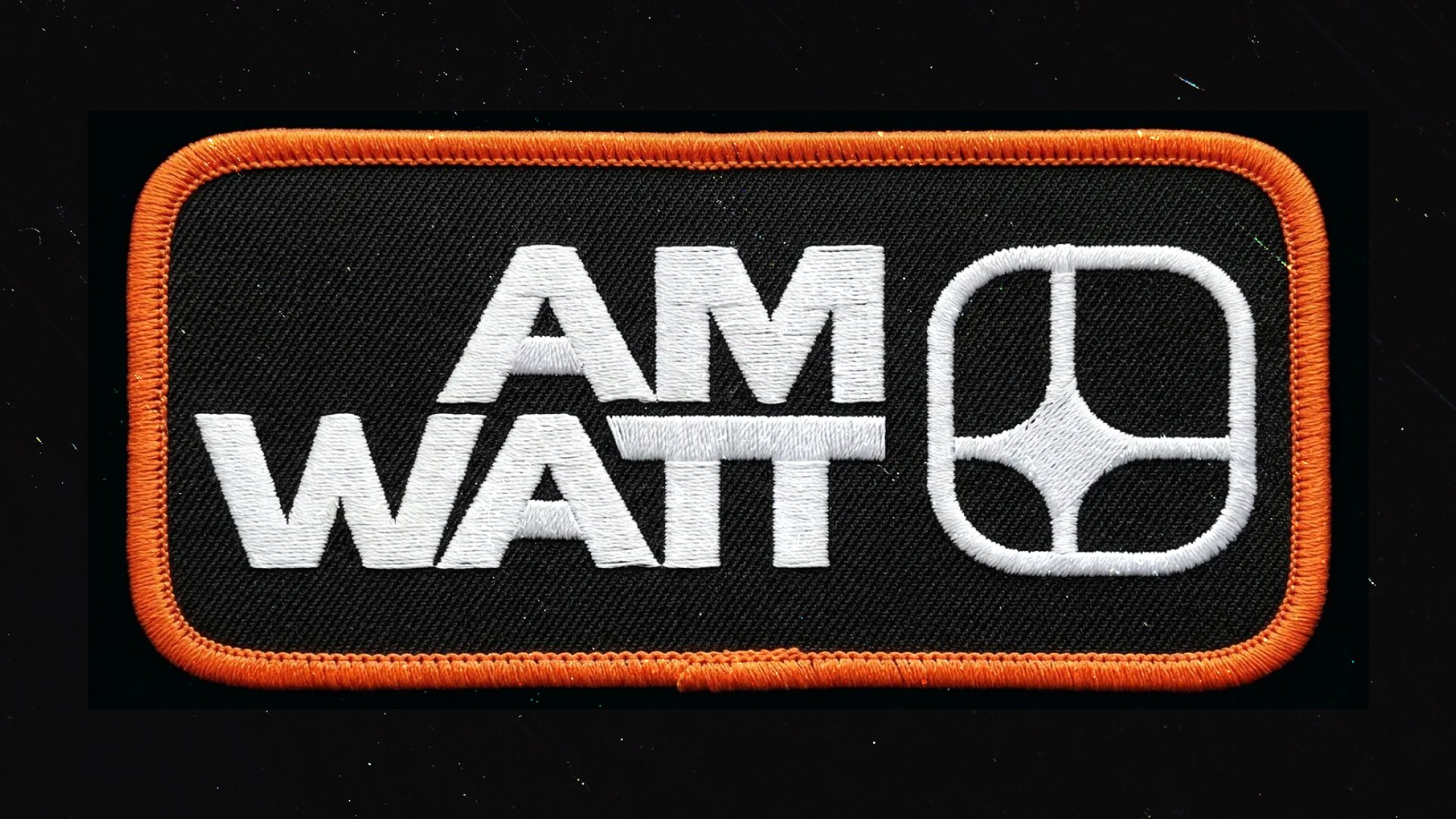
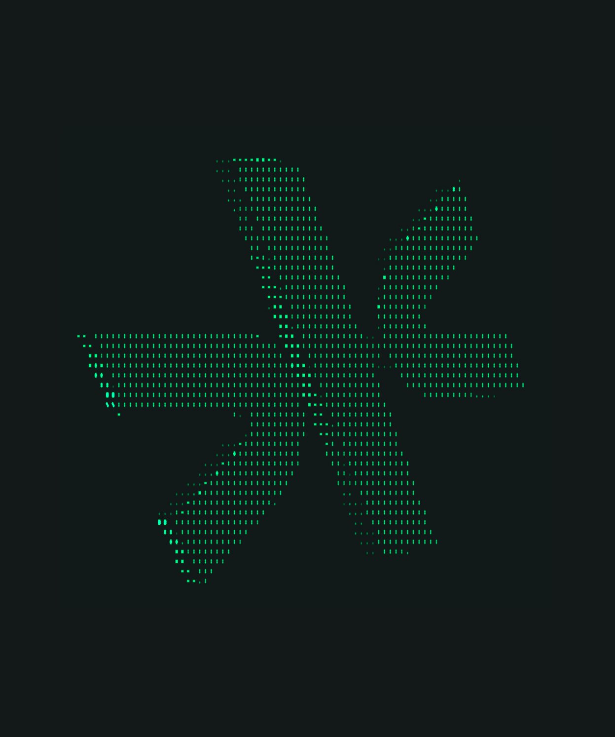
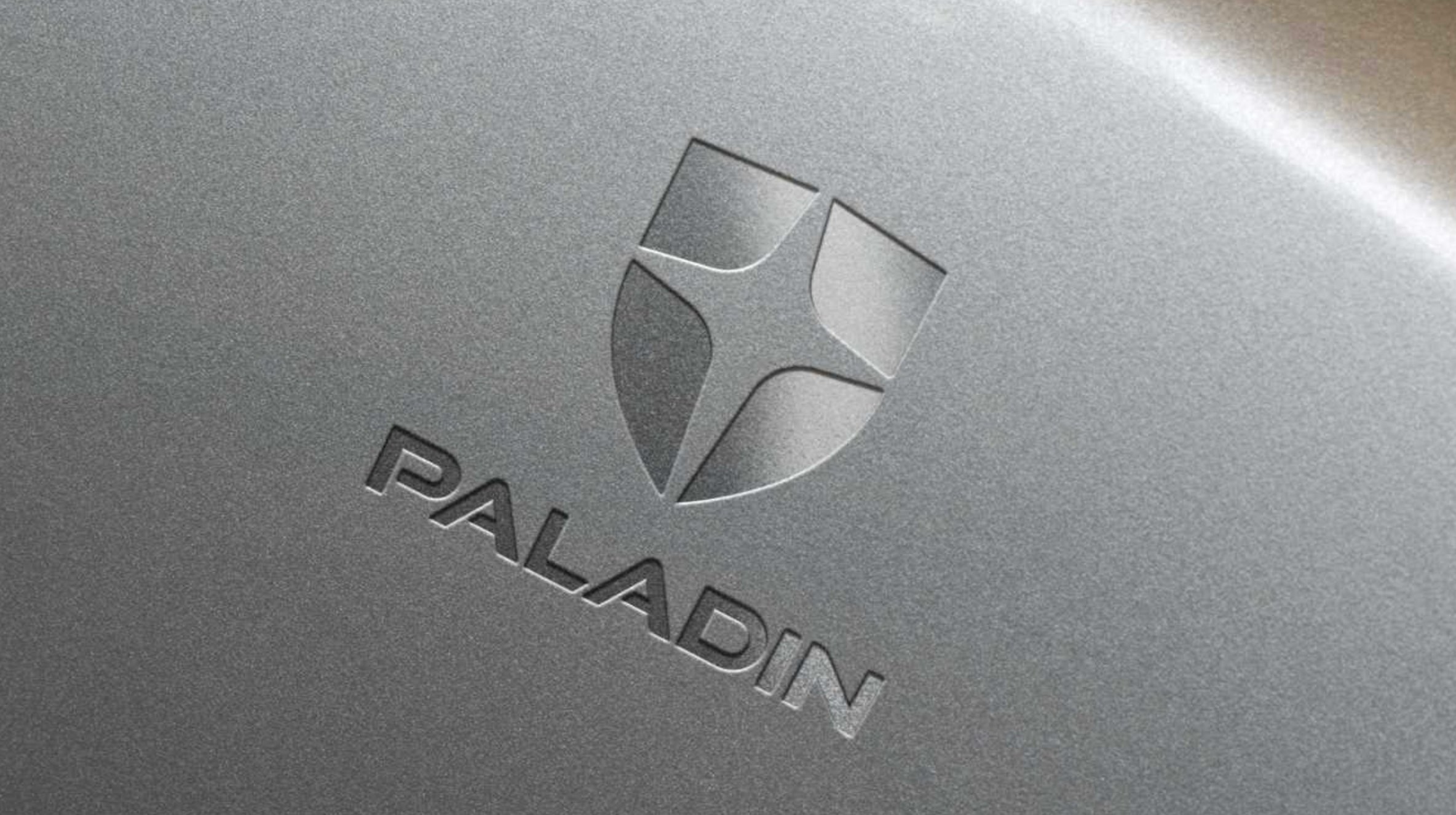
The Symbol: Built like a transformer. Designed like a license plate.
The visual language we kept circling back to was the mid-century American utility emblem. Think 1950s-60s power company seals. WPA-era industrial graphics. The little chrome monogram badge on a piece of heavy machinery. Stuff that wasn’t designed to win awards — it was designed to outlast the building it was bolted to.
There’s a beauty to that kind of work that I think the design world has kind of lost. It wasn’t precious. It wasn’t trying to feel like anything. It just was what it was — a confident, geometric mark, doing its job, holding the line.
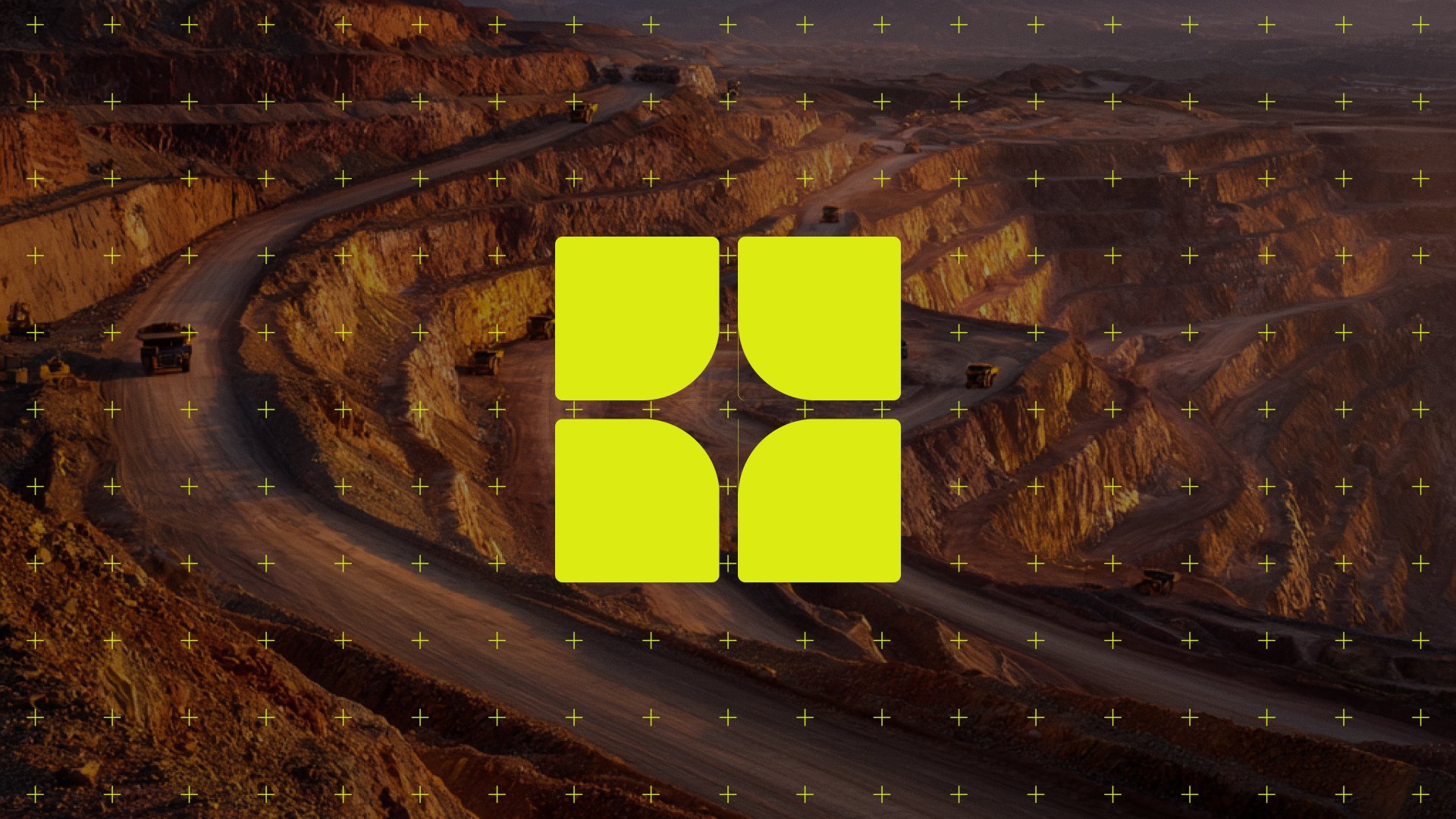
I went through a lot of directions before we landed. There were lightning bolts (too obvious, every energy company has one). There were sunbursts (too solar, too specific). There were eagles (too patriotic, into uncle-with-an-opinion territory). What kept working was something more architectural — a monogram, built from clean geometric lines, with the kind of structural symmetry you’d see in a piece of industrial signage.
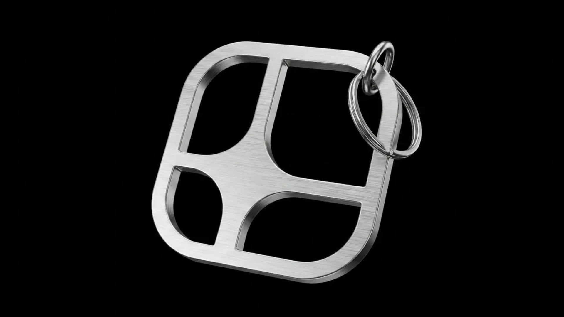
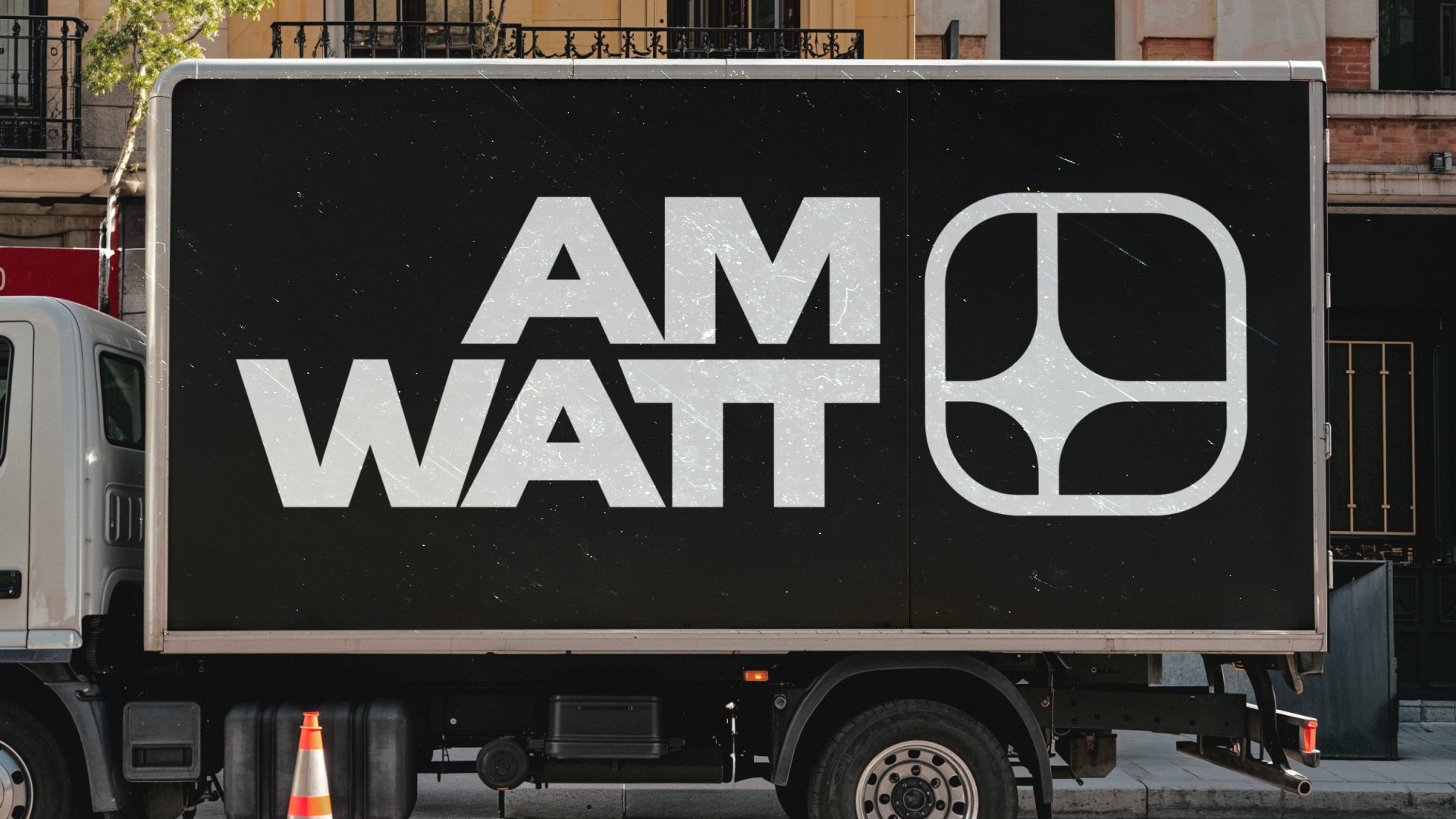
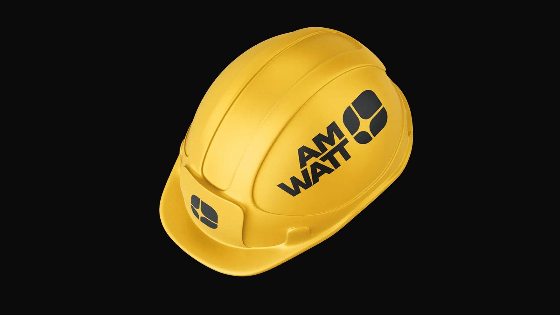
The final mark is drawn with consistent, bold stroke weights — no thin elegant lines, no decorative flourishes. It’s built like something that has to survive being printed on the side of a truck, etched into a metal plate, and embroidered onto a work jacket. Because eventually, it will.
Symbol Breakdown
A few things worth pointing out under the hood:
The proportions are built on a grid. Every angle is a clean increment. Every counter is mathematically determined, not eyeballed. That sounds like overkill for a logo nobody is going to measure with calipers — but it matters, because the mark reads as resolved when you look at it. Your eye can tell when something is on a grid even if you don’t know what a grid is. It’s the difference between a mark that feels designed and a mark that feels assembled.
I also spent an embarrassing amount of time tuning the optical weight of the strokes. The horizontals and verticals had to feel evenly weighted at any size, which meant the horizontals are technically a hair thinner. Optical compensation 101, but the kind of thing you only notice in its absence.
The mark scales down to a favicon and still reads. It scales up to the side of a transformer and still reads. That’s the job.
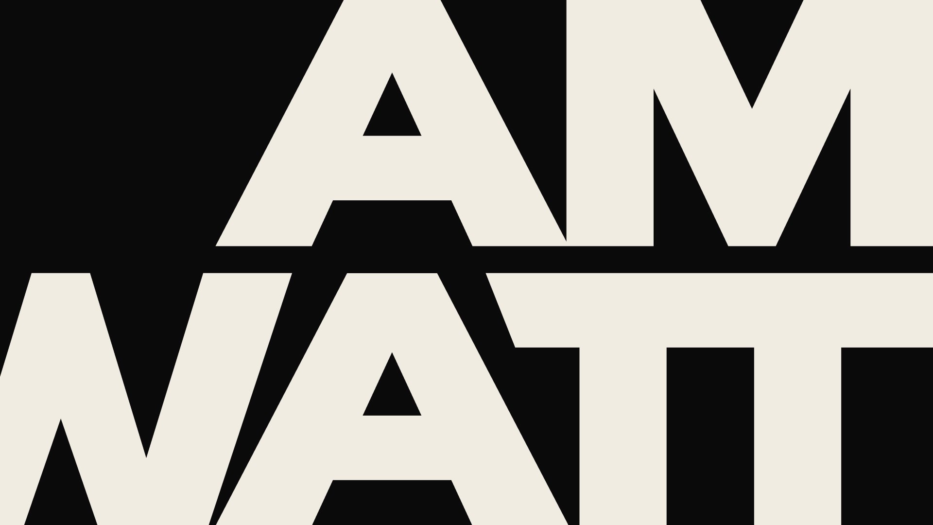
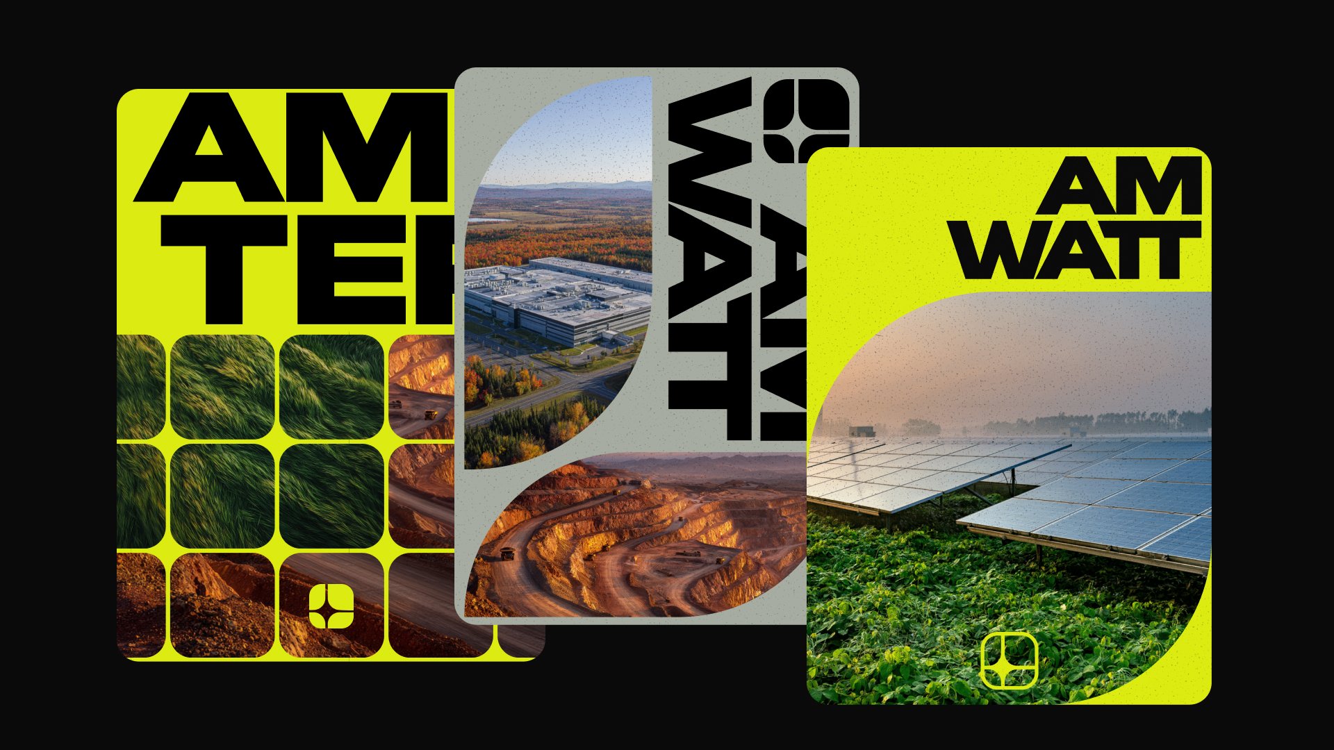
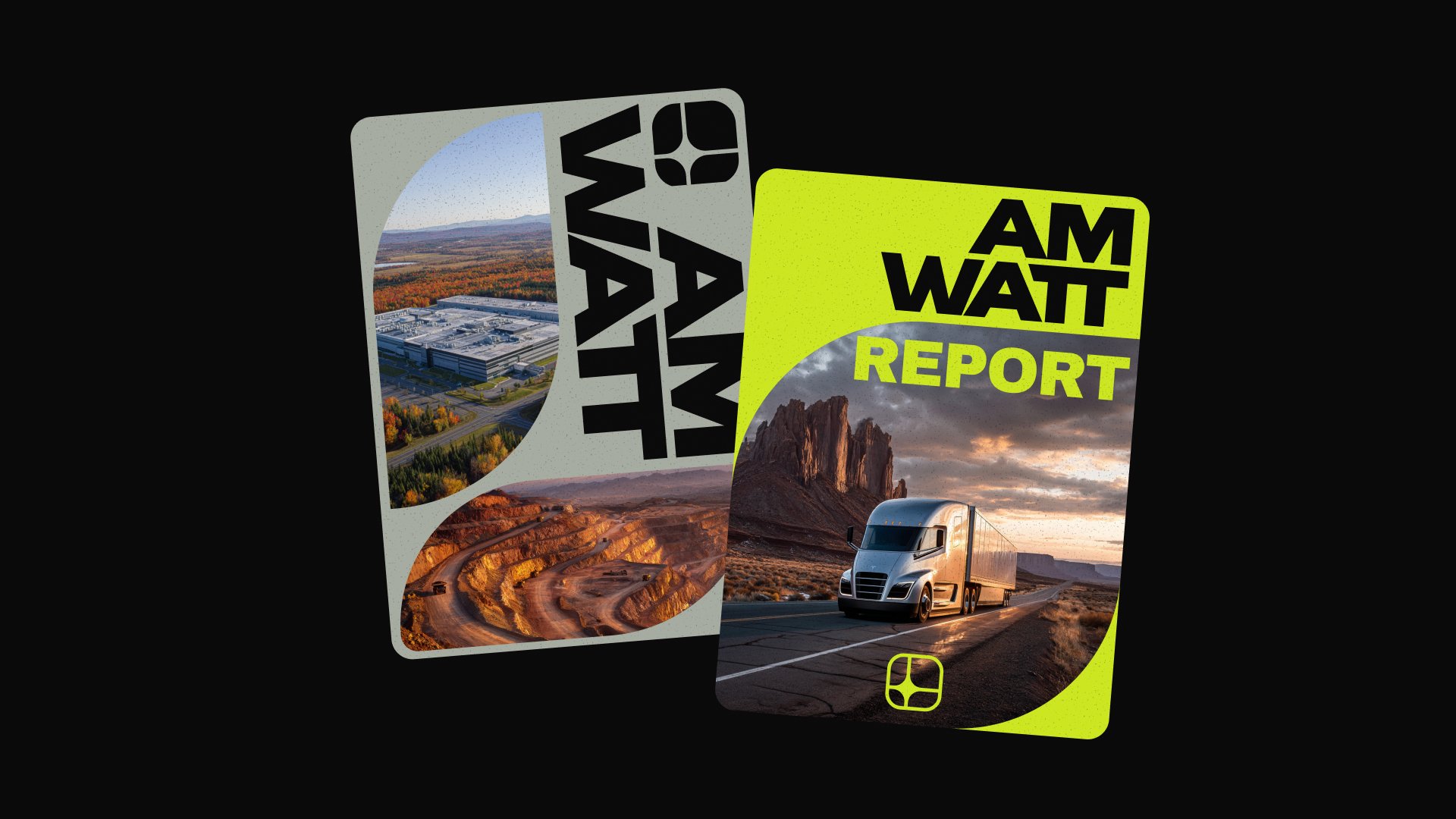
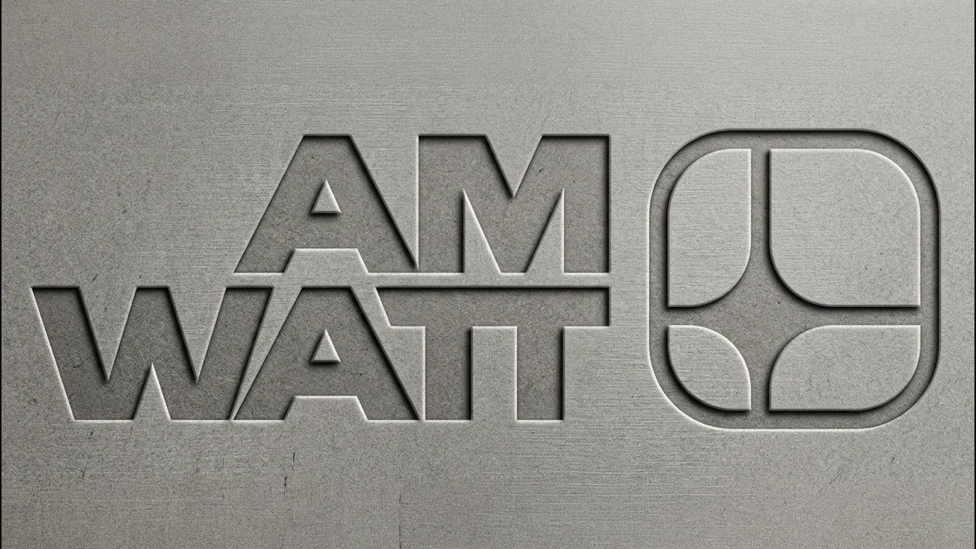
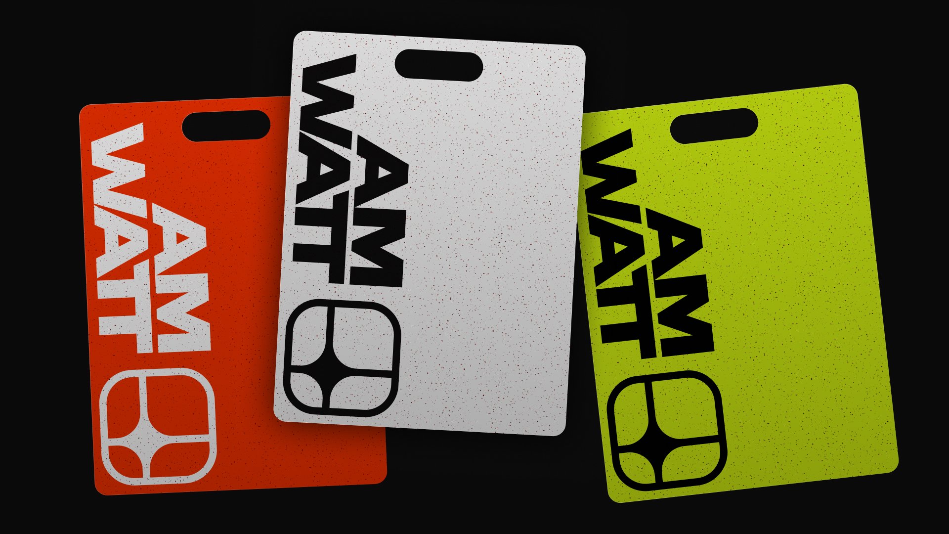
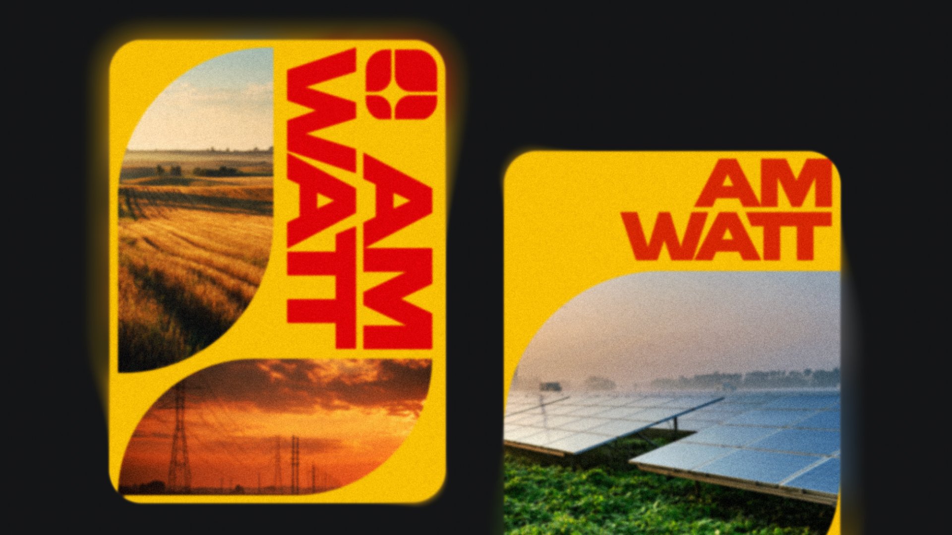
The Wordmark: Heavy, honest, American.
The wordmark needed to do the same work as the symbol — say it without saying it. It had to feel like American industry without falling into cliché American typography (no Western slabs, no eagles-spread serifs, none of that).
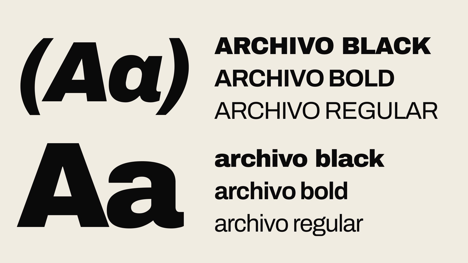
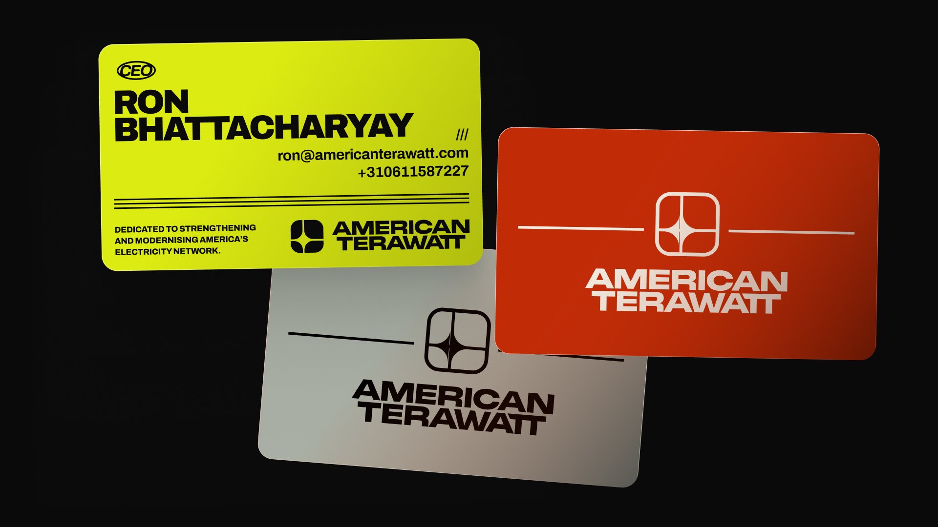
I drew the wordmark from PP Monument Wide, chosen for its honest geometric construction and slightly elongated proportions, which give it a stately, license-plate-like feel. Then I went in and modified the letterforms to match the geometric logic of the symbol — same stroke weights, same corner radii, same proportional system. So when the symbol and wordmark sit together as a lockup, they read as one thing, not two things glued together.
A small thing I’m proud of: the spacing between the two words (“American” and “Terawatt”) is tuned so that at a glance it reads as one continuous word. Up close, you see the gap. From across the room, it’s a single confident block. That’s intentional. American Terawatt isn’t two ideas — it’s one promise.
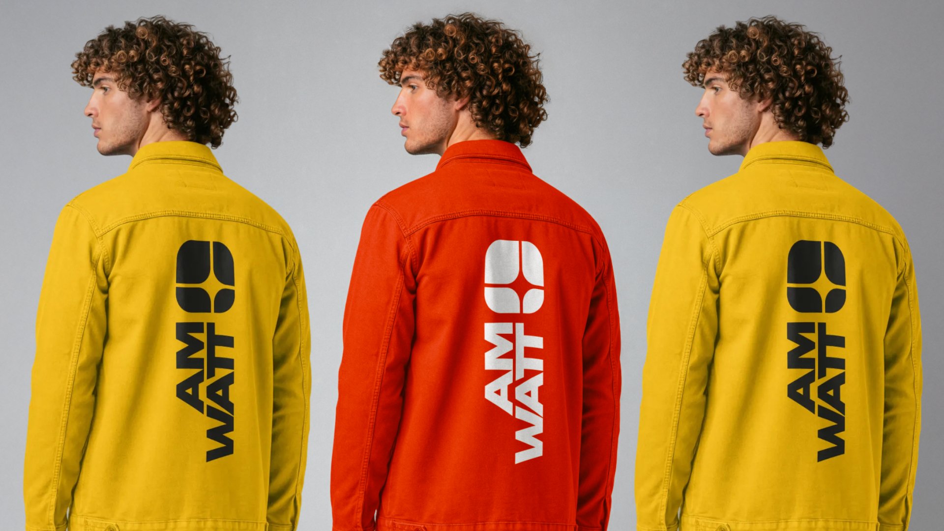
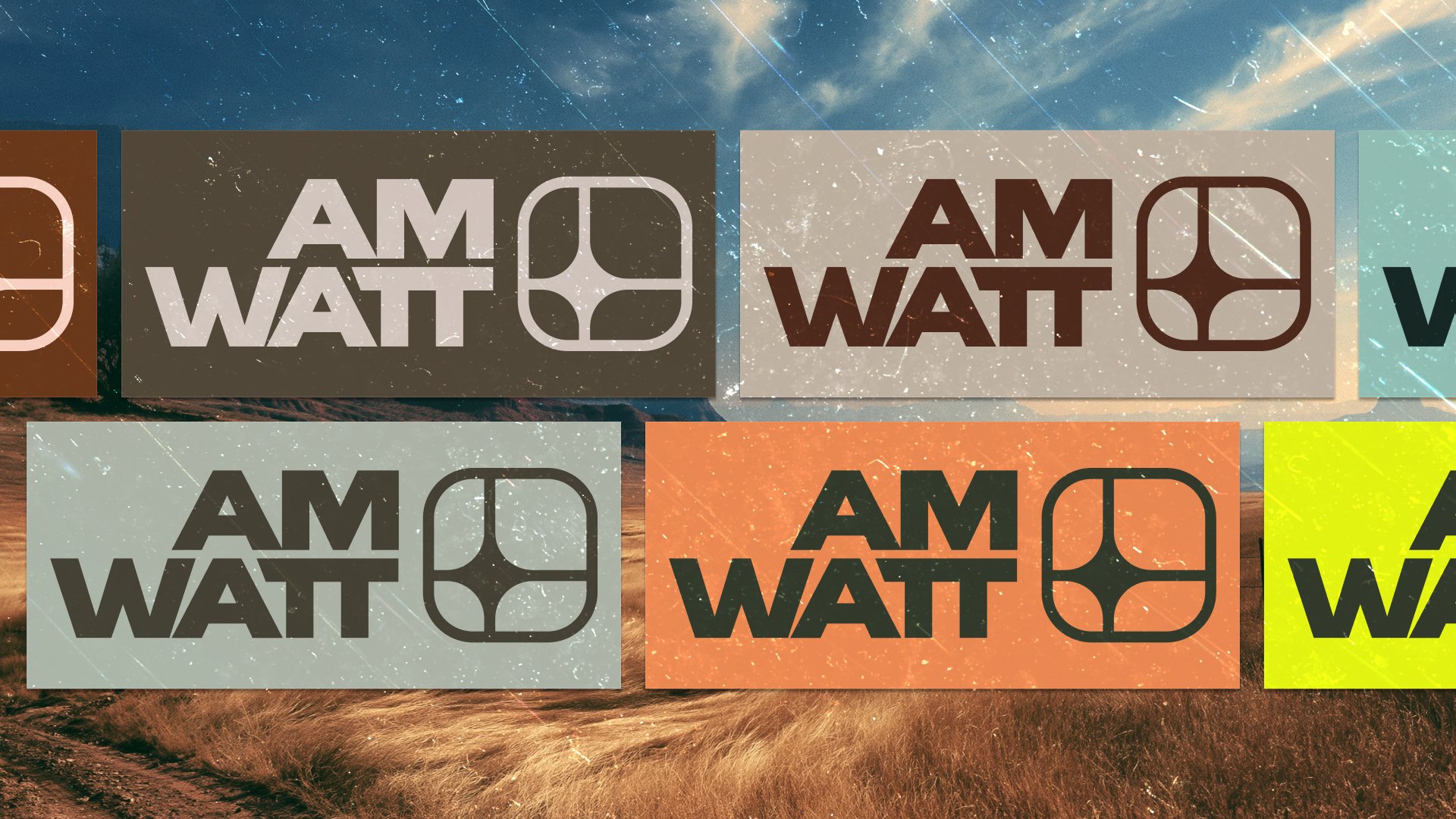
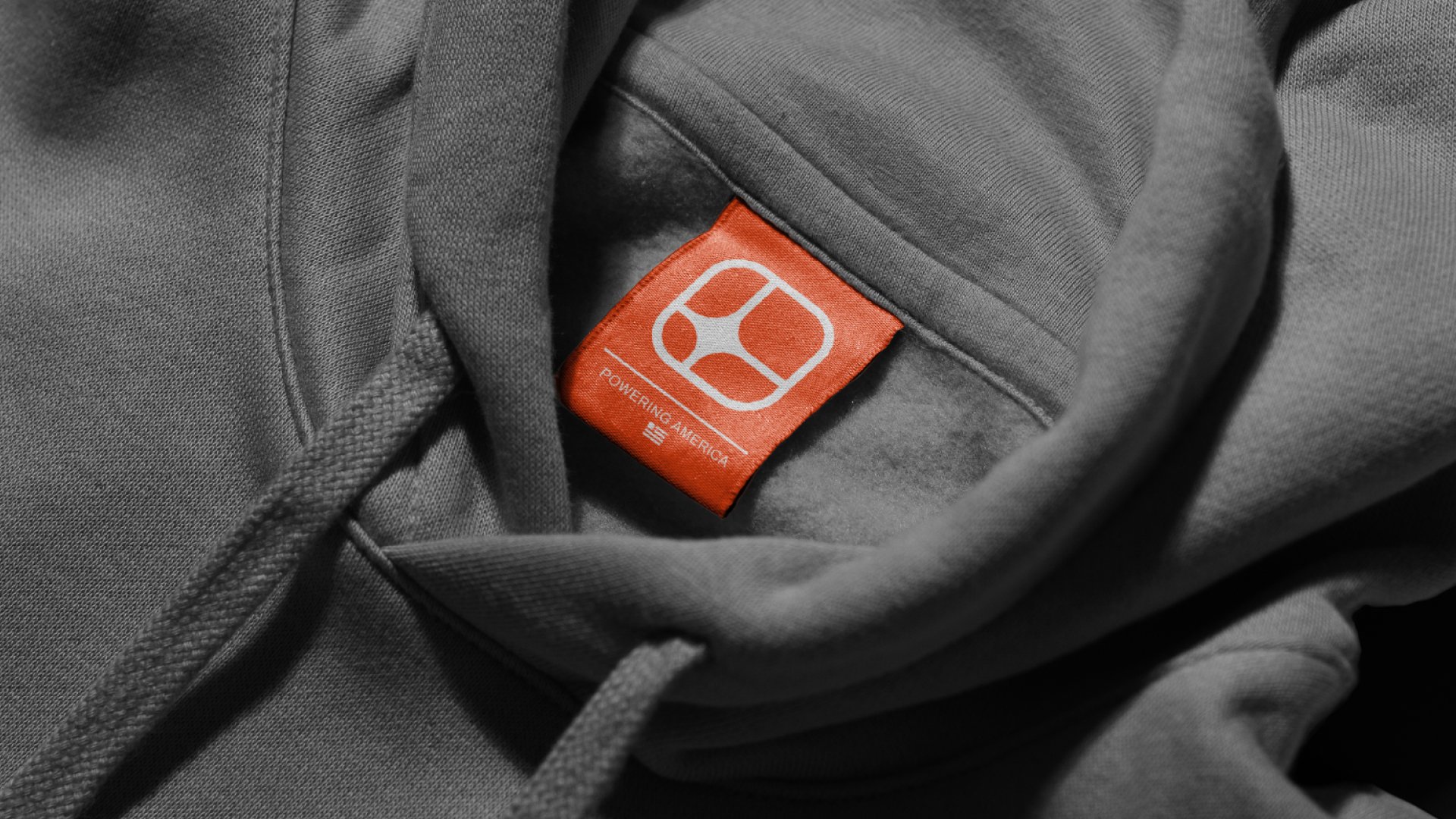
Colour
Not red, white, and blue. Almost, but not quite.
You can probably guess where this one wanted to go: the obvious palette for an American infrastructure company is the flag. But the flag is loud, and we were building a brand designed to be quietly confident. So we walked the palette back a few clicks.
The core palette uses a deep, slightly desaturated navy, a warm off-white that reads as paper rather than screen, and a single accent of a confident, slightly oxidized red. It’s patriotic without waving a flag at you. It feels like a hardback book about American engineering history. It feels like the inside of a Cessna. It feels, to put it bluntly, trustworthy.
No gradients. No pastels. No “energetic teal.” Just a small, deliberate set of colours that look like they were chosen by someone who has things to do.
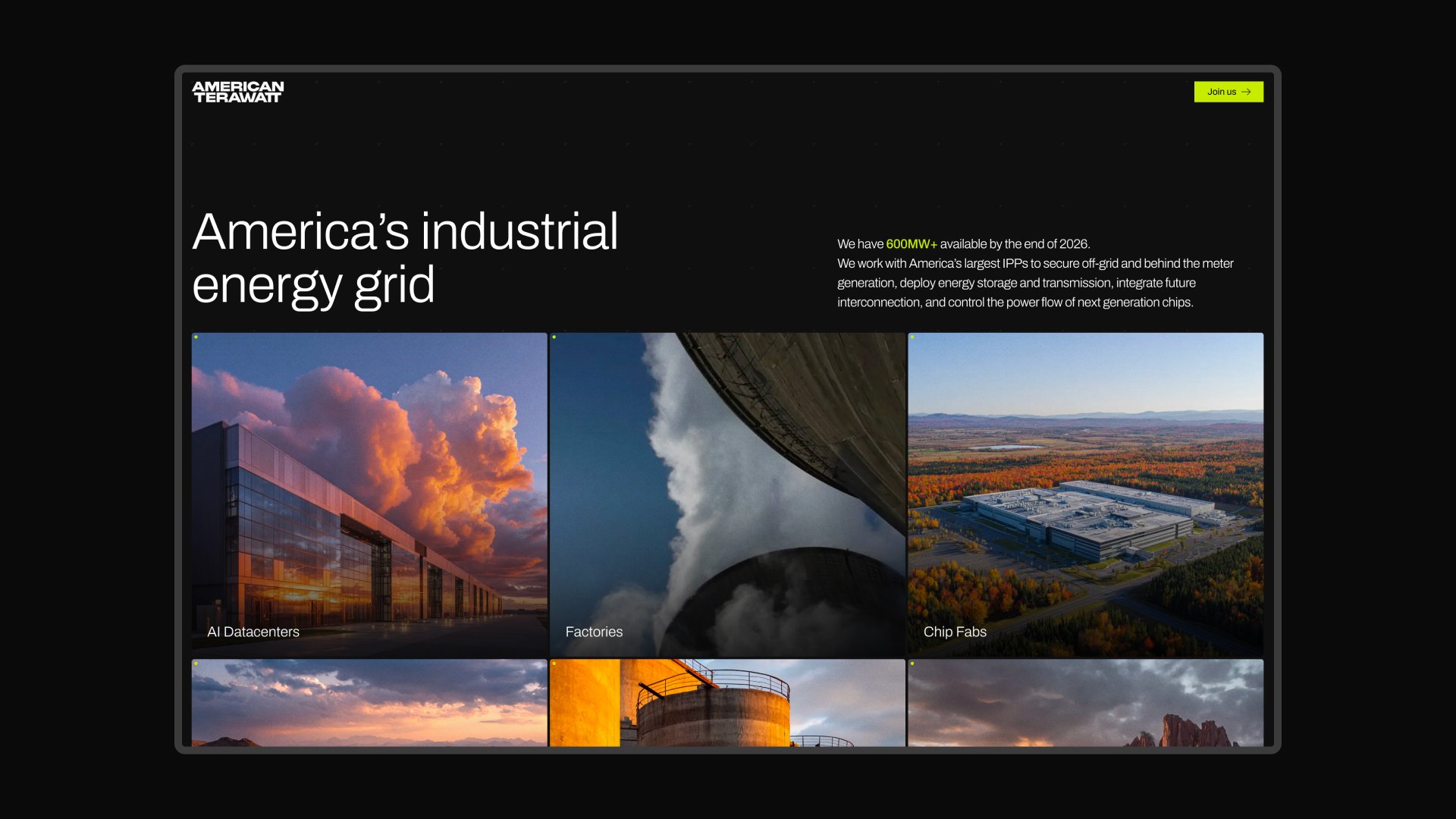
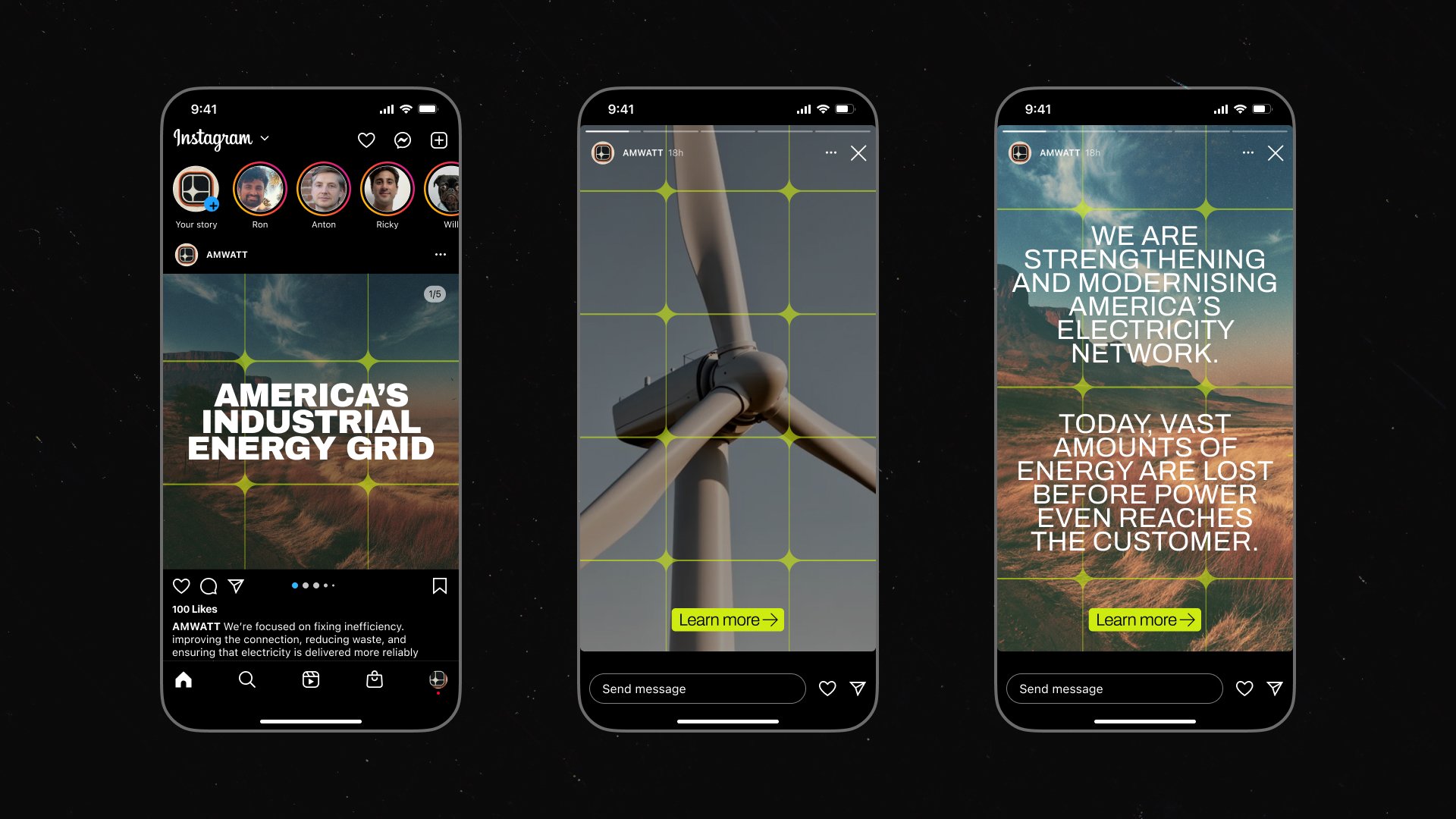
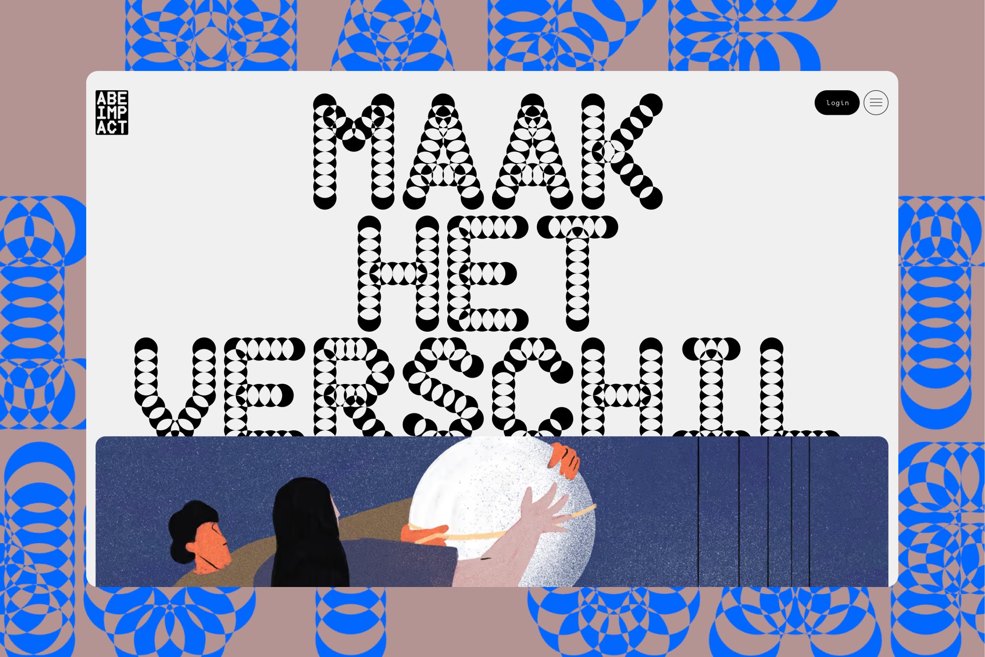
The Splash Site: Saying enough. Not more.
The splash site is one page. One page is all American Terawatt needs right now — the company is in a stage of its life where the most powerful thing it can do is show up looking serious and say what it does in plain English.
The site uses the wordmark, a single line of copy explaining the mission, and a way to get in touch. That’s it. No animated hero. No scroll-jacked sections. No “Our Values” carousel with stock photos of people pointing at laptops. Just the brand, doing its job.
There’s a temptation when you ship a splash site to fill it up — to prove that you’re a real company by showing five sections of nothing. We resisted. A splash site that says one true thing clearly is worth ten that say ten unclear things loudly.
Wrapping up
American Terawatt is a brand for people who are tired of being marketed to. Who’ve watched a lot of slick decks come and go. Who would rather see a clean spec sheet than a hype video. The whole identity is designed to earn one slow nod from that person, and then get out of the way so the actual work can happen.
I’m proud of how this one came out. It’s not a brand that’s going to win viral love on design Twitter, and it’s not supposed to. It’s supposed to look right on a hard hat, on a business card slid across a conference table in Houston, and on a substation forty years from now. That’s a much harder brief than “look cool,” and it’s the one I find myself most drawn to these days.
Thanks to Ron for trusting me with this. Building a brand for a company whose whole job is reliability is a privilege — you have to be what you’re claiming the company will be. Steady, considered, no nonsense.