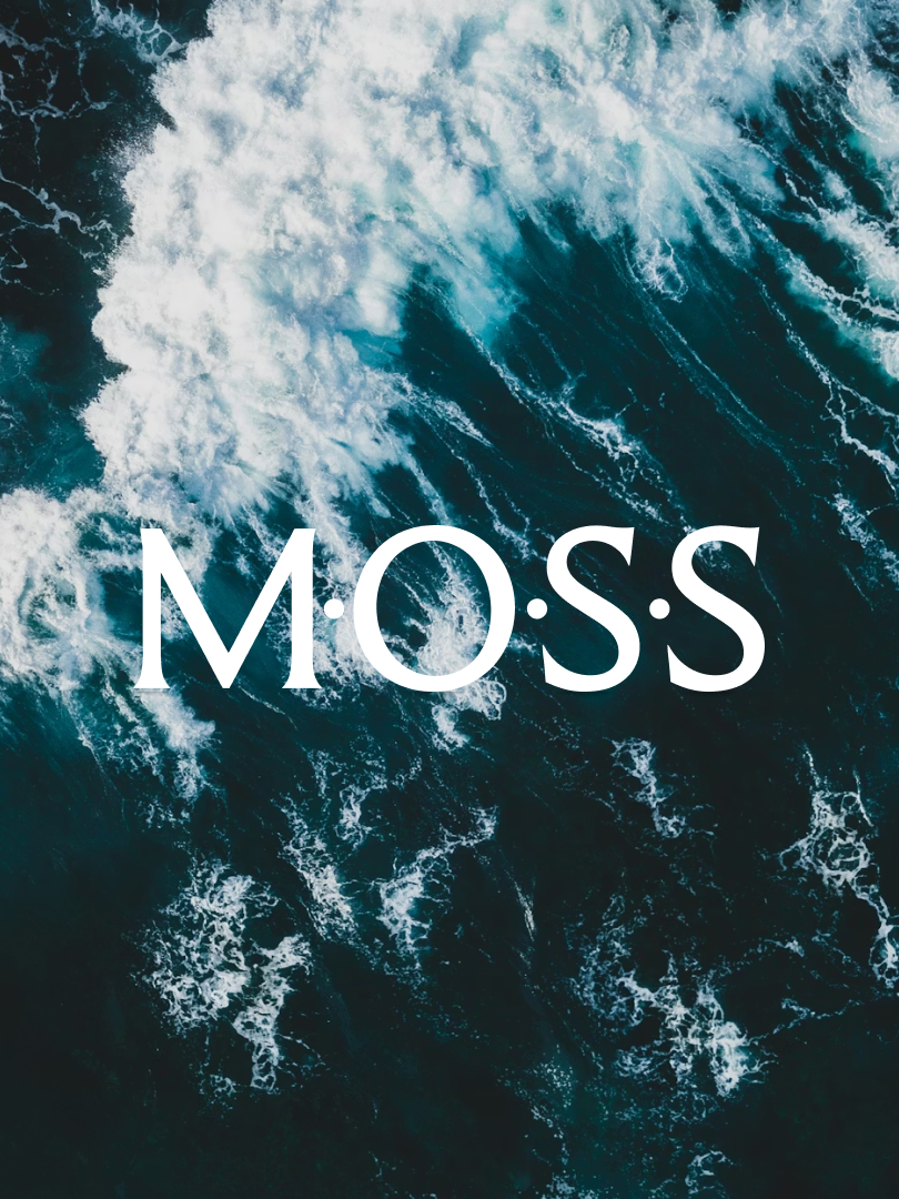
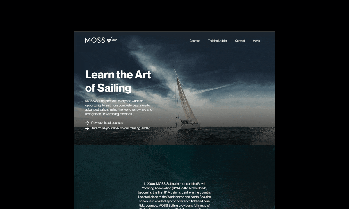
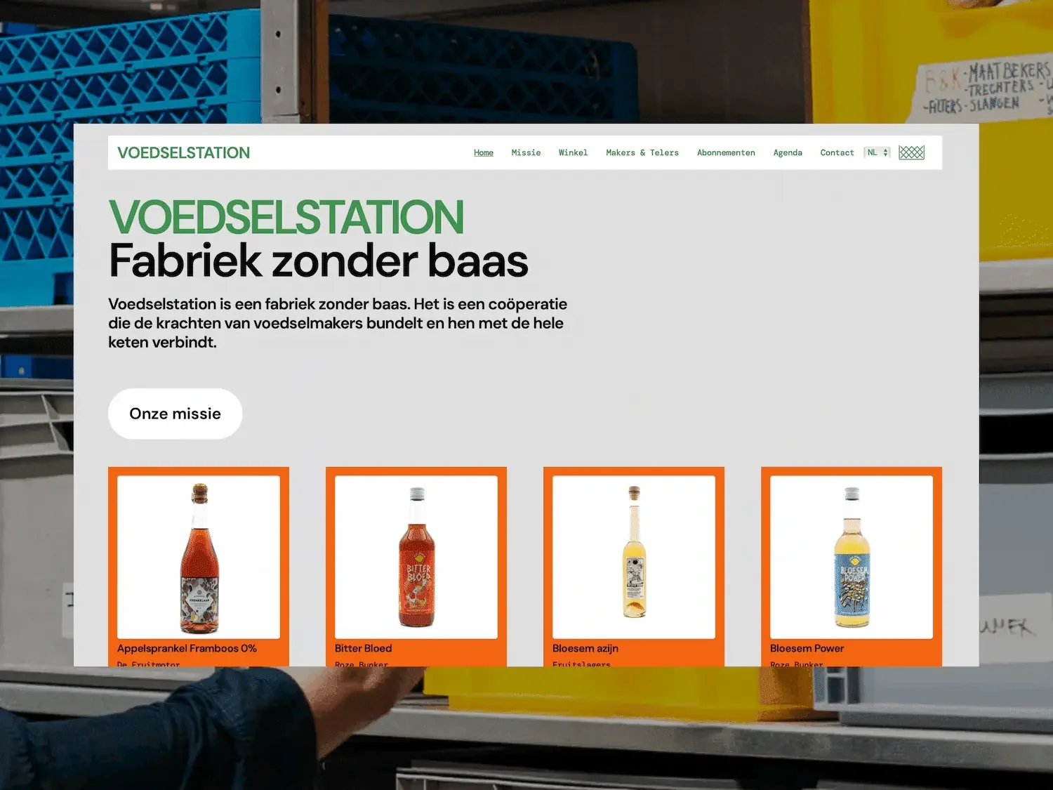
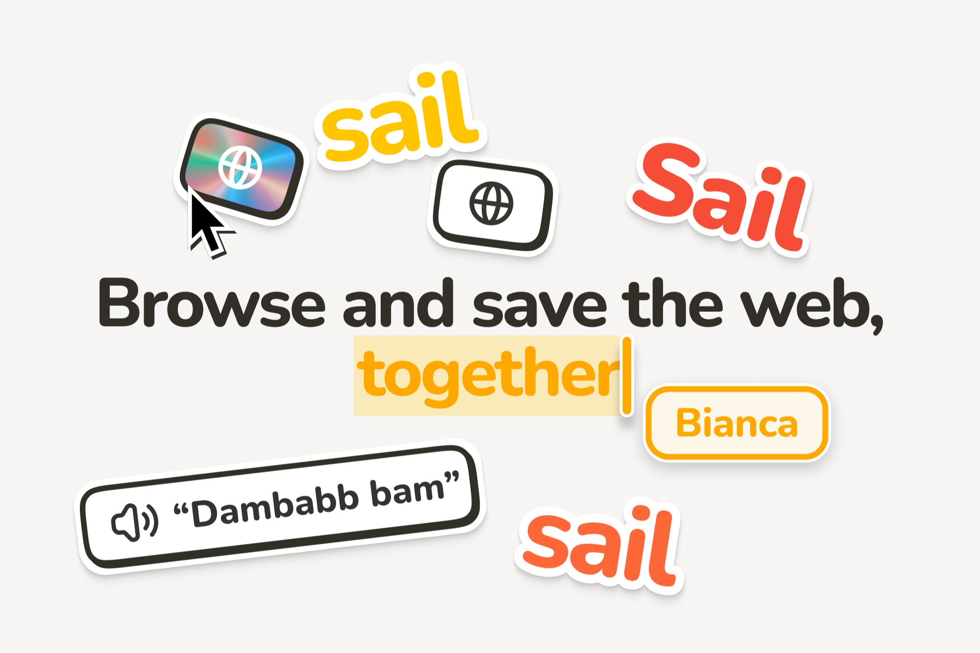
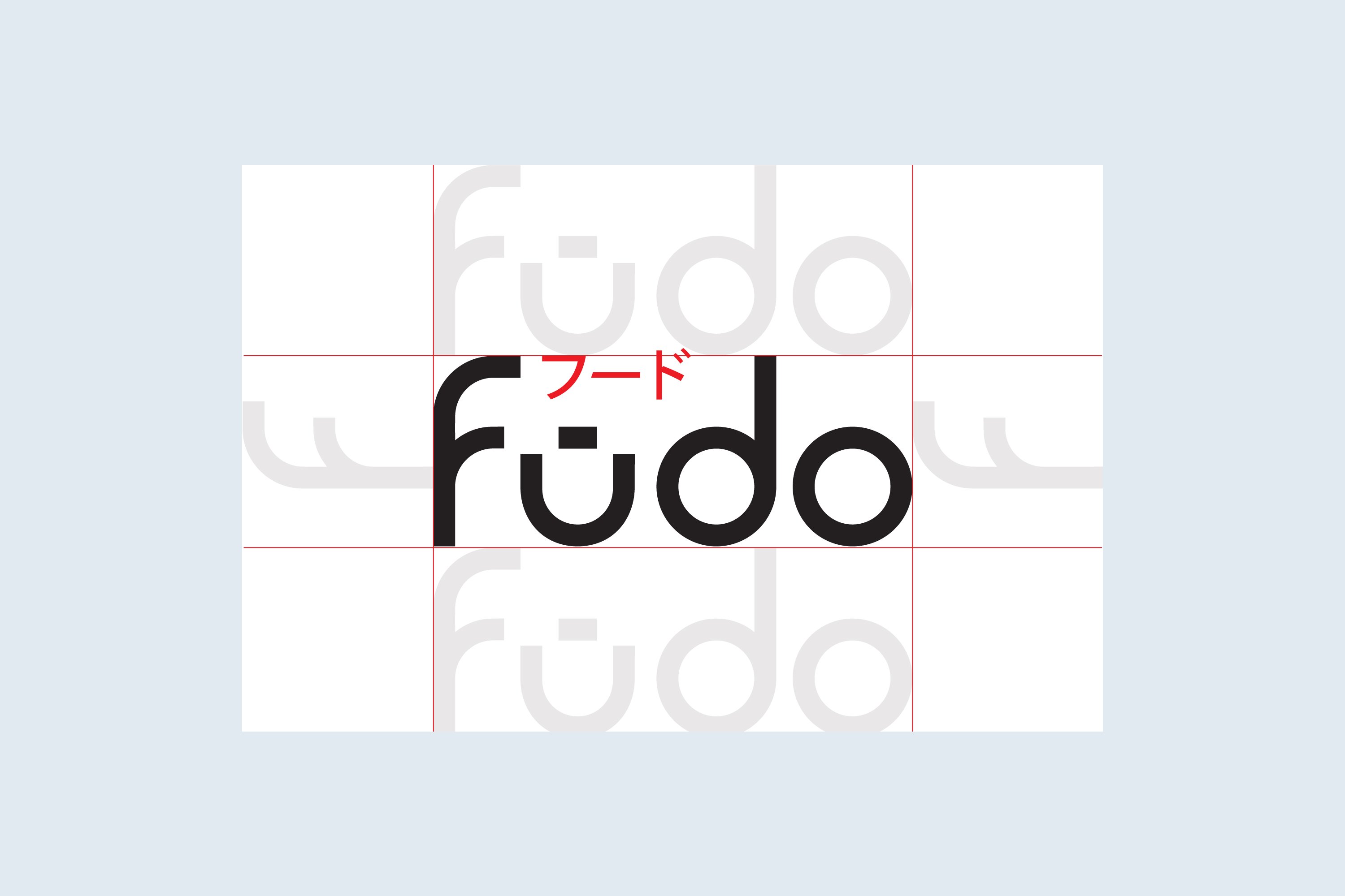
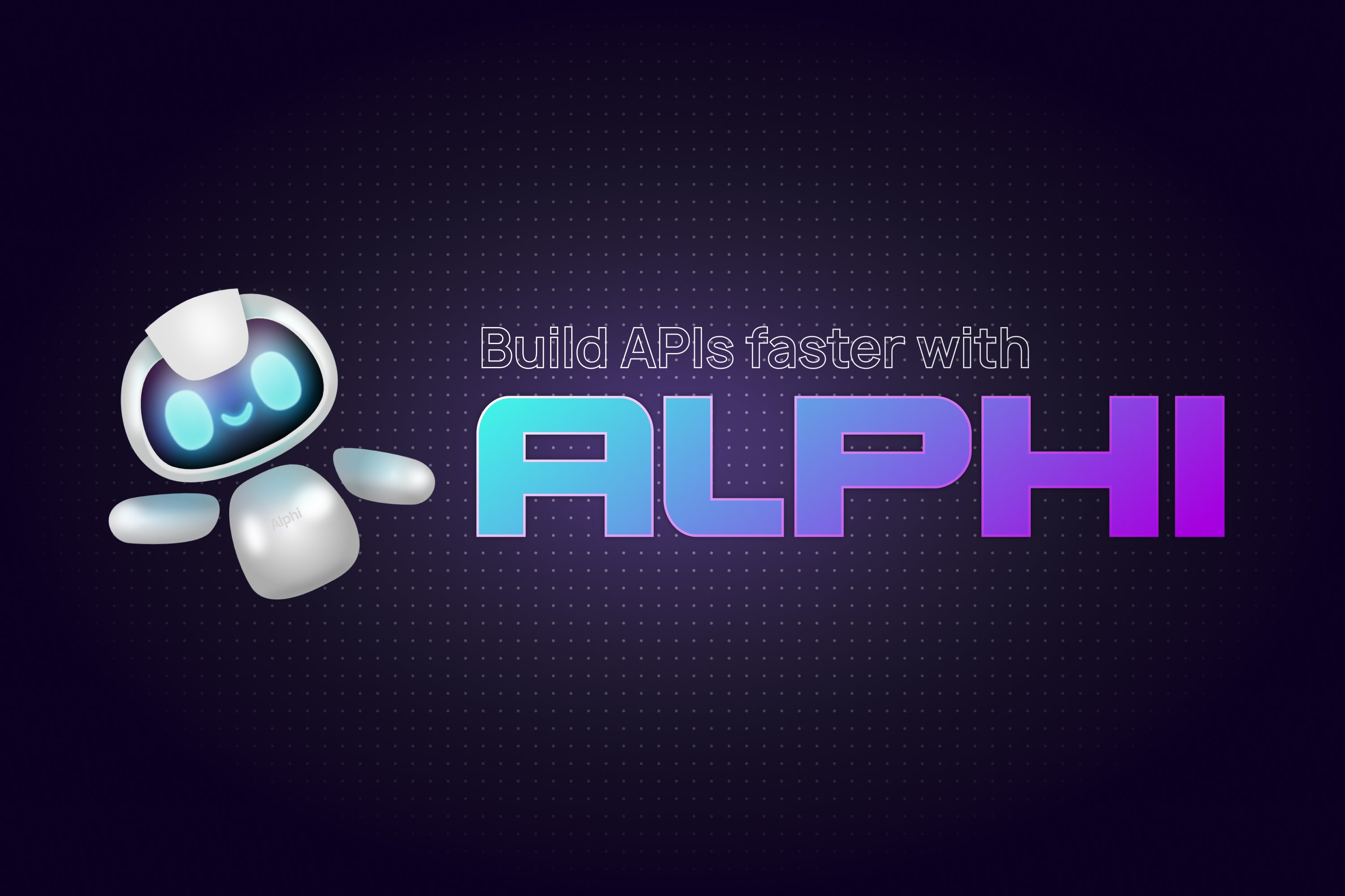
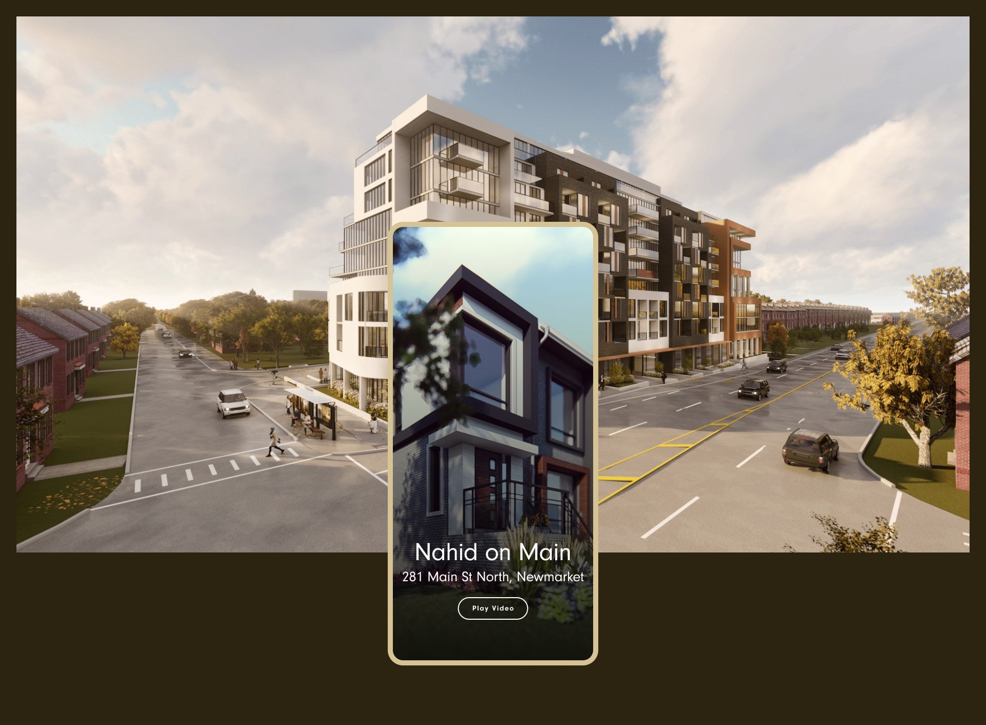
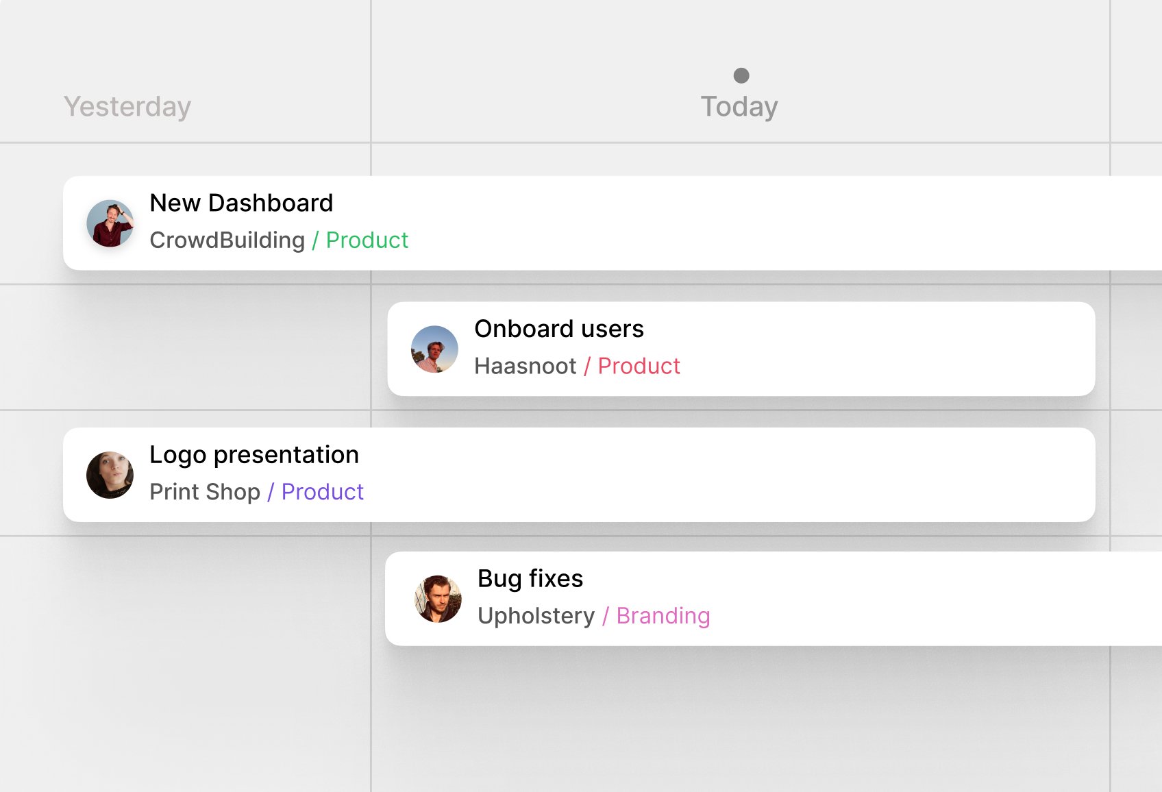
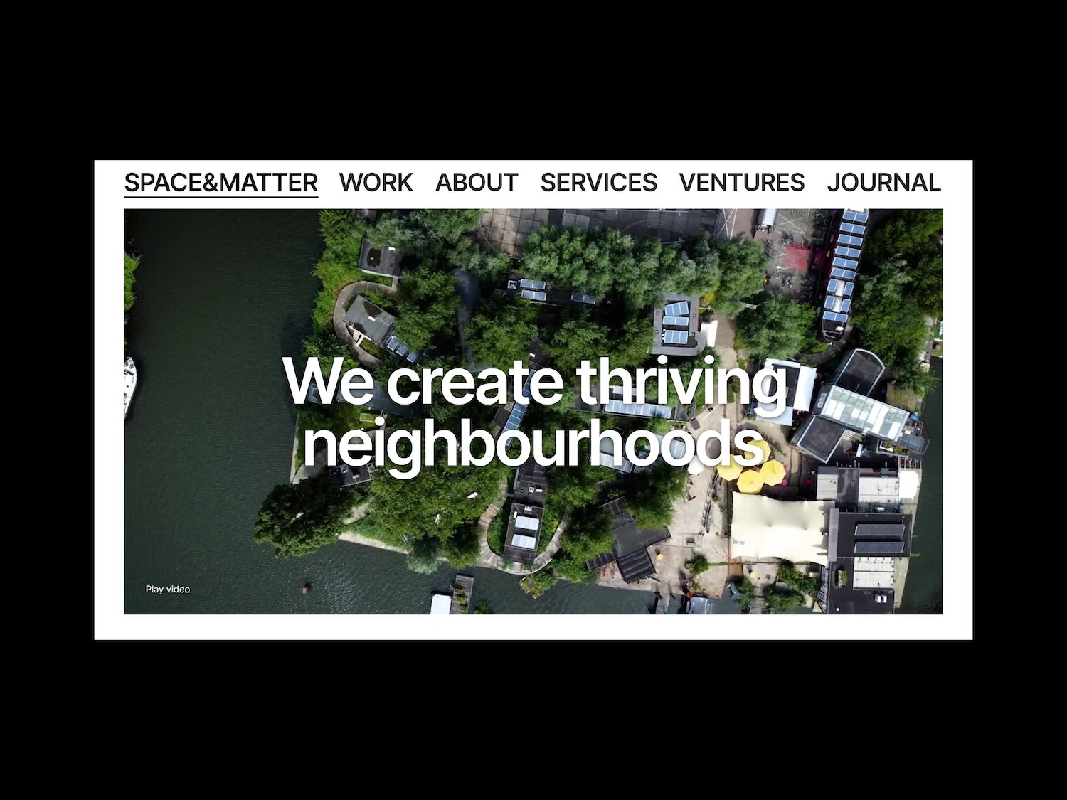
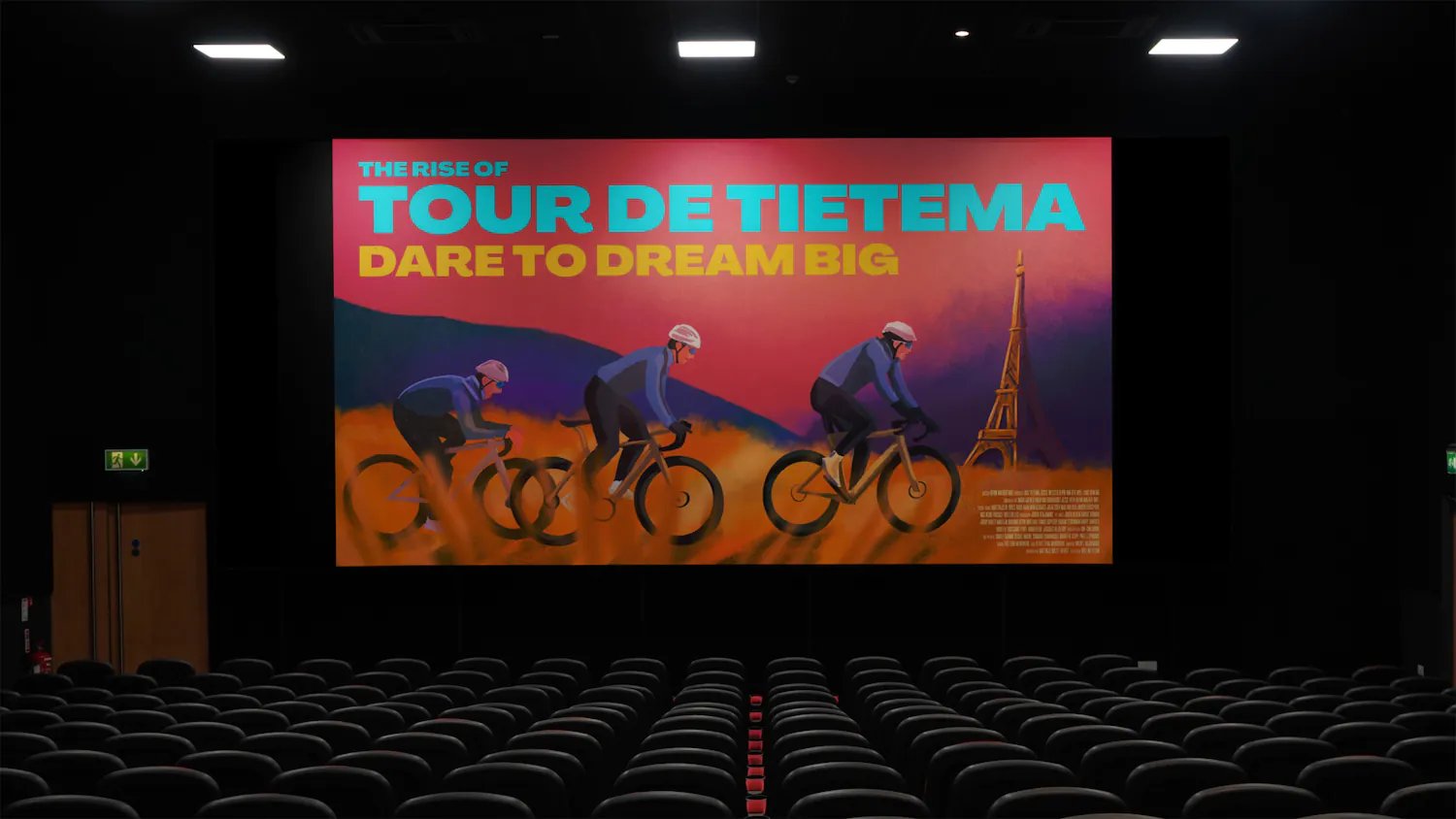
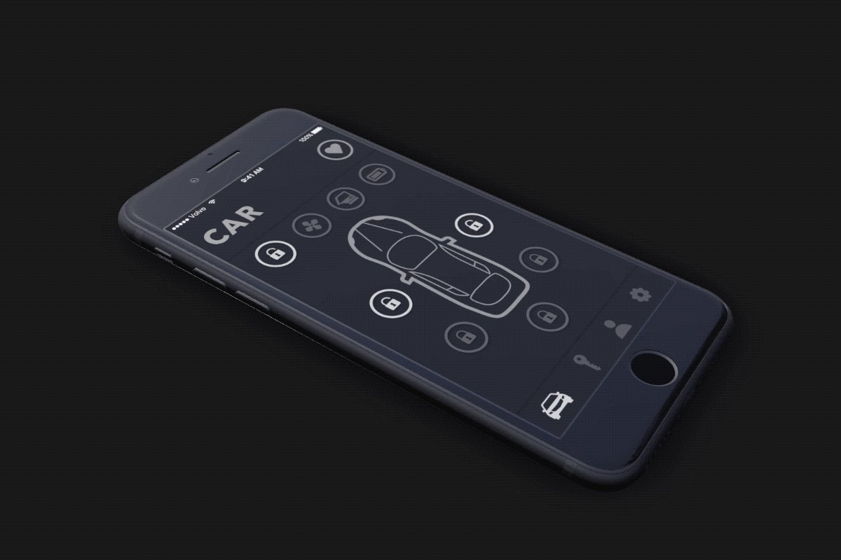
MOSS Sailing Industry Hospitality & Travel Services Brand IdentitiesProductsCampaignsWebsites Award-winning identity and website Identity, website and campaign materials for an RYA training centre. Read more Award-winning identity and website for a sailing training centre. More projects Arty MOSS Ecommerce Tella Comulate Climascapes Abe Impact American Terawatt Squizzi AiSC Scorecard Sohamm Babajee CrowdBuilding v2Cleargate Tango&Fado Muddy George StofferingHyperWrite Isoschild Paladin Voedselstation Whalesync Sail Fūdo Sushi Alphi BSAFEDana Ly Frameset CeeyuCrowdBuilding v1 Just Haasnoot MDD ANWB Smart Switch BijzonderBiometric Feedback Google Reach Vassan Viva Heavy LightLiving Roadmap Options Development RoadmapRouter Space&MatterThe Wall Printing Company Tour de Tietema Volvo App