

Tella
Brand identity refresh for the all-in-one screen recorder
A new mark, voice, and visual system for Tella — the screen recording tool used by creators, founders, and teams to record, edit, and share video without the production overhead.
Collaboration
- Kent de Bruin
- Grant Shaddick
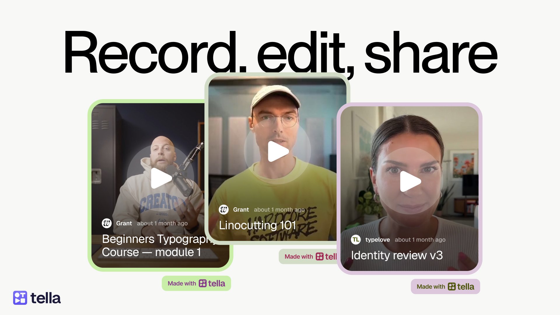
Tella is a video recording app for screen recording, editing and sharing. It’s made for the short, personal videos that usually come out rough: client walkthroughs, progress updates, the occasional story. Tella makes them look polished in a few clicks.
The product was already growing well. The harder problem was standing out. Recording tools are everywhere, and Tella needed to feel like its own thing.
Where it began
Kent de Bruin, one of my best friends and Tella’s lead designer, reached out to spar on a few ideas. It started small. A handful of backgrounds, some icons, a bit of UI consultancy alongside him. Then it kept growing, and rather than let the pieces and styles drift apart, we decided to take on the whole identity together.
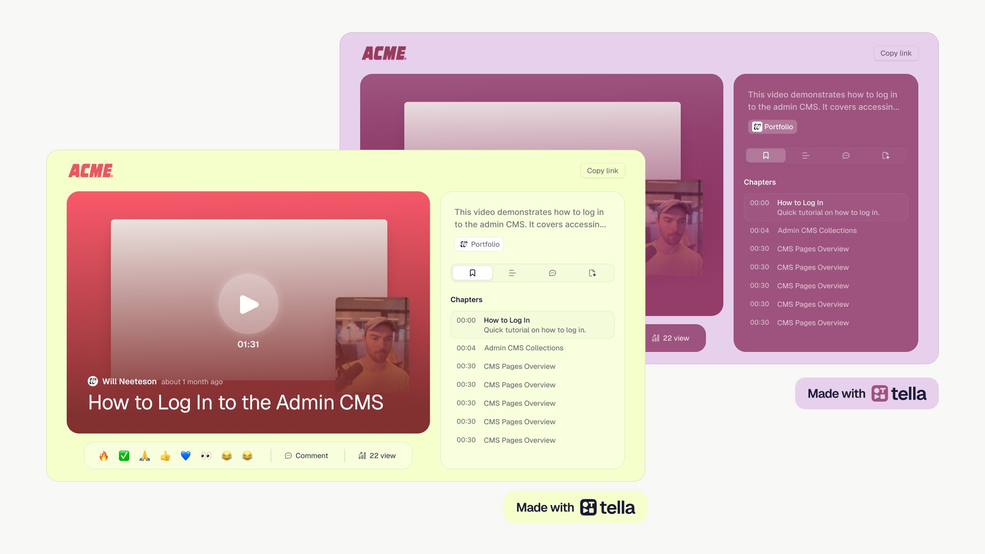
Tella is a frame
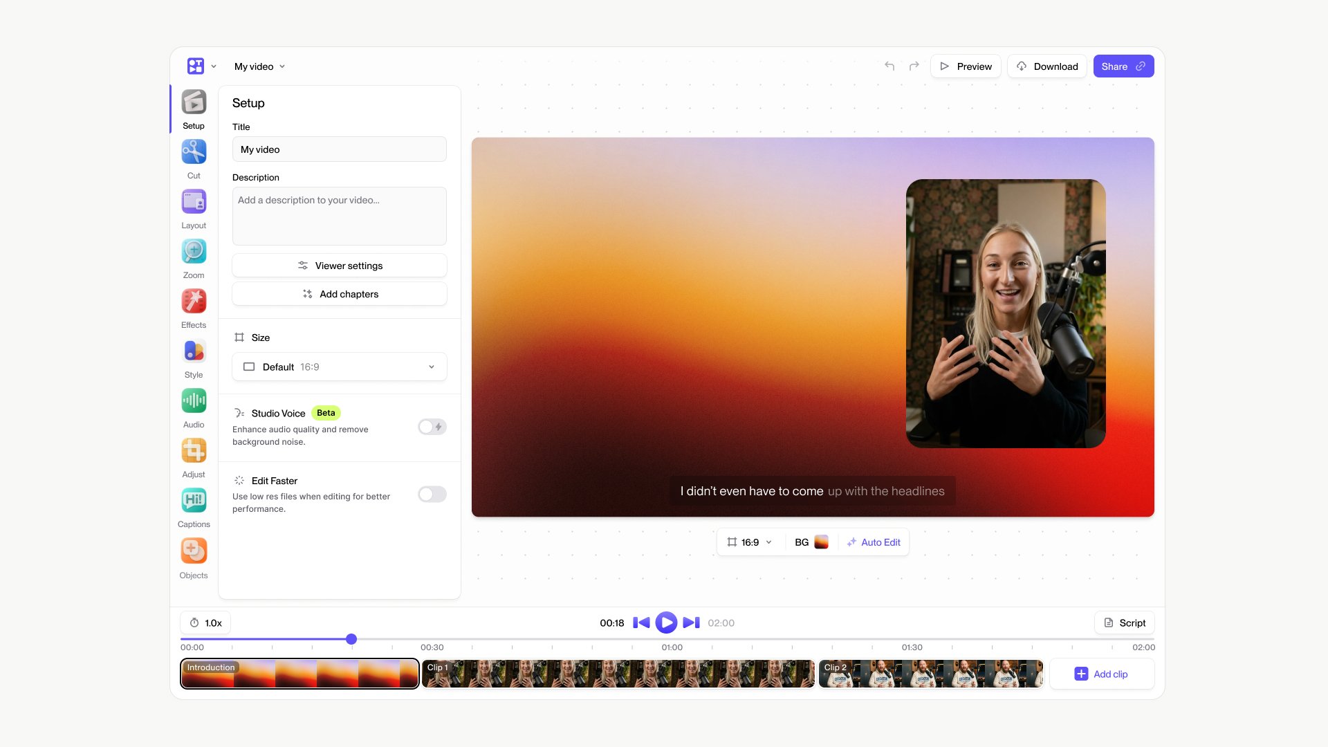
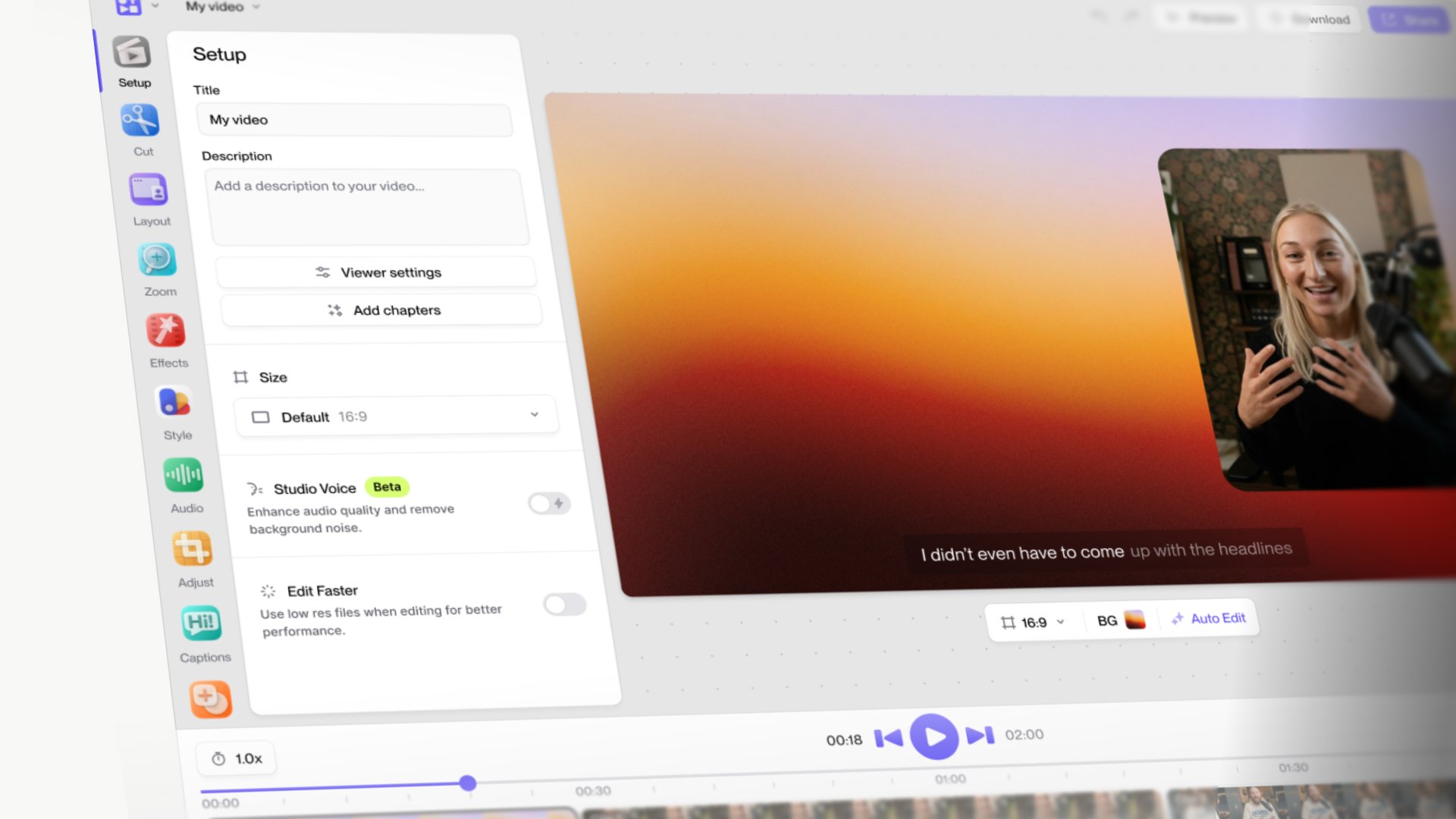
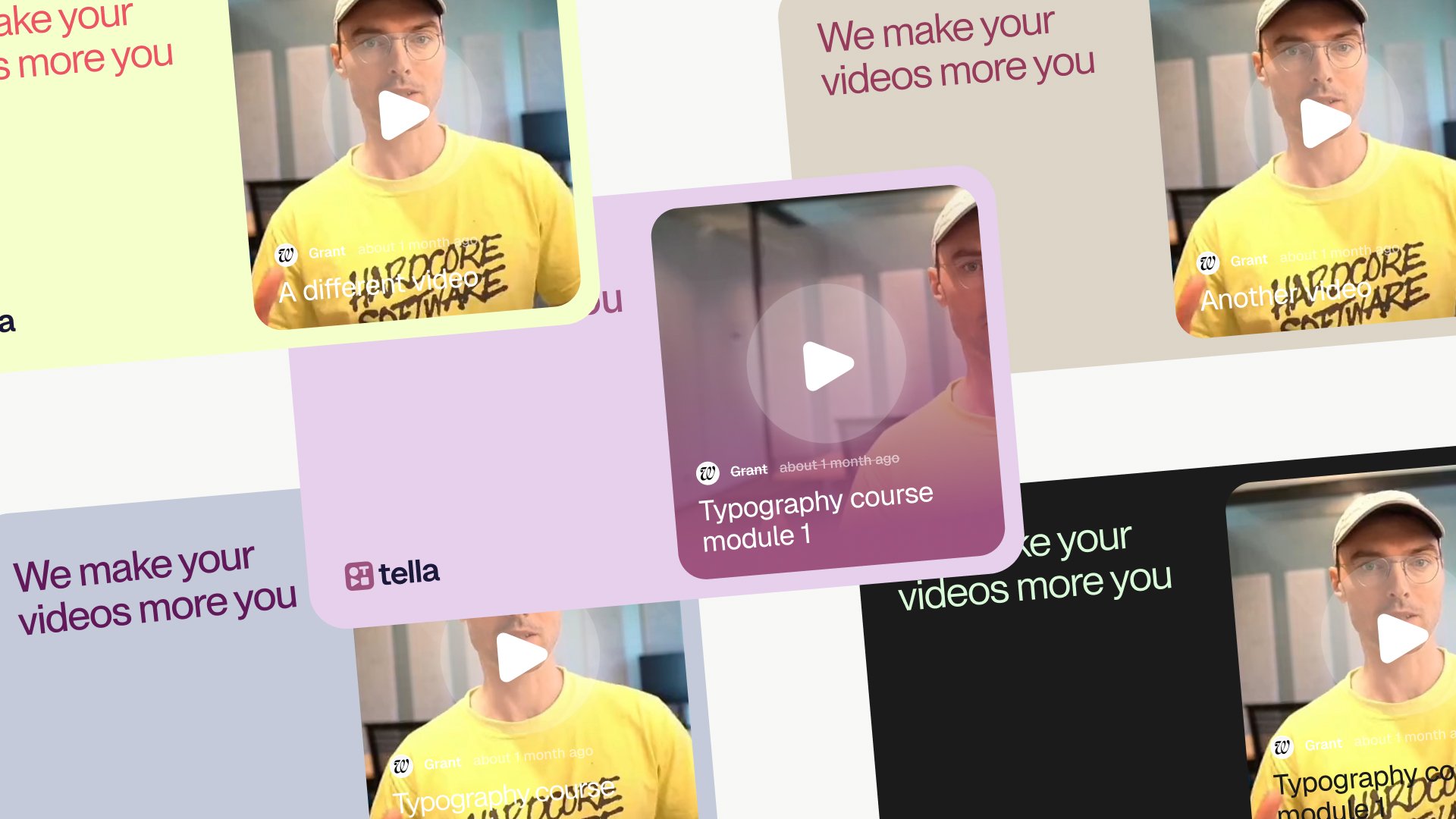
The first thing I noticed about Tella was how personal the videos feel. You drop in a background from the library, add music, whitelabel the whole thing, and clean it up in a few clicks. The result feels less like a Tella video and more like mine.
That’s the appeal, and it was also the problem. If every video carries its own colours, backgrounds and labels, then what is the brand?
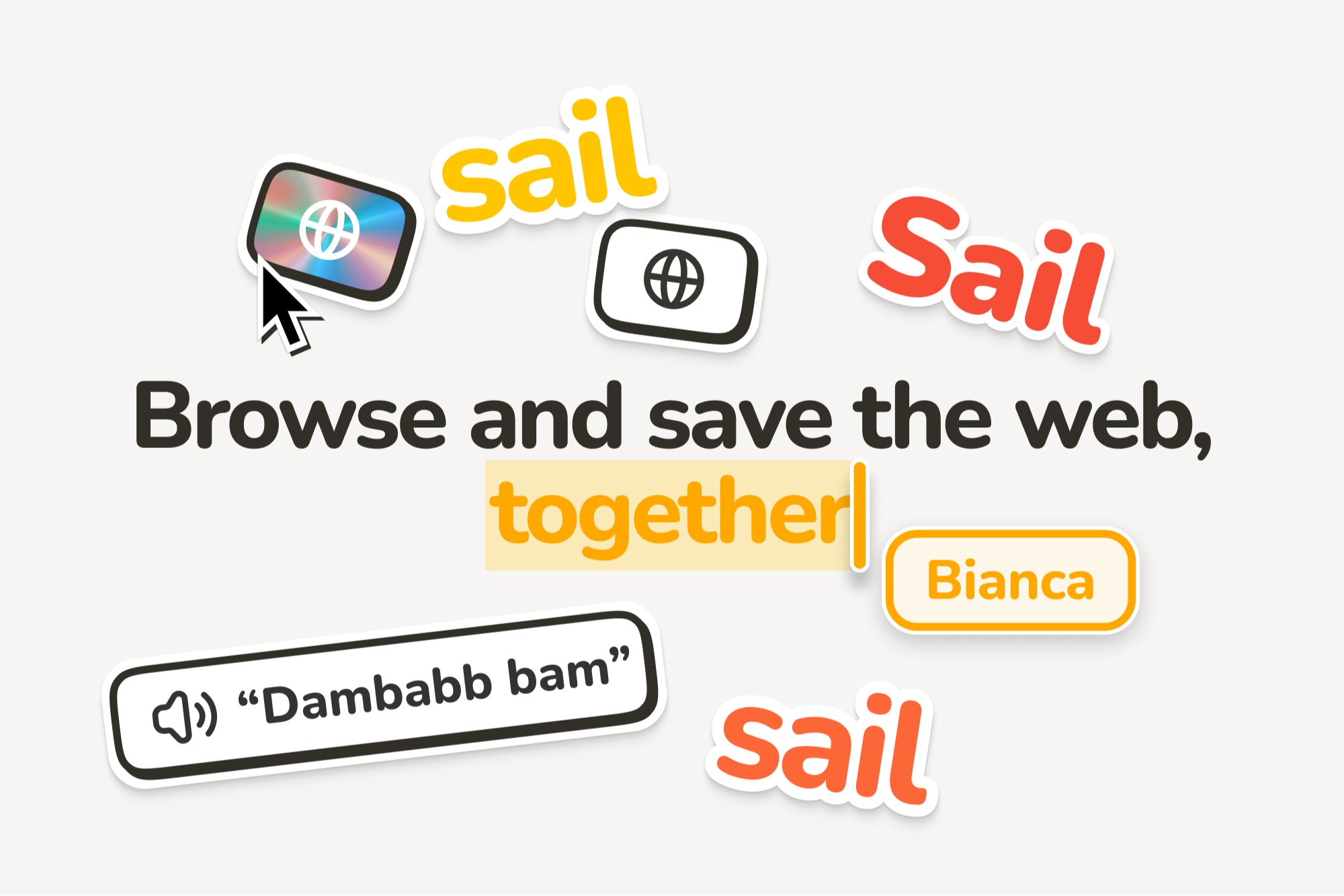
The answer turned out to be the one thing every video has in common: the frame around it. Everything inside the frame belongs to the user. The frame itself is Tella. The label adapts to each person’s preferences while still reading as part of the same system.
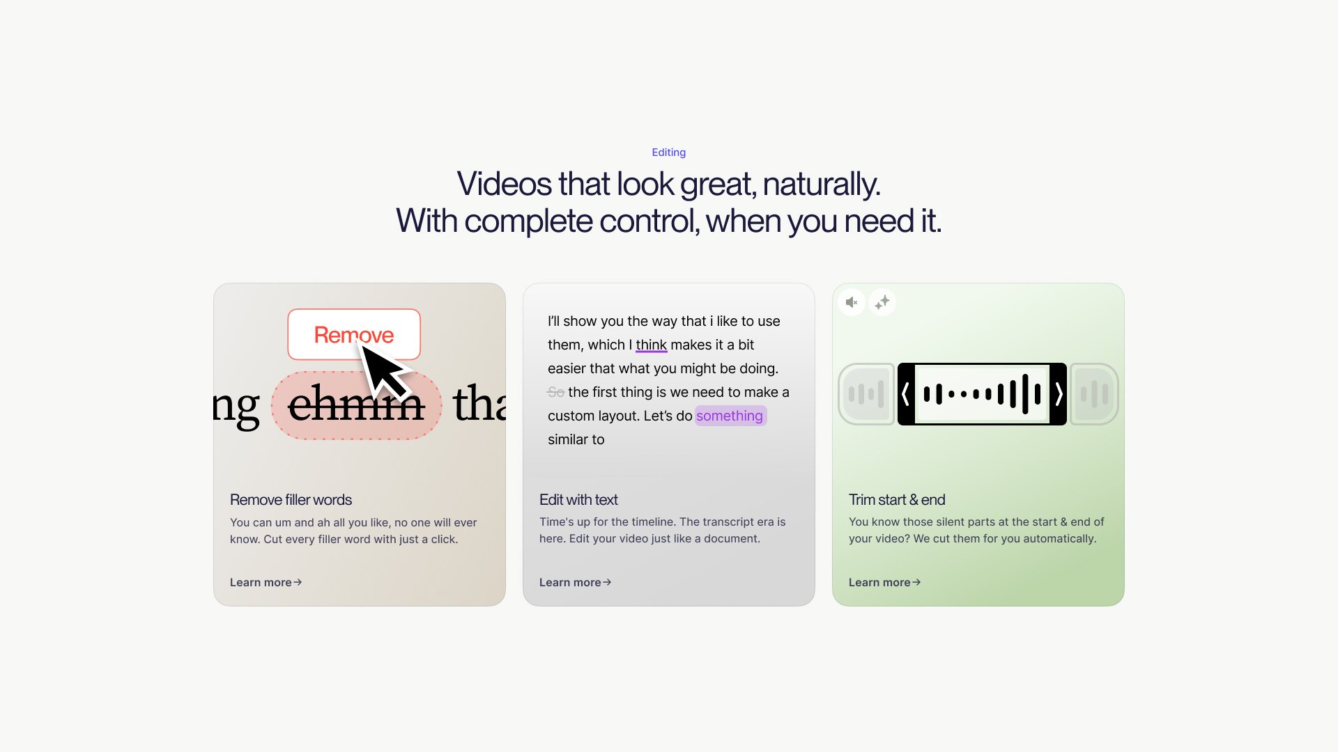
Once I saw it that way, the rest of the identity followed. Tella isn’t the video. It’s the frame that powers someone to tell their story, and it doubles as a box of tools to play with, the cropping, trimming and tidying that turn a raw clip into something worth sending.
The system
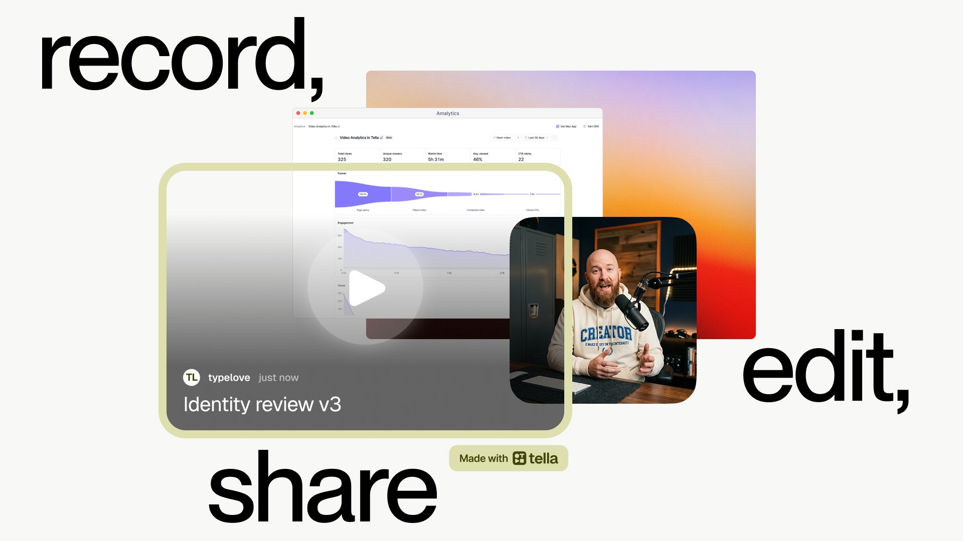
A frame only works if it holds up anywhere. The identity had to live across different colours, tones and settings without losing itself, so I built it as a frame around a canvas. The structure stays fixed while the contents change.
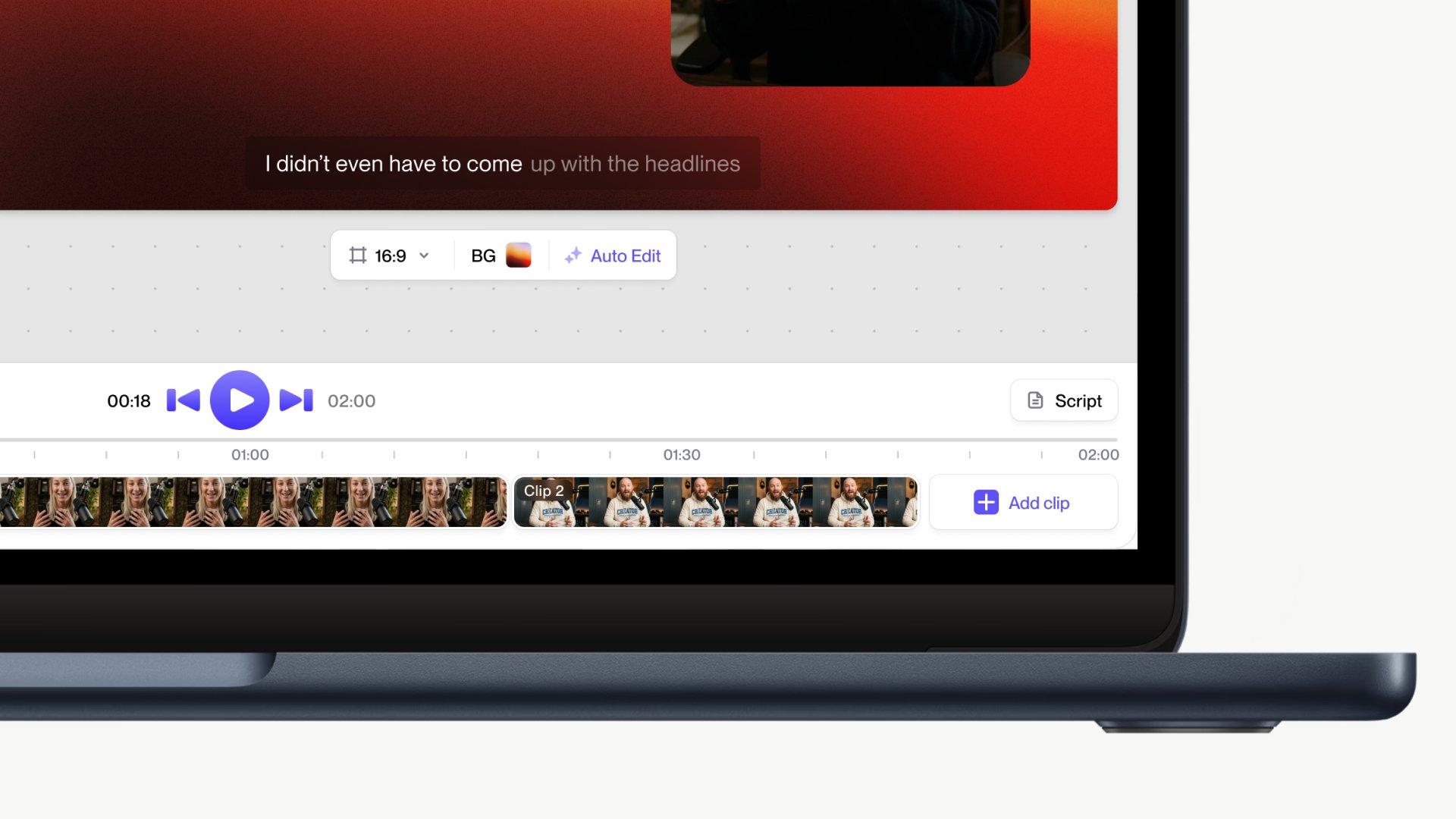
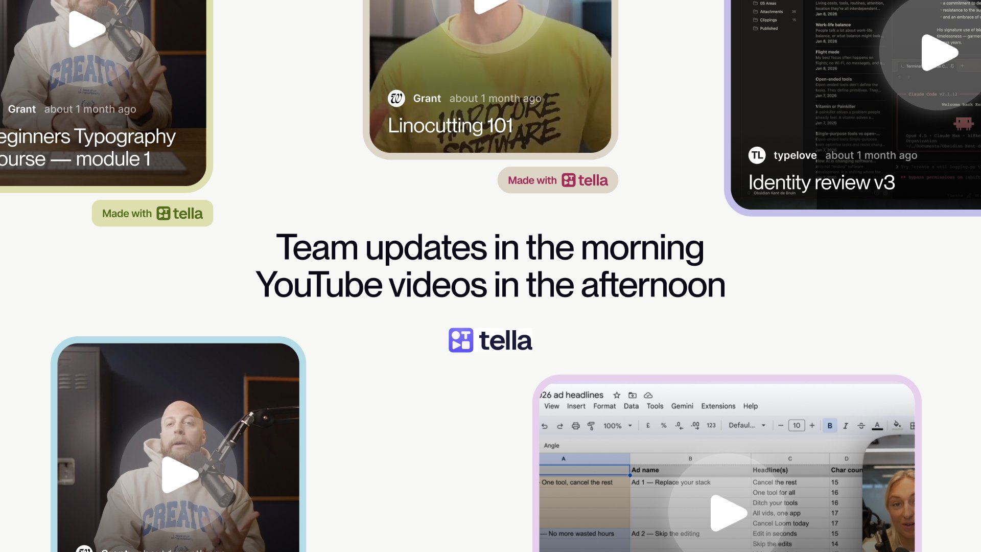
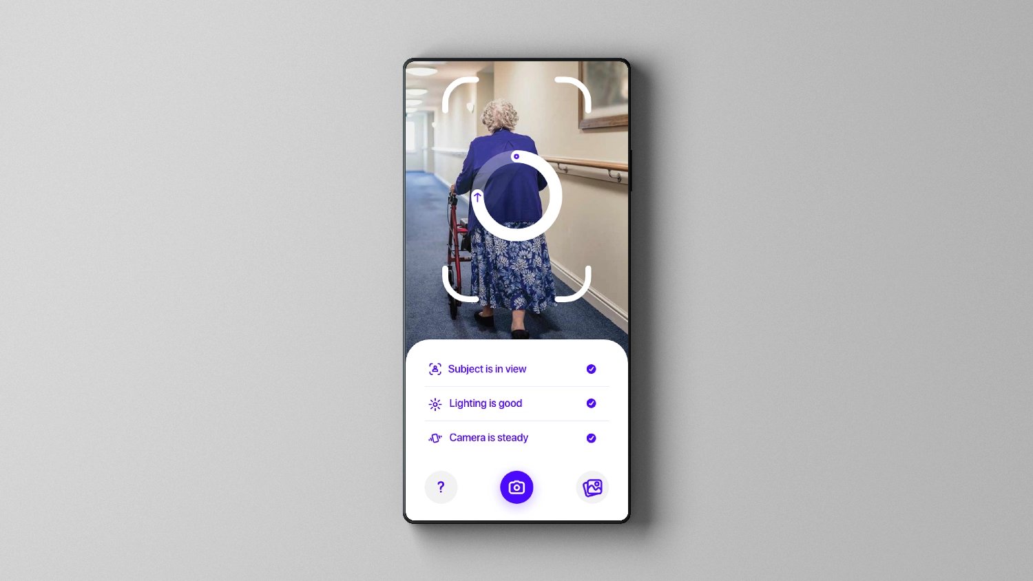
Inside that frame, most Tella videos are built from the same three layers: a background from the Tella library, a main feed that’s usually a screen recording, and a feed of the person talking. The system keeps those layers clean and easy to read, so however a video is put together, the frame still holds as one piece.
In the details
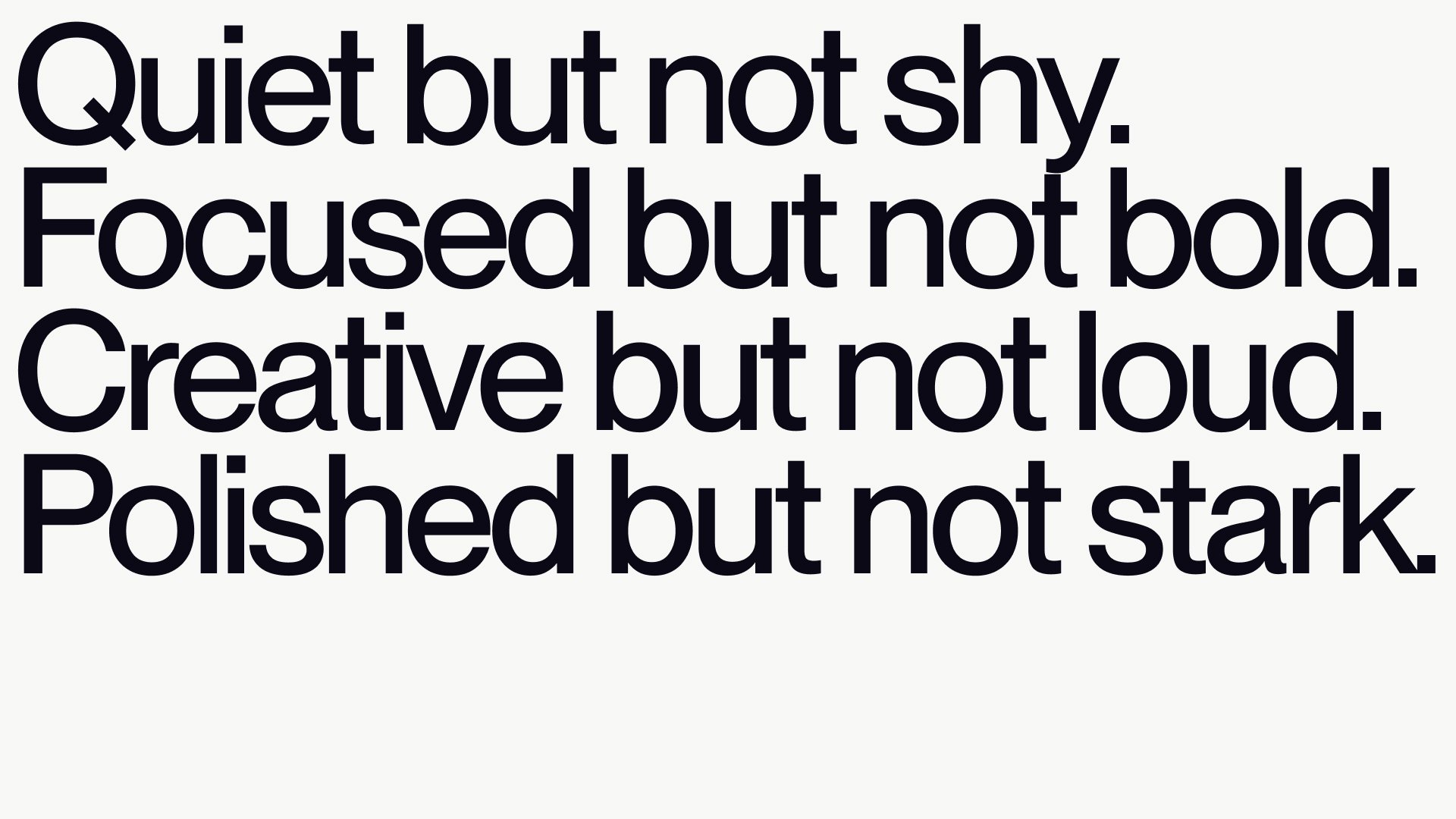
Everything after that came down to detail. One belief ran through the whole project: if the small things are considered, people trust that the rest is too.
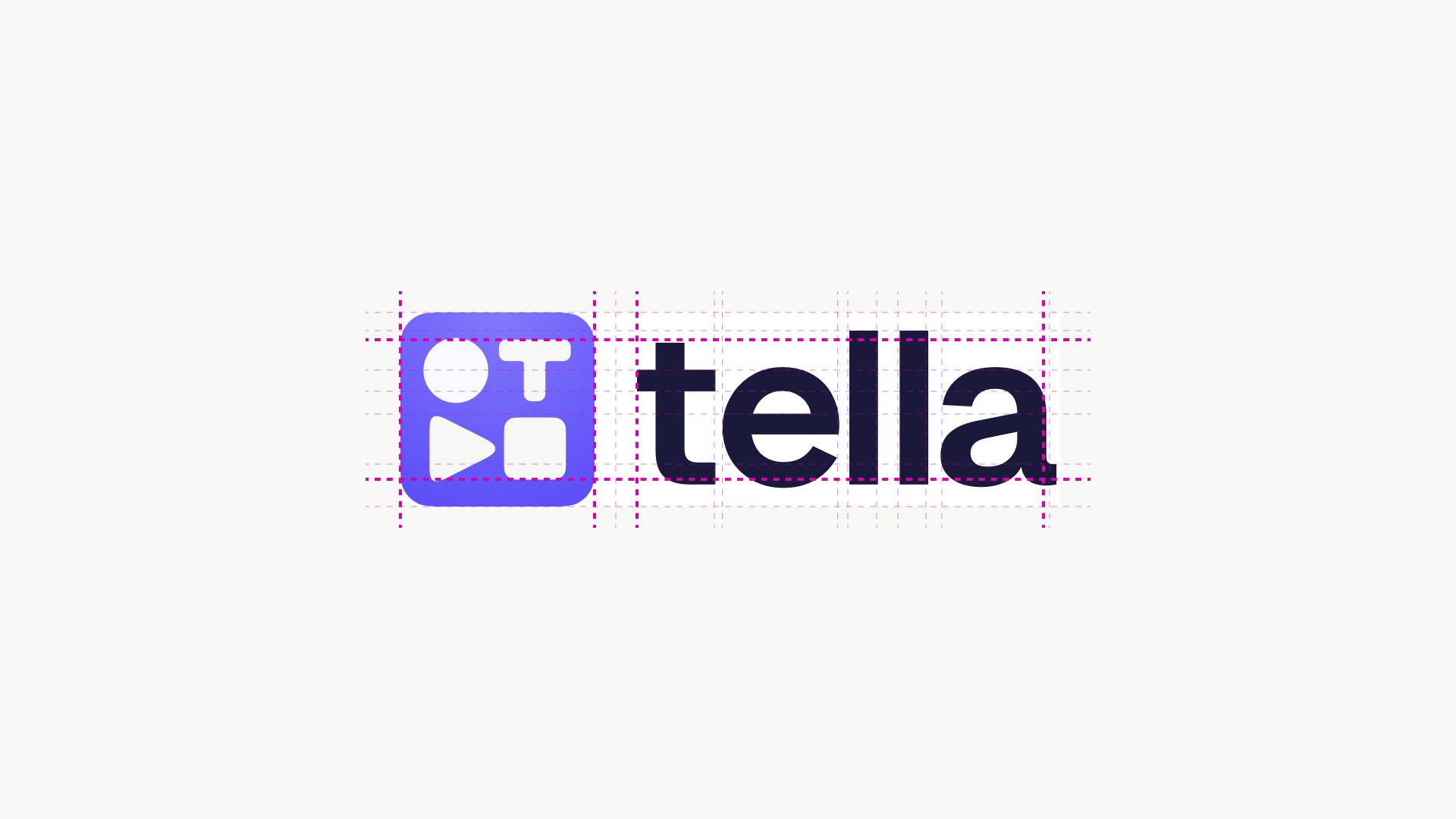
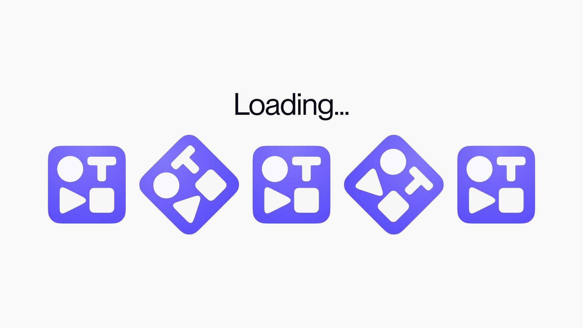
It started with the mark. The wordmark and logo were redrawn rather than reinvented. They were sharpened for clarity, fixed where they needed technical work, and brought into line with the new style.
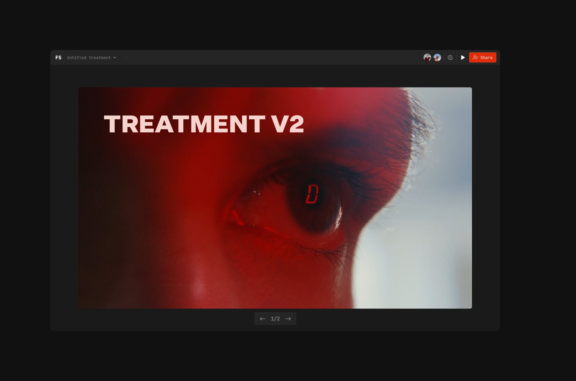
The backgrounds were my favourite part. We spent weeks on a series built around light and landscapes. Each one had to feel beautiful enough to stand on its own, yet stay quiet the moment a video sat in front of it. They carry a mood without ever competing with the thing they hold.
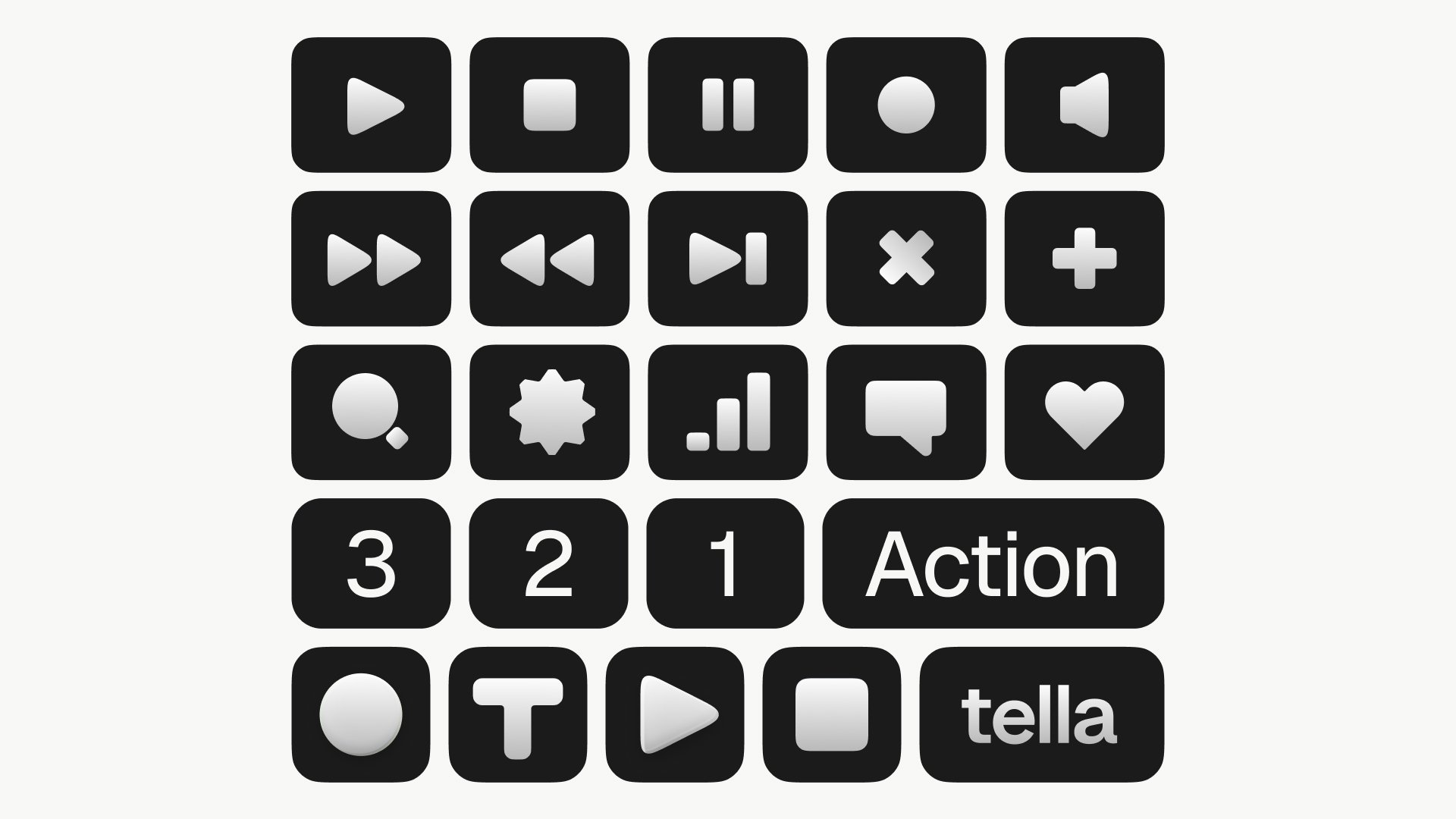
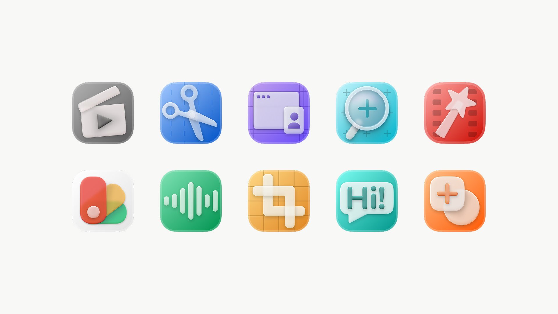
The edit icons were where playfulness lived. Tella has always had a playful side, and while the new identity stepped back from the obvious version of it, the icons were one place it still belonged. Grant, Tella’s founder, was insistent we get them right, so we designed and tweaked each one with more care than icons that size usually get. If they hold that level of detail, the rest of the app reads as if it does too.